Captive Portal Accessibility: WCAG 2.1 Compliance Guide
This authoritative guide details how to design, test, and deploy captive portals that meet WCAG 2.1 AA accessibility standards. Essential reading for venue operators and IT teams navigating UK and US public-sector compliance mandates.
🎧 Listen to this Guide
View Transcript

Executive Summary
For enterprise IT leaders and venue operations directors, captive portal accessibility is no longer an optional enhancement—it is a strict legal requirement. The UK Public Sector Bodies Accessibility Regulations and the US Department of Justice’s 2024 final rule under ADA Title II mandate that all public-facing digital services, including WiFi splash pages, must conform to Web Content Accessibility Guidelines (WCAG) 2.1 Level AA. Failure to comply exposes organisations to legal risk, reputational damage, and alienated guests.
Despite this, captive portals remain one of the most consistently overlooked compliance touchpoints in modern IT estates. Because they sit at the intersection of network engineering and web development, they often bypass standard accessibility audits. This technical reference guide provides actionable, vendor-neutral guidance on designing, testing, and remediating captive portals to meet WCAG 2.1 AA standards. By implementing these practices, network architects can ensure their Guest WiFi deployments provide equitable access for all users while mitigating compliance risks across Hospitality , Retail , and public-sector environments.
Listen to our executive briefing on captive portal accessibility compliance:
Technical Deep-Dive: WCAG 2.1 AA Applied to Captive Portals
The WCAG 2.1 framework is organised around four core principles: Perceivable, Operable, Understandable, and Robust (POUR). While the standard contains 50 success criteria at Level AA, a captive portal—typically a streamlined authentication form—must primarily address criteria affecting form interaction, keyboard navigation, and screen reader compatibility.
Perceivable: Contrast and Reflow
The most frequent accessibility failure in branded captive portals is insufficient colour contrast. Success Criterion 1.4.3 (Contrast Minimum) requires a contrast ratio of at least 4.5:1 for standard text and 3:1 for large text or UI components. Venue operators frequently attempt to apply primary brand colours—such as light grey text on a white background—which immediately fail compliance checks. Network teams must collaborate with marketing to define an accessible digital palette for the splash page.
Furthermore, Criterion 1.4.10 (Reflow) mandates that content must present without horizontal scrolling at a viewport width of 320 CSS pixels (equivalent to 400% zoom on a desktop monitor). Many legacy captive portals employ fixed-width containers that break entirely under magnification, effectively locking out users with low vision. Modern responsive design is a baseline requirement.
Operable: Keyboard Navigation and Session Timing
For users with motor impairments who rely on assistive technologies rather than a mouse, keyboard accessibility is critical. Criterion 2.1.1 (Keyboard) dictates that every interactive element on the portal—input fields, submit buttons, and terms of service checkboxes—must be reachable and operable using only the Tab, Enter, Space, and arrow keys. A common architectural flaw occurs when custom-styled checkboxes are implemented as <div> elements rather than native HTML <input type="checkbox"> elements, rendering them invisible to keyboard navigation.
Session management also introduces accessibility challenges. Criterion 2.2.1 (Timing Adjustable) applies directly to the authentication timeout windows configured on the network controller. If a captive portal imposes a strict time limit for registration, users who navigate slowly using screen readers or switch controls will be disproportionately timed out. The portal must warn the user before the timeout occurs and provide a mechanism to extend the session.
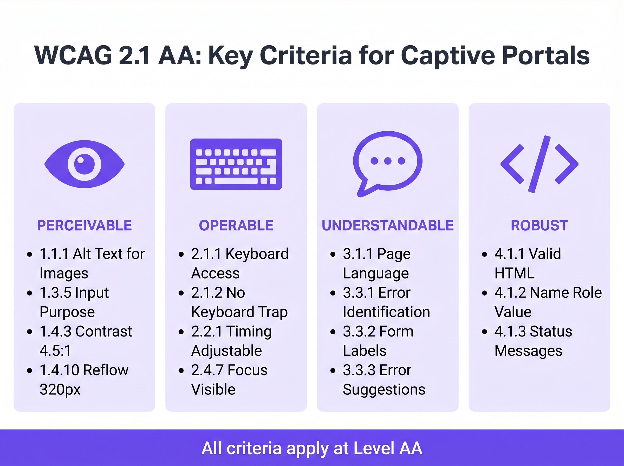
Understandable: Form Labels and Error Handling
Form accessibility is the cornerstone of a compliant captive portal. Criterion 3.3.2 (Labels or Instructions) requires visible, persistent labels for all input fields. A widespread anti-pattern in modern UI design is the use of placeholder text as a substitute for persistent labels. Placeholder text disappears upon input, leaving users with cognitive disabilities without context, and frequently fails contrast requirements.
When authentication fails—perhaps due to an invalid email format or an unaccepted MAC address—the error must be explicitly identified and described in text (Criterion 3.3.1). Relying solely on a red border to indicate an error state violates both colour dependence rules and error identification requirements. The error text must be programmatically associated with the offending field using the aria-describedby attribute.
Robust: Screen Reader Compatibility
Criterion 4.1.2 (Name, Role, Value) is the foundation of assistive technology support. Every interactive element must possess an accessible name and programmatic role. When a user running NVDA or VoiceOver encounters a "Connect" button, the underlying HTML must explicitly identify it as a button and announce its purpose. If the portal relies on icon-only social login buttons (e.g., a Google or Facebook logo) without accessible text labels, screen readers will merely announce "button" or "link", providing no context to the user.
Implementation Guide: Building Accessible Portals
Deploying an accessible captive portal requires a shift from retroactive fixing to proactive design. The following deployment phases ensure compliance across the network estate.
Phase 1: Semantic HTML Architecture
The most effective accessibility strategy is relying on native, semantic HTML rather than complex ARIA (Accessible Rich Internet Applications) overlays. Use <form>, <fieldset>, <legend>, <label>, and <input> elements exactly as intended by the specification. Native elements inherit keyboard operability and screen reader support by default.
For example, when requesting marketing consent—a critical step for Event-Driven Marketing Automation Triggered by WiFi Presence —the checkbox must be explicitly linked to its label using the for and id attributes. This not only ensures screen reader announcement but also increases the clickable hit area, benefiting users with motor control difficulties.
Phase 2: Focus Management and Modals
Captive portals frequently employ modal dialogs to display comprehensive Terms and Conditions or Acceptable Use Policies. From an accessibility perspective, modals are high-risk components. When a modal opens, keyboard focus must be programmatically moved into the modal, and focus must be trapped within it (Criterion 2.1.2: No Keyboard Trap) until the user explicitly dismisses it. If focus escapes the modal and returns to the obscured background page, screen reader users become entirely disoriented.
Phase 3: Dynamic State Announcements
Modern splash pages often process authentication asynchronously via APIs rather than forcing full page reloads. While this improves the general user experience, it creates accessibility gaps if status changes are not announced. Use ARIA live regions (aria-live="polite" for status updates, aria-live="assertive" for critical errors) to ensure screen readers announce dynamic changes, such as "Connecting to network..." or "Authentication failed. Please check your details."
Best Practices and Testing Methodology
Validating captive portal accessibility requires a hybrid approach. Automated scanning tools provide rapid baseline checks, but manual testing is mandatory for confirming true operability.
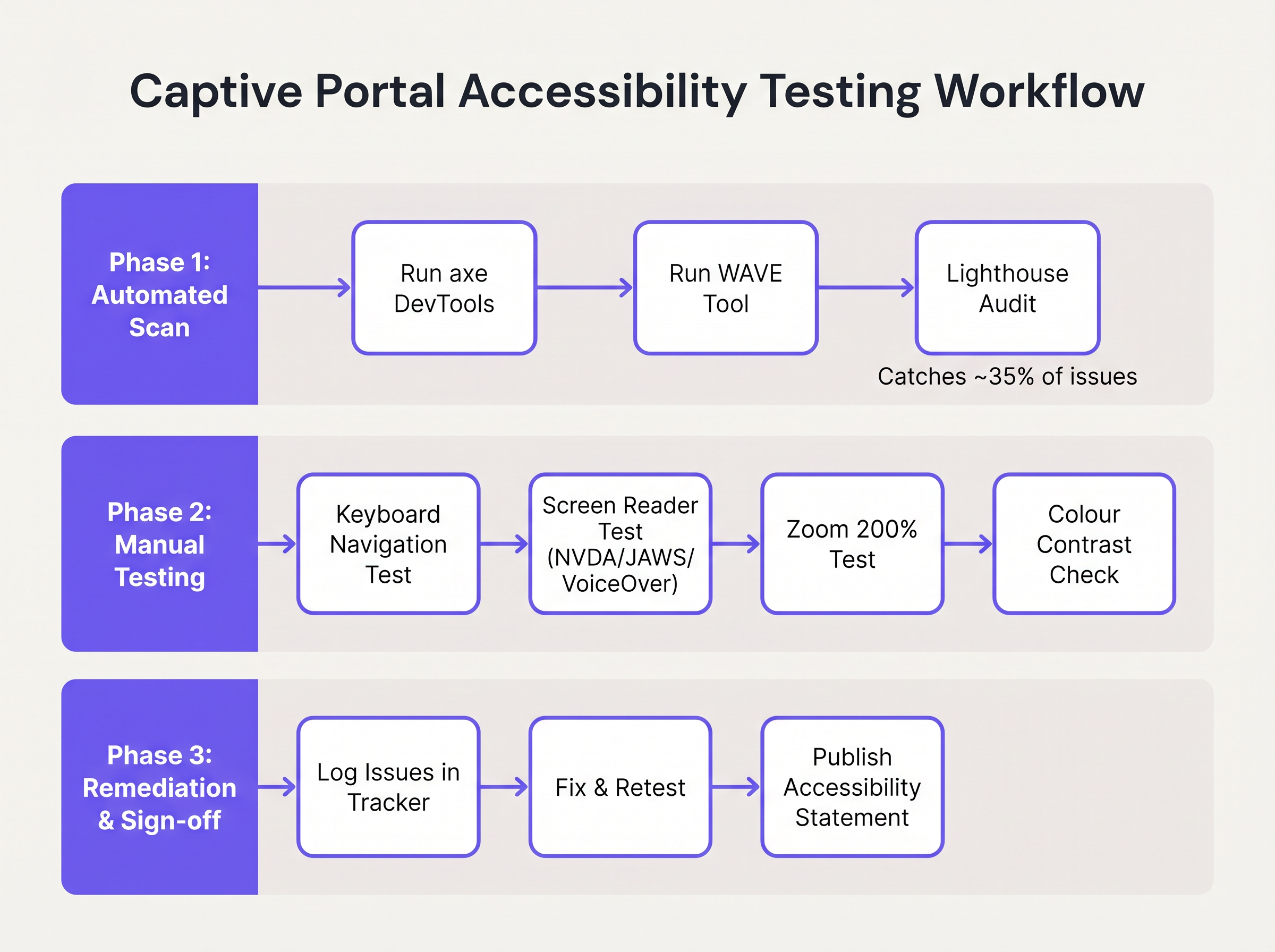
- Automated Scanning: Integrate tools like axe DevTools or WAVE into the portal development pipeline. These tools rapidly identify structural issues such as missing
alttext, absent labels, and severe contrast violations. However, automated tools typically only catch 30-40% of WCAG failures. - Keyboard Navigation Audits: Network engineers must routinely test the live portal by disconnecting the mouse and navigating exclusively via the keyboard. Verify that the focus indicator (the outline highlighting the active element) is highly visible and that the tab order follows a logical, predictable sequence.
- Screen Reader Verification: Test the portal using native screen readers: VoiceOver on iOS (crucial, as mobile devices represent the vast majority of captive portal authentications), TalkBack on Android, and NVDA or JAWS on Windows desktop. Verify that all form fields, errors, and state changes are accurately announced.
- Vendor Accountability: When procuring managed WiFi services or portal platforms, demand a Voluntary Product Accessibility Template (VPAT) or an independent WCAG 2.1 AA conformance report from the vendor. Purple's portal builder incorporates fundamental accessibility features, streamlining compliance for Guest WiFi deployments.
Troubleshooting & Risk Mitigation
When accessibility audits fail, the root causes are typically found in three specific areas of the captive portal architecture.
The Custom UI Trap
Developers frequently replace native HTML form elements with custom <div> and <span> constructs styled with CSS to match precise brand guidelines. While visually appealing, these custom elements strip away all native accessibility semantics.
Mitigation: Always build upon native HTML elements. If custom styling is mandatory, apply CSS to the native elements rather than replacing them. If a custom element must be used, developers must manually rebuild the accessibility stack using ARIA roles, states, and keyboard event listeners—a complex and error-prone process.
The CAPTCHA Barrier
Traditional visual CAPTCHAs (requiring users to identify distorted text or select images of traffic lights) are fundamentally inaccessible to users with severe vision impairments.
Mitigation: Implement modern, invisible CAPTCHA solutions (such as reCAPTCHA v3 or Cloudflare Turnstile) that assess risk based on behavioral telemetry rather than user interaction. If a challenge is unavoidable, an accessible audio alternative must be provided.
The Auto-Redirect Disorientation
Upon successful authentication, captive portals typically redirect the user's browser to a designated landing page or the originally requested URL. For screen reader users, sudden, unannounced context changes are highly disorienting.
Mitigation: Provide a clear, intermediate status message ("Authentication successful. You are now being redirected to the internet.") before executing the redirect. Ensure the target landing page is also fully accessible.
ROI & Business Impact
Investing in captive portal accessibility delivers measurable returns beyond mere risk avoidance. For public-sector entities, education institutions, and healthcare providers, WCAG 2.1 AA compliance is a strict legal mandate; failure to comply invites formal investigations, financial penalties, and public relations crises.
However, in commercial sectors such as Retail and Transport , accessibility directly impacts the bottom line. A captive portal is a primary acquisition channel for customer data. If 15% of the global population experiences some form of disability, an inaccessible portal actively prevents a significant demographic from joining loyalty programmes or opting into marketing communications.
By deploying an accessible portal, venue operators maximise authentication success rates, expand their addressable marketing audience, and demonstrate a tangible commitment to inclusive digital experiences. Integrating these compliant portals with broader marketing strategies—such as Mailchimp Plus Purple: Automated Email Marketing from WiFi Sign-Ups —ensures that the expanded data capture translates directly into increased customer lifetime value.
Key Terms & Definitions
WCAG 2.1 AA
The Web Content Accessibility Guidelines version 2.1, Level AA. The internationally recognised technical standard for digital accessibility, mandated by law in the UK and US for public-sector digital services.
The benchmark standard that network architects must reference when procuring or designing captive portal solutions to ensure legal compliance.
Assistive Technology (AT)
Hardware or software—such as screen readers, screen magnifiers, or alternative keyboards—used by individuals with disabilities to interact with digital interfaces.
Captive portals must be coded to interface correctly with AT; failure to do so prevents authentication and network access.
Screen Reader
Software that translates on-screen text and interface elements into synthesized speech or braille output (e.g., VoiceOver, NVDA, JAWS).
The primary tool used by visually impaired guests to navigate WiFi splash pages, requiring strict adherence to semantic HTML and ARIA standards.
ARIA (Accessible Rich Internet Applications)
A set of HTML attributes that define ways to make web content and web applications more accessible to people with disabilities.
Used by portal developers to bridge accessibility gaps in complex or dynamic UI components when native HTML is insufficient.
Keyboard Trap
An accessibility failure where a user navigating via keyboard can enter a specific component (like a modal dialog) but cannot use the keyboard to exit it.
A critical failure point in captive portals, often occurring when terms and conditions overlays are poorly implemented, permanently blocking the authentication flow.
Focus Indicator
The visual outline (often a ring) that highlights which interactive element currently has keyboard focus.
Essential for sighted keyboard users to track their position on the portal. Often mistakenly removed by designers for aesthetic reasons using `outline: none` in CSS.
Contrast Ratio
The mathematical difference in luminance between a text color and its background color, ranging from 1:1 to 21:1.
WCAG AA requires a minimum ratio of 4.5:1 for standard text. Network teams must verify brand colors against this metric before deploying splash pages.
Semantic HTML
The use of HTML markup to reinforce the semantics, or meaning, of the information in webpages rather than merely to define its presentation.
The fundamental building block of an accessible portal. Using a `<button>` tag for a submit action rather than a styled `<div>` ensures the browser and screen reader understand the element's purpose.
Case Studies
A 400-room hotel is upgrading its guest WiFi infrastructure. The marketing department has provided a portal design featuring light grey placeholder text inside form fields, custom-styled terms and conditions checkboxes built using `<div>` elements, and a session timeout of 60 seconds to prevent lingering unauthenticated connections. How should the network architect remediate this design for WCAG 2.1 AA compliance?
The network architect must mandate three specific remediations before deployment:
- Form Labels: Replace the placeholder text with persistent, visible
<label>elements positioned above each input field. Ensure the text meets the 4.5:1 contrast ratio requirement against the background. - Native Checkboxes: Discard the custom
<div>checkboxes. Implement native<input type="checkbox">elements, styled via CSS if necessary, ensuring they are reachable via the Tab key and toggleable via the Spacebar. - Timeout Management: The 60-second timeout is too aggressive for users relying on assistive technology. The architect should implement a warning modal at 45 seconds, alerting the user to the impending timeout and providing a clear, keyboard-accessible button to extend the session.
A university IT department is deploying a new captive portal across campus. During testing, they discover that when a user enters an invalid student ID format, the input box border turns red, but VoiceOver on iOS does not announce the error, leaving visually impaired students unable to authenticate. How should the development team fix this?
The team must implement programmatic error association and dynamic announcements.
- They must add a descriptive text error message below the input field (e.g., "Error: Student ID must be 8 digits").
- They must assign a unique ID to the error message element.
- They must add the
aria-describedbyattribute to the input field, referencing the error message's ID. - To ensure immediate announcement upon form submission, the error container should utilize an ARIA live region (e.g.,
aria-live="assertive").
Scenario Analysis
Q1. Your venue marketing team wants to remove the visible text labels from the captive portal login form and rely entirely on placeholder text inside the input fields to achieve a 'cleaner, minimalist aesthetic'. How should you respond?
💡 Hint:Consider WCAG Criterion 3.3.2 (Labels or Instructions) and the behaviour of placeholder text when a user begins typing.
Show Recommended Approach
You must reject this design change. Relying solely on placeholder text violates WCAG 2.1 AA Criterion 3.3.2. Placeholder text disappears as soon as the user begins typing, removing vital context for users with cognitive disabilities. Furthermore, default placeholder text often fails the 4.5:1 minimum contrast ratio requirement. Persistent, visible <label> elements positioned outside the input fields are mandatory for compliance.
Q2. During a manual accessibility audit of your new splash page, you attempt to navigate using only the keyboard. You successfully Tab through the email and name fields, and press Enter to open the 'Terms and Conditions' modal overlay. However, once inside the modal, pressing Tab cycles focus through the background page elements behind the modal, rather than the 'Accept' and 'Decline' buttons within the modal itself. What is this failure called, and how is it resolved?
💡 Hint:Consider how keyboard focus must be managed when dynamic overlays are presented to the user.
Show Recommended Approach
This is a failure of focus management, specifically violating the principles related to keyboard operability and focus order. When the modal opens, the development team must programmatically shift focus into the modal container. More importantly, they must implement a 'focus trap' using JavaScript, ensuring that pressing Tab cycles only through the interactive elements within the modal until the user explicitly dismisses it. Once dismissed, focus must be returned to the button that originally opened the modal.
Q3. A local government client requires that their public WiFi portal meets strict WCAG 2.1 AA standards. They have requested a 2-minute session timeout on the authentication page for security reasons. Is this compliant?
💡 Hint:Review WCAG Criterion 2.2.1 (Timing Adjustable) regarding time limits.
Show Recommended Approach
A strict 2-minute timeout without warning is not compliant. Under WCAG Criterion 2.2.1 (Timing Adjustable), users must be warned before a time limit expires and given at least 20 seconds to extend the time limit with a simple action (e.g., pressing the Spacebar). Users with motor impairments or those using screen readers may require significantly longer than 2 minutes to read terms and conditions and complete form fields.
Key Takeaways
- ✓Captive portal accessibility is a legal mandate under UK Public Sector regulations and US ADA Title II, requiring WCAG 2.1 AA compliance.
- ✓The most frequent accessibility failures on splash pages include insufficient colour contrast, missing form labels, and reliance on placeholder text.
- ✓Keyboard operability is critical; every form field, checkbox, and submit button must be navigable without a mouse.
- ✓Screen reader compatibility requires semantic HTML architecture and programmatic association of error messages using ARIA attributes.
- ✓Automated scanning tools catch only 30-40% of accessibility issues; manual keyboard and screen reader testing is mandatory for compliance validation.
- ✓Accessible portals directly increase authentication success rates, expanding the addressable audience for marketing and analytics initiatives.
