Heat Map Generation Turning Visitor Data into Venue Intelligence
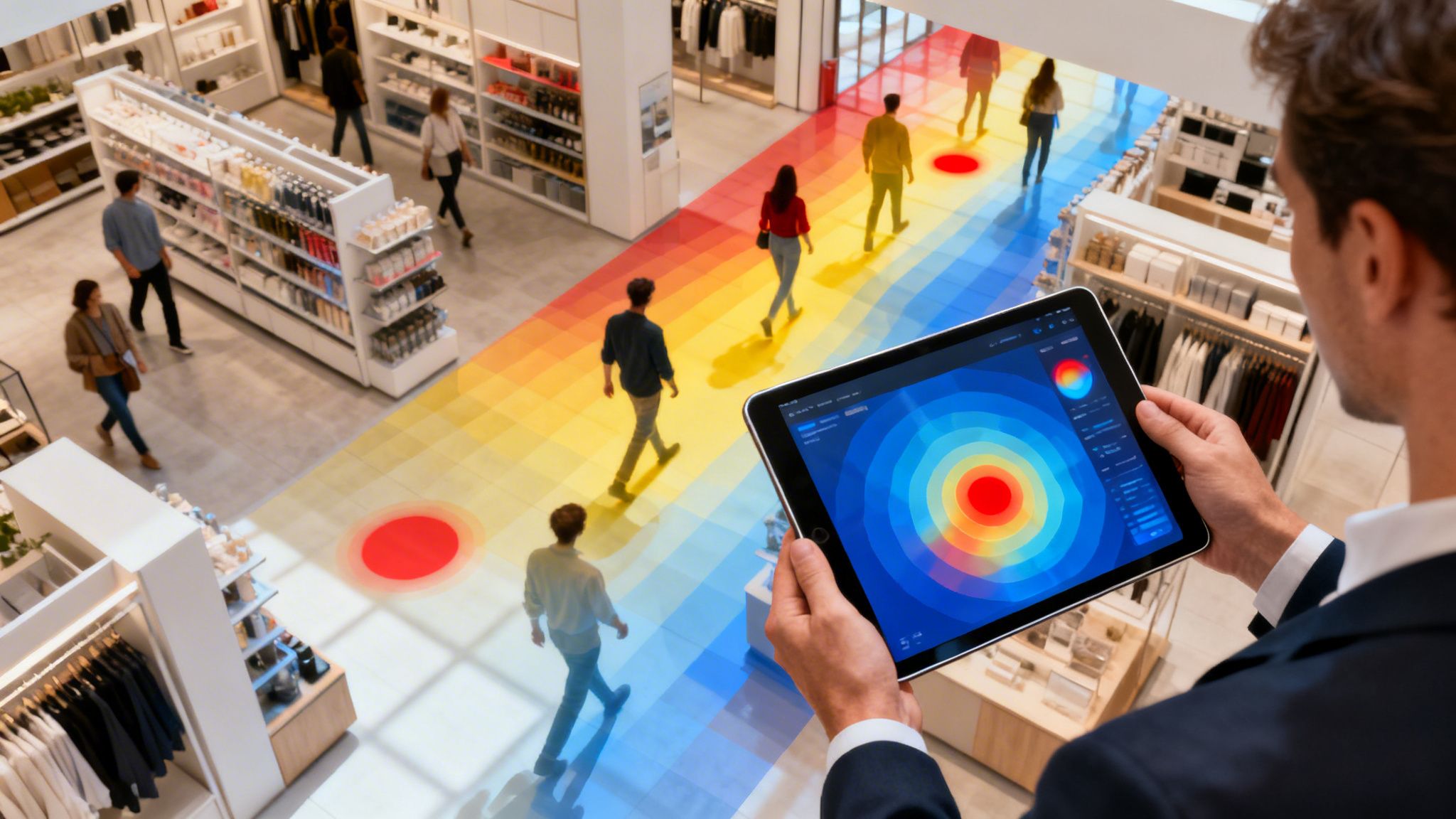
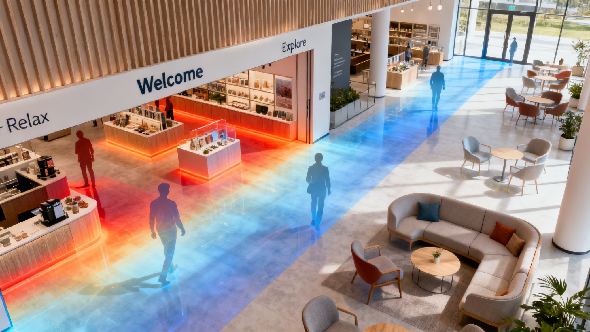
What if you could actually see the invisible trails people leave as they move through your venue?Imagine a weather map, but instead of showing rainfall, it reveals the busiest aisles, the most popular displays, and the hidden bottlenecks in your space.
That’s exactly what heat map generation does. It’s the process of taking anonymous data from sources like your WiFi network and other sensors and turning it into a simple, visual story of human movement.
See Your Space in a Whole New Light
This guide is for anyone in enterprise IT, retail marketing, or hospitality who’s tired of making decisions based on hunches. Heat map generation takes the guesswork out of optimising your staff rotas, fine-tuning marketing campaigns, and ultimately, creating a better guest experience. By truly understanding visitor behaviour, you can turn your physical location into a smarter, more profitable, and more responsive environment.
Moving Beyond Guesswork to Genuine Insight
For years, understanding customer flow meant relying on staff observations or tedious manual clicker counts—methods that are famously inaccurate and time-consuming. Heat maps sweep away that ambiguity and replace it with hard, visual evidence.
They finally reveal the "why" behind your operational numbers. It’s no longer just about how many people came in, but where they went, how long they lingered, and which routes they took to get there.
This shift from raw data to a visual narrative is a game-changer. Suddenly, different departments are speaking the same language. An IT manager can spot network strain in high-traffic areas, while a marketer sees the perfect spot for a new promotional stand.
A heat map doesn’t just show you data; it tells you a story about your space. It reveals customer journeys, highlights bottlenecks, and uncovers opportunities that were previously invisible.
The Core Benefits for Your Business
By visualising these foot traffic patterns, you unlock a whole host of strategic advantages that have a direct impact on your bottom line. Heat map generation provides a clear path to real, tangible improvements across your entire operation.
Here’s what that looks like in practice:
- Smarter Operations: Stop guessing with staffing. You can finally see the over-staffed quiet zones and under-resourced hotspots, allowing you to deploy your team where they’re needed most, especially during peak times.
- A Better Customer Experience: Find and fix the frustrating parts of your venue. Heat maps instantly highlight bottlenecks, long queues, or confusing layouts that hurt the visitor experience.
- Maximised Revenue: Pinpoint the most valuable real estate in your venue. This insight helps you optimise product placement, justify premium rental rates for promotional spaces, or measure the real impact of in-store marketing.
- Data-Driven Design: Planning a remodel? Use historical data to design your space around proven customer behaviour, making sure any new layout works perfectly from day one.
At the end of the day, understanding the flow of people is fundamental to creating a better physical environment. Heat maps provide the critical intelligence to make it happen.
What Is Heat Map Generation A Visual Guide
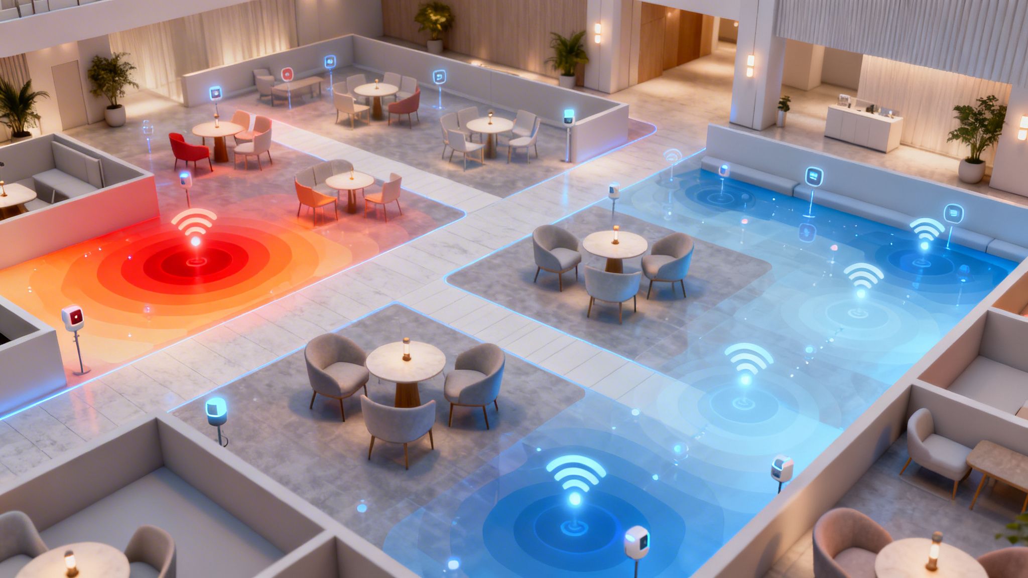
At its heart, heat map generation is the art of turning raw, anonymous location data into a simple, colour-coded visual story. Think of it like painting by numbers, but your canvas is your venue’s floor plan. Every visitor's device adds a small splash of colour, and over time, these splashes come together to paint a vivid picture of how people move through your space.
This visual approach makes complex data instantly understandable for anyone on your team. Areas humming with activity glow in warm colours like red and orange, showing you exactly where your hotspots are. Meanwhile, the quieter, less-travelled spots cool down into blues and greens, highlighting areas with low engagement. It’s a world away from staring at endless rows in a spreadsheet.
Crucially, this process isn’t about tracking individuals. It works by collecting and combining anonymised signals—often from your existing WiFi network—to reveal collective behaviour. The goal is to get a feel for the natural rhythm and flow of your venue.
Understanding Different Heat Map Stories
Not all heat maps tell you the same thing. Depending on what data you’re looking at, they can answer very different business questions. The real power of heat map generation is unlocked when you choose the right map to find the specific answers you need.
A simple footfall map, for instance, shows you which areas are popular, but a dwell time map reveals where people are genuinely engaged and spending their time. Each map type is a different lens for viewing your space, helping you move from simple observation to making smart, strategic decisions.
Here are a few common types and what they can show you:
- Footfall Heat Maps: These are the bread and butter of venue analytics. They show the total volume of visitors in different areas over a set period, making it easy to spot your busiest zones at a glance.
- Dwell Time Heat Maps: This map visualises how long people stick around in certain areas. Red zones mean high engagement where visitors linger, while blue areas are places people just pass through.
- Path Maps: Instead of just showing hotspots with colours, these maps often use lines to trace the most common routes people take through your venue. They’re fantastic for understanding customer journeys and spotting navigational bottlenecks.
Heat map generation is more than just counting people; it's about understanding the behaviour behind the numbers. It translates invisible movements into a clear story, revealing why certain areas succeed while others are overlooked.
You can gain even deeper insights when you learn more about how to create different indoor maps for your venue.
Types of Venue Heat Maps and Their Applications
Different heat maps serve different purposes. Knowing which one to use is key to solving specific business challenges, from optimising store layouts to improving the visitor experience.
By layering these different views, you start to build a complete, nuanced picture of how your physical space really works. This multi-layered understanding is what empowers you to fine-tune layouts, allocate staff more effectively, and ultimately create a better experience that keeps people coming back for more.
How Your Existing WiFi Network Creates Heat Maps
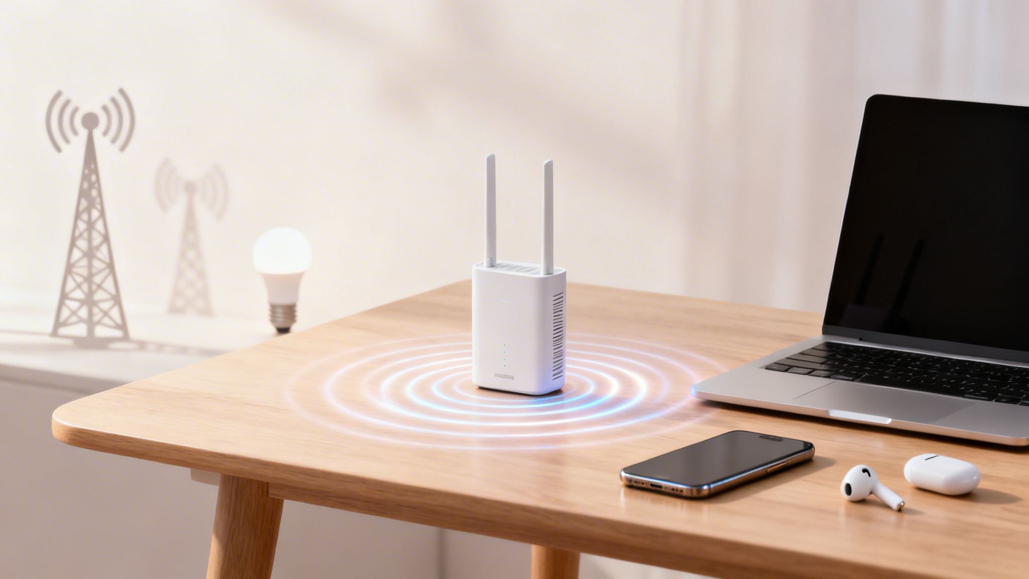
You might be surprised to learn that you probably already have the powerful sensor network needed for advanced heat map generation installed in your venue. Your existing WiFi infrastructure—whether from vendors like Meraki, Aruba, or UniFi—is more than just a tool for internet access; it's the backbone of a sophisticated location analytics system.
This whole system works without ever touching personal data. Instead, it relies on anonymous signals that WiFi-enabled devices, like smartphones, are constantly broadcasting. Your access points (APs) act like a set of ears distributed throughout your space, picking up these digital whispers.
The key to it all is a concept called Received Signal Strength Indicator (RSSI). Think of it like hearing music from a speaker in a large room. The closer you are to the speaker, the louder it sounds. In the same way, the closer a device is to a WiFi access point, the stronger its signal is, resulting in a higher RSSI value.
![]()
From Signal Strength to Physical Location
An analytics platform, like Purple, grabs these RSSI readings from multiple access points to figure out a device's approximate location. If a device has a really strong signal at AP1, a medium one at AP2, and a faint one at AP3, the system can triangulate its position on your floor plan with impressive accuracy.
This method is completely anonymous. The platform doesn't need to know who owns the device or any personal details. It simply registers the presence of an anonymous device at a specific coordinate, which becomes a single data point for your heat map.
Your WiFi network is constantly gathering thousands of these anonymous location data points every minute. An analytics engine acts as the interpreter, translating this raw signal data into a clear, visual story of how people are moving through and interacting with your space.
By processing these signals over time, the platform builds a rich picture of footfall, dwell times, and common pathways. This turns your standard IT infrastructure into a powerful source of business intelligence. You can learn more about the potential of presence analytics in our comprehensive guide.
Enriching Data with Other Sensors
While WiFi provides an excellent foundation, other technologies can add more layers of detail to your heat maps for even deeper insights. These can be integrated to provide a more complete view of what's happening in your venue.
- Bluetooth Beacons: These small, low-energy transmitters can be placed in specific areas, like on a promotional display. They offer highly precise location data for close-range interactions, perfect for understanding engagement with specific products.
- IoT Sensors: Devices like door counters or motion sensors provide supplementary data. A door counter, for example, can verify the total footfall numbers captured by the WiFi network, adding an extra layer of confidence to your analytics.
- Camera Analytics: Anonymised video analytics can count people in queues or measure occupancy in specific zones, feeding this data back into the central platform to be visualised on a heat map.
This concept of using environmental data to understand behaviour isn't new. The UK Met Office, for instance, creates detailed heat maps to visualise temperature changes, helping urban planners prepare for heatwaves. In much the same way, Purple's analytics transforms the 'heat' of visitor footfall into actionable business intelligence, helping you optimise your operations.
Ultimately, your existing network hardware is the starting point. When connected to a smart analytics platform, it becomes the engine that powers heat map generation, turning everyday operational infrastructure into a tool for strategic decision-making.
Turning Raw Data into Actionable Insights
A raw feed of WiFi location pings isn't a heat map; it's just digital noise. The real magic of heat map generation happens when this messy, chaotic data is transformed into a clean, smooth, and actionable visual story—one that reveals genuine human behaviour.
This transformation kicks off with a critical first step: data cleansing. Think of it as a smart filter that sifts through every signal to make sure your map reflects true visitor patterns, not just background chatter. Without it, your heat map could be completely skewed by misleading data points that have nothing to do with your customers.
For example, signals from your employees' phones, stationary IoT equipment like smart tills, or even WiFi-enabled security cameras all need to be identified and filtered out. A modern analytics platform handles this automatically, learning to recognise and ignore these static or predictable signals. What’s left is the authentic movement of your guests.
Aggregating and Smoothing Data
Once the data is clean, the next job is to make sense of it. This is where aggregation and interpolation algorithms come in. Instead of plotting thousands of individual dots on a map—which would be a visual mess—the system groups these data points into meaningful clusters.
Picture your floor plan overlaid with an invisible grid. The aggregation process counts how many cleaned data points fall into each square over a set time. Squares with more points get a higher "score," and those with fewer get a lower one.
This is what ultimately creates the familiar colours on the map. High-score squares are painted in warm colours like red and orange, while low-score squares show up in cool blues and greens. Interpolation is the final artistic touch, smoothing the transitions between these coloured squares to create the fluid, easy-to-read gradients of a finished heat map.
A great heat map doesn't just show you where people were; it reveals the intensity of their presence. By filtering out noise and intelligently grouping data, the system uncovers the true centres of gravity in your venue.
This power to turn invisible data into clear insights isn't limited to footfall. Researchers at Durham University, for instance, generated a comprehensive waste heat map for the entire UK. They discovered that industry and electricity generation sectors produce nearly 391,000 GWh of waste heat annually—enough to power the country several times over. By plotting this data, they identified prime opportunities for energy recovery, turning invisible waste into a powerful strategy. You can read more about their groundbreaking national heat map research.
The Power of Historical Analysis
A single heat map gives you a snapshot in time, but its real strategic value is unlocked when you start comparing different snapshots. Analysing historical data helps you spot trends, understand cause and effect, and make much smarter forecasts for the future.
Modern analytics platforms make this surprisingly simple, allowing teams to explore data and find answers without needing a data science degree. Here are just a few examples of powerful comparisons:
- Weekday vs. Weekend: Compare a heat map from a quiet Tuesday morning with one from a bustling Saturday afternoon. This is perfect for fine-tuning your staffing rotas, ensuring you have the right people in the right places at the right times.
- Before vs. After: Generate a heat map before moving a key product display, then another one a week later. This gives you clear, visual proof of whether the change successfully drew more customer attention.
- Seasonal Trends: Look at footfall patterns from last December to predict where the busiest spots in your shopping centre will be this holiday season. This lets you proactively manage crowds and place seasonal promotions for maximum impact.
By automating this complex process of cleansing, aggregating, and visualising data, platforms like Purple empower marketing and operations teams to go far beyond simple observation. You can directly explore behavioural patterns, test your assumptions, and uncover the insights needed to drive real business growth.
Real-World Applications That Drive ROI
Theory is one thing, but the real test for any technology is whether it can deliver tangible results. This is where heat map generation truly shines, turning abstract data into concrete business decisions that directly impact the bottom line. By visualising how people actually use a space, organisations can finally stop guessing and start making moves based on hard evidence.
From retail floors to hospital corridors, these visual insights reveal opportunities for improvement that were completely invisible before. Let's dig into exactly how different sectors are using this technology to solve real-world problems and generate a measurable return on investment (ROI).
Optimising Retail and Boosting Sales
For any retailer, understanding shopper behaviour is the holy grail. Heat maps offer an unprecedented look into the customer journey, showing which aisles get the most traffic, where shoppers linger the longest, and which promotional displays are actually grabbing their attention.
This information is pure gold for merchandising and marketing teams. A heat map might show that a high-margin product, tucked away in a quiet corner, is getting almost no footfall. By moving it to a newly identified "hotspot" near the main entrance, a store can see an immediate and significant uplift in sales.
- Product Placement: Identify prime shelf space and uncover "dead zones" to strategically place key products for maximum exposure.
- Promotional Impact: Measure how effective an end-of-aisle display is by comparing heat maps from before and after its launch. A 25% increase in dwell time around a new display is a clear win.
- Store Layout: Analyse common shopper paths to spot bottlenecks or confusing layouts that cause frustration and lead to abandoned baskets.
This simple three-step process is how raw sensor data becomes clear, actionable business intelligence.
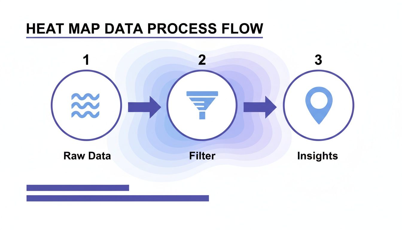
The journey from raw signals to filtered insights allows venues to visualise and act upon genuine customer behaviour.
Enhancing Hospitality and Guest Experiences
In the hospitality world, the guest experience is everything. Heat map generation helps hotels, restaurants, and event venues fine-tune their operations to create a seamless, enjoyable environment for every single visitor.
A hotel, for instance, can analyse lobby traffic to smooth out the check-in process. If a heat map shows a consistent bottleneck forming around the reception desk at 3 p.m. every day, management can proactively add an extra staff member during that peak period. The result? Shorter queues and happier guests from the moment they arrive.
Heat maps translate invisible operational friction into a clear visual problem statement. A red spot showing a long queue is not just data; it's a direct signal to improve a process, enhance an experience, and build customer loyalty.
Likewise, a restaurant can use dwell time analysis to understand which tables are most popular or if the bar area is effectively encouraging patrons to stay for another drink. This insight informs everything from seating arrangements to staffing rotas, ensuring the ambiance and service are always perfectly aligned with customer flow.
Improving Efficiency in Healthcare and Transport
In busy environments like hospitals and transport hubs, efficiency and smooth flow are non-negotiable. For a healthcare facility, one of the biggest goals is to reduce patient wait times. Heat maps can analyse the entire patient journey, from the waiting room to consultation areas, highlighting delays and helping administrators redesign processes to be more efficient and less stressful.
The same principle applies to managing large public spaces. Just as Esri UK’s heat maps visualise a century of extreme weather trends to help with infrastructure planning, venue operators can anticipate digital congestion. Their interactive gallery shows the UK's warming trend, noting the ten hottest years have all occurred since 2002. This data empowers network administrators to prepare for heat spikes that can strain WiFi performance as more people move indoors. During the 2022 heatwave, UK-wide public WiFi outages hit 15% amid 40°C temperatures—a challenge that platforms like Purple, with its scalable Passpoint-certified access, are built to handle.
For transport hubs like airports or train stations, analysing passenger flow is essential for both safety and efficiency. Heat maps can identify areas where crowds are likely to form, allowing for better signage, smarter security lane placement, and improved overall passenger management, especially during peak travel times.
Ensuring Privacy and Compliance by Design
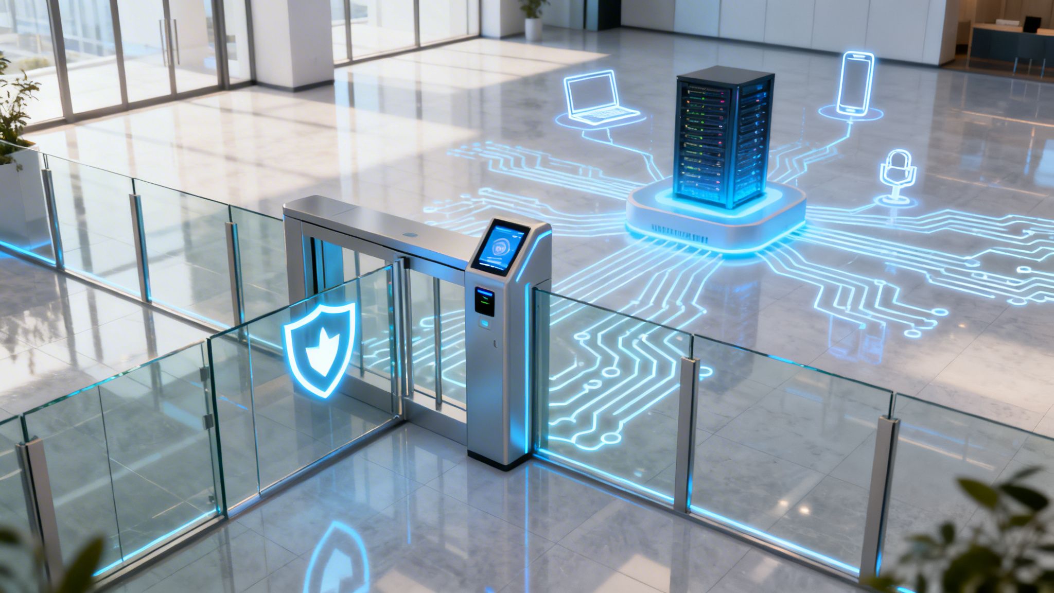
Tapping into location analytics brings a serious responsibility to protect visitor privacy. For any modern heat map generation strategy to work, it has to be built on a foundation of trust. This isn't just about ticking legal boxes; it's about adopting a "privacy by design" mindset right from the start.
This core idea ensures that data collection is always ethical, transparent, and focused on collective crowd behaviour—not tracking individuals. The whole point is to understand how groups of people move through a space, without ever needing to know who they are. This shift in focus is what gives business leaders and IT managers the confidence to use these powerful tools responsibly.
Anonymisation and Data Protection
The secret to responsible analytics is solid anonymisation. Leading platforms do this by immediately and irreversibly scrambling unique device identifiers, like MAC addresses, through a process called hashing. This turns a specific ID into a random string of characters that can't be traced back to the original device.
This process completely cuts the link between the analytical data and the individual, making sure all insights are based on anonymous, aggregated patterns. Think of it as observing crowd flow from a helicopter rather than following a single person on the street.
By putting these measures in place, platforms ensure they are fully compliant with tough global data protection laws like GDPR.
Best Practices for Transparency and Trust
Beyond the technical side, building trust with your visitors means being clear and honest. A responsible analytics strategy is one that people can understand and feel good about. When you're working with the kind of visitor data that fuels heat map generation, having comprehensive privacy policies is non-negotiable.
Here are a few best practices to put into action:
- Transparent Communication: Be upfront in your WiFi login process and terms of service. Let people know that anonymised location data is being used to improve their experience in the venue.
- Opt-Out Options: Always provide a simple, easy-to-find way for visitors to opt out of data collection if they want to.
- Data Minimisation: Only collect the data you absolutely need to get the job done. Don't gather extra information just for the sake of it.
By mixing powerful anonymisation with transparent practices, you can unlock the true potential of heat map generation. You can learn more about how to keep that trust while collecting visitor information in our guide to guest WiFi data privacy. It’s a balanced approach that lets you make smarter, data-driven decisions while always respecting and protecting your customers.
Your Questions Answered
Thinking about using heat maps in your venue? It's a smart move. To help you figure out if it's the right fit, we've tackled some of the most common questions that come up.
How Accurate Is This Stuff, Really?
Modern WiFi analytics platforms are surprisingly sharp, usually pinpointing a device's location to within a few metres. No, it's not GPS-level precision, but for understanding how crowds move, where people linger, and general footfall patterns inside a building, it's more than enough.
The secret sauce is a well-distributed network of access points. The more APs that can 'hear' a device's signal, the more data points you have, and the more precise the location estimate becomes.
What New Hardware Do I Need to Buy?
Probably nothing. That's the best part of WiFi-based heat mapping. It piggybacks on the enterprise-grade network infrastructure you already have in place from vendors like Meraki, Aruba, or UniFi.
Your existing network becomes the sensor grid. You don't need to install any extra proprietary boxes to start gathering the anonymous data needed for heat map generation. An analytics platform like Purple simply plugs into what you've already got.
The whole idea is to use the infrastructure you already own to unlock powerful business insights. This dramatically lowers the barrier to entry and gets you up and running fast.
How Do I Actually Measure the Return on Investment (ROI)?
You measure the ROI by connecting the insights from your heat maps to real, tangible business results. It’s not just about pretty colours on a screen.
For instance, a retailer can directly measure the sales lift for a product after they move it to a high-traffic "hotspot" they discovered on the map. A hotel can see real labour savings by optimising cleaning and front-desk schedules based on proven peak times in the lobby or bar.
You can directly track metrics such as:
- Increased Sales: Linked directly to better product placement or store layout.
- Improved Staff Efficiency: From scheduling based on data, not guesswork.
- Higher Engagement: Measured by increased dwell times near key promotions or displays.
When you connect the visual data to your actual performance numbers, you can clearly and confidently show the financial value of understanding your space.
Discover how Purple can transform your existing WiFi network into a powerful business intelligence tool. Learn more about our venue analytics platform.


