
A WiFi heat map is simply a visual plan of wireless signal strength laid over a map of your building. Think of it like a weather map, but for your WiFi. Warm colours like red and orange show where your signal is strongest, while cool colours like blue show where it’s weak or non-existent.
It’s the tool that takes you from just guessing where to put your access points to making smart, data-driven decisions. For any business, this is the first real step towards building a high-performance network that actually works for your staff and customers.
Why a WiFi Heat Map Is Your Most Important Network Tool

In today's world, solid WiFi isn't just a nice-to-have; it's a core part of business operations. Yet, so many venues still design their networks by just placing access points where it feels right and hoping for the best. This approach is a recipe for disaster, leading to patchy performance, frustrated users, and a direct hit to your bottom line.
Think about the real-world problems that stem from poorly planned WiFi. A hotel guest who can't stream a film after a long day isn't likely to leave a glowing review. In a busy shop, a point-of-sale (POS) terminal dropping its connection during the Christmas rush means lost sales and angry customers. These aren't just IT headaches—they are serious business failures.
Moving Beyond Guesswork
There’s a reason why data-driven network planning is now the standard. A WiFi heat map is the foundational tool for this modern approach, giving you a clear, accurate picture of your wireless environment. It shows you exactly how radio frequency (RF) signals travel through your unique space, accounting for all the physical blockers like concrete walls, lifts, and even large crowds of people.
- Find and eliminate "dead zones" where the signal completely vanishes.
- Locate areas of weak coverage that cause slow speeds and dropped connections.
- Pinpoint sources of interference from other electronics or neighbouring networks.
- Optimise access point (AP) placement for maximum coverage and efficiency.
A WiFi heat map turns abstract network data into a practical, actionable blueprint. It's the difference between trying to navigate a maze blindfolded and having a detailed map guiding you to the exit.
The Strategic Value of a Validated Network
The demand for this level of precision is fuelling major market growth. The spectrum heatmap analytics market, which includes WiFi heat mapping, is on track to hit $1.86 billion globally by 2026. This trend is especially strong in the United Kingdom, where businesses are realising that a professional WiFi survey delivers a clear return on investment through better coverage and fewer support tickets.
For UK businesses in hospitality, retail, and healthcare, heat maps are now essential for delivering a consistent quality of service. You can learn more about this market expansion at netblocks.org .
Creating a high-performance network, validated with a proper heat map, is about more than just a strong signal. It’s about building a reliable foundation for more powerful tools. A perfectly optimised network ensures that advanced platforms like Purple can work their magic.
When your coverage is consistent and predictable, you can confidently roll out features like:
- Identity-based segmentation for secure staff and guest access.
- Seamless, passwordless authentication for a much smoother user journey.
- Accurate location analytics that rely on devices staying reliably connected.
Ultimately, a WiFi heat map isn't just a tool for fixing problems. It's a strategic asset for designing a network that supports your business, keeps customers happy, and gives you a genuine competitive edge.
Choosing the Right WiFi Heat Mapping Method
Deciding how to create a WiFi heat map isn't a one-size-fits-all approach. The right method really comes down to your specific needs—things like your budget, whether your building is still a blueprint or fully operational, and just how precise you need the map to be.
The three main ways to go about it are predictive surveys, on-site surveys, and using controller-based analytics. Each has its own strengths and weaknesses, and understanding them is crucial. You wouldn't use a sledgehammer to hang a picture, right? In the same way, you don't need a full-blown on-site survey for a building that doesn't even exist yet. Let’s break down which one makes sense for your situation.
Predictive Surveys: The Digital Blueprint
Think of a predictive survey (also called a desktop survey) as your starting point for any new WiFi design. It's an absolute must for pre-construction projects or major refurbishments, letting you model the network's performance before a single access point (AP) is even unboxed.
Using specialised software like Ekahau or iBwave , you start with a digital floor plan. Then, you tell the software about the building materials—plasterboard, concrete, glass—that will get in the way of the radio frequency (RF) signals. The software then runs a simulation to show how WiFi signals will travel, allowing you to strategically place virtual APs for the best possible coverage.
- Best For: New builds, major renovations, and initial budget planning.
- Key Advantage: It's a cost-effective way to get your design right from the start, preventing expensive reworks down the line.
This approach is invaluable for getting your initial plan and budget locked in. But remember, it's just a simulation. Its accuracy is only as good as the floor plan and the information you feed it about things like wall materials.
A predictive survey is like creating an architectural blueprint for your WiFi. It gives you a solid plan and helps estimate costs, but it hasn't been tested against the chaos of real-world conditions just yet.
On-Site Surveys: The Ground Truth
An on-site survey—often called a "walk-through" or "AP-on-a-stick" survey—is the gold standard for accuracy. This is where a technician physically walks the entire site with a specialised device, measuring live RF signals from either temporarily placed or permanently installed APs.
This step is non-negotiable for tricky environments. Think hospitals filled with signal-blocking medical gear, warehouses packed with metal racking, or any situation where you're troubleshooting an existing network that just isn't performing. The real-world data you collect gives you a precise heat map that accounts for all the unexpected RF obstacles you'd never find on a blueprint.
There are two main flavours of on-site surveys:
- Passive Surveys: These just listen to the existing RF environment. They measure signal strength and noise from all nearby devices, which is brilliant for hunting down sources of interference.
- Active Surveys: These actually connect to your network to measure what the user will experience—data rates, packet loss, and latency. This gives you a true picture of performance.
Controller-Based Analytics: The Live Pulse
Many modern enterprise WiFi systems from vendors like Meraki or Aruba come with a handy feature: they can generate a simplified WiFi heat map right from the dashboard. The system's controller is constantly collecting performance data from your live APs, giving you a near-real-time view of your network's health.
This is fantastic for ongoing monitoring. It helps you spot developing issues—like a new source of interference or a failing AP—without having to send a technician out to do a full walk-through.
The catch? This data is based on what the APs are "hearing", not what a user's device is experiencing on the ground. It can sometimes miss client-side problems or those frustrating dead zones that pop up between APs. If you want to get a better feel for how these visualisations work, exploring different WiFi maps and analytics software can offer some great insights.
Comparison of WiFi Heat Mapping Methods
Choosing the right method is all about trade-offs between cost, accuracy, and the stage of your project. Here’s a quick comparison to help you decide which approach, or combination of approaches, is the best fit for your enterprise environment.
Ultimately, the most bulletproof strategy is often a hybrid one. You start with a predictive design to get your plan right, validate it with an on-site survey before and after you install the hardware, and then lean on controller analytics for day-to-day monitoring to keep everything running smoothly.
How to Conduct a Professional On-Site Survey
Moving from a predictive model to an on-site survey is like switching from a satellite image to walking the streets yourself—it’s where you find the ground truth. A proper on-site survey is what validates your design, flags real-world problems, and makes sure your WiFi heat map actually reflects reality.
Getting this right isn't just about a casual stroll with a laptop. It takes careful planning, methodical execution, and a sharp eye for analysis. This is absolutely essential for building a network that can support advanced features, like those offered by Purple. If the whole process feels a bit much, remember that you can always bring in the experts through specialised professional WiFi services to handle it for you.
This workflow shows how you get from an initial predictive design to a validated, high-performing network through on-site surveying and continuous monitoring.
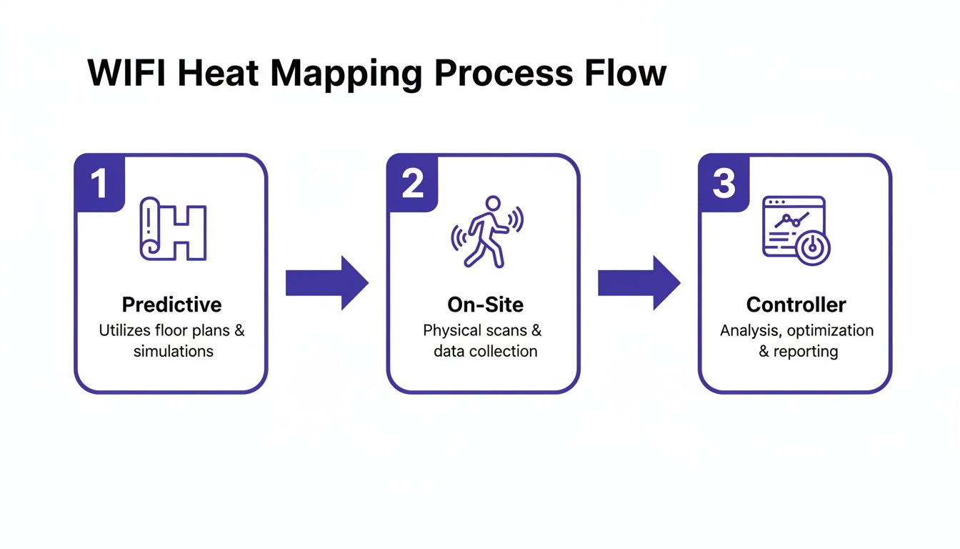
As you can see, that on-site survey is the critical bridge connecting a theoretical plan to a proven network that just works.
Preparing for the Survey
Honestly, the success of your survey is pretty much decided before you even set foot in the building. Rushing the prep phase is the most common mistake I see, and it can make your results completely useless.
Your first job is to get an accurate, to-scale floor plan. Don't just grab one from a file and assume it’s correct. You need to physically walk the space and check that walls, doors, and any large fixtures are exactly where the blueprint says they are. An outdated plan guarantees a flawed heat map.
Next, you need to be crystal clear about your coverage goals. Not all areas are created equal. For instance:
- High-Density Zones: Think of a hotel lobby or a conference room. These spots need serious capacity and signal strength to handle dozens of people all trying to connect at once.
- Critical Operations Areas: A retail floor packed with POS terminals needs flawless, ultra-reliable coverage. The bandwidth demands might be low, but the connection simply cannot drop.
- Low-Priority Zones: Storage rooms or back corridors? They probably just need basic connectivity, if any at all.
Documenting these specific needs gives you clear pass/fail criteria, which makes the analysis phase so much easier.
Executing the Walk-Through
With your plan locked in, it’s time to start collecting data. This is the active part of the survey, where you'll physically walk the entire coverage area with your measurement tools. The key here is consistency.
Maintain a steady, natural walking pace. Don't sprint through open areas and then crawl along corridors. The survey software is constantly correlating your physical location with the signal readings it's taking, so any erratic movements can completely skew the data.
As you walk, pay attention to your surroundings. Make notes directly on your floor plan of anything that could be a source of RF interference. You’d be surprised what you find. Keep an eye out for common culprits in a commercial venue:
- Microwave ovens tucked away in a staff room.
- Lifts and their powerful motors.
- Large metal objects like filing cabinets or industrial kitchen equipment.
- Even things like cordless phones or certain security camera systems can cause chaos.
It’s also crucial to capture data for all relevant frequency bands. Modern networks run on both 2.4 GHz and 5 GHz, and increasingly on 6 GHz (WiFi 6E). Each band behaves differently—2.4 GHz travels further but is congested, while 5 GHz is faster but gets blocked easily by walls. A complete survey measures them all to give you the full picture.
Remember: you are surveying for the user experience. Hold the survey device at the height and orientation a typical user would. A tablet held flat by a walking surveyor will get very different readings from a smartphone held vertically by someone sitting at a desk.
Analysing the Results
Once your walk-through is done, the survey software will churn through the thousands of data points you’ve collected and paint your WiFi heat map. This is where you turn all that raw data into actionable insights.
The most common metric you'll look at is Received Signal Strength Indicator (RSSI), measured in dBm. This is a straightforward measurement of signal power. A reading of -67 dBm is often considered the minimum for reliable data, voice, and video. Anything dipping below -80 dBm is basically a dead zone.
But signal strength isn't the whole story. You also have to analyse the Signal-to-Noise Ratio (SNR). This tells you how much stronger the WiFi signal is compared to the background RF noise. A great RSSI reading is useless if the SNR is low because of interference. For a healthy network, you should be aiming for an SNR of 25 dB or higher. A low SNR is a clear indicator that you need to investigate those potential interference sources you noted down during your walk.
By carefully digging into these key metrics on your new heat map, you can pinpoint exact problem areas and make informed fixes—like moving an access point, tweaking its power, or changing its channel—to build a truly optimised wireless network.
How to Read Your Heat Map and Fix Common WiFi Problems

You’ve done the survey, and now you’re staring at a colourful WiFi heat map. While it might look impressive, it’s just a pretty picture until you understand the story it's telling you. Learning to translate these visual patterns into actionable network fixes is the real skill that separates a struggling network from a high-performance one.
A truly healthy heat map shows a consistent wash of strong signal—usually greens and yellows—across all the areas you’ve defined as critical. You’ll see uniform colour where it's needed, with smooth, predictable transitions between coverage zones. It's a visual confirmation that your design is working exactly as intended.
But more often than not, that first map reveals problems. This is where the real work begins, turning that diagnostic data into a better, more reliable network for your users.
Diagnosing Coverage Holes and Dead Zones
The most obvious problem a heat map screams about is a coverage hole, or dead zone. These will show up as cold blue or grey areas on your map where the signal strength (RSSI) plummets, often dropping below the usable threshold of -75 dBm. These are the exact spots where users report dropped connections or can't get online at all.
When you spot a dead zone, the cause is usually one of a few common culprits:
- Physical Obstructions: A new wall, a hefty metal filing cabinet, or even a lift shaft can easily block the signal from the nearest access point (AP).
- AP Placement: Sometimes, the access point is simply too far away to provide a strong enough signal to that specific area.
- Incorrect Antenna Orientation: This is a classic one. For APs with external antennas, a poorly aimed antenna can create a coverage shadow right next to it.
Fixing these holes typically means making a physical adjustment. You might need to move an existing AP closer to the dead zone or, if it's a large area, add a new one to fill the gap. Our access point calculator can help you plan for the right density before you start drilling holes.
Tackling Co-Channel and Adjacent-Channel Interference
So, what happens when your map shows strong signal everywhere, yet people still complain about slow speeds and choppy performance? This is often a clear indicator for channel interference, a problem that needs a different kind of heat map visualisation to uncover.
Instead of looking at signal strength, you'll need to view a map that shows channel overlap. If you see multiple APs all trying to talk on the same or adjacent channels in one area (often shown as angry red overlaps), they are essentially shouting over each other. This digital noise forces devices to wait their turn to speak, absolutely crushing performance.
Co-channel interference is like having three different meetings happening in the same small conference room. Everyone is talking, but nobody can be clearly understood. A proper channel plan ensures each conversation has its own space.
To sort this out, you need to implement a proper channel plan. Manually assign non-overlapping channels—1, 6, and 11 on the 2.4 GHz band—to adjacent APs. You have a lot more breathing room on the 5 GHz band, which has far more channels to work with, making it much easier to give each AP its own clean airspace.
Fixing Weak Perimeter and Roaming Issues
Another common issue is a weak signal around the edges of your property. This doesn't just create a poor user experience for people near windows or on balconies; it can also pose a security risk if your signal "leaks" too far outside, inviting unauthorised connection attempts.
Your heat map will show this as signal strength gradually fading to yellow or blue at the building's boundaries. The solution here is often to fine-tune the power levels of your perimeter APs. By reducing the transmit power, you can effectively pull the signal back inside your building's footprint, tightening up coverage and improving security.
This is especially vital in the UK, where internet accessibility has reached 96.3% of the population. With so many users expecting connectivity, businesses have to ensure their WiFi is robust within their premises. Many UK properties, especially older ones with thick stone walls, present unique signal challenges that make professional heat maps essential for bridging connectivity gaps where standard broadband falls short.
By methodically identifying these visual cues—the cold spots of dead zones, the angry reds of interference, and the fading edges of a weak perimeter—you can turn your WiFi heat map from a simple picture into a powerful tool for building a flawless network.
Turning Heat Map Data into a Long-Term Network Strategy
A successful WiFi heat map survey isn’t the finish line; it’s the starting gun for a much smarter, more proactive approach to network management. Viewing it as a one-off fix is a huge missed opportunity. Instead, this rich data should become the foundation of your continuous improvement strategy, finally unlocking capabilities that were too unreliable to even consider before.
Think of it this way: reliable, validated coverage is the bedrock for all modern networking features. Without a heat map to prove your signal is solid and consistent, rolling out advanced functionalities is just a gamble. Your heat map data is what gives you the confidence to move forward with sophisticated solutions.
From Coverage Map to Strategic Asset
By turning your heat map data into a long-term network strategy, you're essentially creating a live digital twin concept of your WiFi environment. This allows for constant, ongoing optimisation and shifts your network from a reactive cost centre to a strategic business asset that actually drives value.
This strategic approach has never been more important, especially as wireless technology evolves at a breakneck pace. The global push towards 5G is reshaping how UK organisations plan their infrastructure. Projections show global 5G mobile subscriptions are set to quadruple, soaring from 1.62 billion in 2023 to 6.29 billion by 2030. This explosion in wireless complexity makes sophisticated heat mapping absolutely essential for managing spectrum and planning for what's next.
Your validated WiFi heat map becomes the proof point for several key initiatives:
- Enabling Advanced Security: Build zero-trust network access on a foundation of known, reliable coverage.
- Improving User Experience: Deliver seamless connectivity that supports everything from video calls to critical business applications without frustrating drops.
- Powering Location Analytics: Ensure accurate data collection for footfall analysis and user journey mapping.
Unlocking Identity-Based Networking
One of the most powerful applications of a validated network is enabling seamless, identity-based networking. The old model of shared passwords and clunky captive portals is not just inefficient, it’s a security risk. With a network proven by a WiFi heat map, you can confidently deploy advanced authentication solutions.
For instance, platforms like Purple integrate directly with identity providers like Entra ID or Google Workspace. This lets you automatically create distinct network experiences for different user groups. Staff can connect securely using their corporate credentials without ever needing to type a password, while guests get a simple, branded onboarding process. This just isn't feasible on a network with patchy coverage where authentication would constantly fail.
Think of it this way: your heat map confirms the roads are perfectly paved and clear of potholes. Only then can you safely allow high-performance vehicles—like secure, passwordless access—to travel on them at full speed.
Guaranteeing Service in Multi-Tenant Environments
In multi-tenant properties like build-to-rent (BTR) communities, student accommodation, or serviced offices, reliable WiFi is a core utility. A detailed WiFi heat map is more than a diagnostic tool; it's a service guarantee. It allows property managers to prove they are delivering the promised level of connectivity to every single unit.
This data is crucial for:
- Service Level Agreements (SLAs): Use heat map reports to visually demonstrate SLA compliance to tenants and stakeholders.
- Troubleshooting: Quickly resolve resident complaints by referencing a map of their exact unit, identifying interference or weak spots without guesswork.
- Onboarding New Tenants: Provide new residents with a "connectivity certificate" for their flat, showing the quality of the WiFi they can expect from day one.
Building Trust in Location Analytics
For retail, hospitality, and large public venues, location analytics provide invaluable insights into customer behaviour. But the accuracy of this data is entirely dependent on devices staying reliably connected as they move through the space.
A network riddled with dead zones and roaming issues will produce fragmented, untrustworthy analytics. If a customer's phone disconnects while walking from one end of a shop to the other, your analytics platform sees two separate, disjointed visits. A thoroughly heat-mapped network ensures continuous connectivity, making your location data far more accurate. This reliable data stream allows you to trust your insights on dwell times, footfall patterns, and marketing attribution, ultimately demonstrating a much clearer return on your investment.
Your WiFi Heat Map Questions, Answered
When it comes to WiFi heat mapping, we hear a lot of the same questions from IT managers and business owners. Let's get straight to the point and answer the most common ones with practical advice you can use.
How Often Should I Perform a WiFi Heat Map Survey?
This really comes down to how much your physical space changes. For a standard office that isn't undergoing constant renovation, a full, professional survey every 12 to 18 months is a good rule of thumb. It's the best way to catch any performance drift before it becomes a real problem.
But if you’re running a more dynamic venue—think retail outlets, event spaces, or busy co-working hubs—the game changes. Any time you make a significant change to the layout, you need a new survey. That means moving big metal shelving units, putting up new partitions, or even seeing a major shift in where people gather.
In between those big on-site surveys, don't forget to lean on the analytics built into your network controller. Think of it as a continuous "health check" that can flag emerging issues long before users start complaining.
What Is the Biggest Mistake to Avoid When Creating a Heat Map?
The single biggest mistake we see, time and time again, is starting with an inaccurate or outdated floor plan. Your WiFi heat map is only as good as the blueprint it’s built on. If the scale is off, or it doesn't show that new wall the facilities team put up last month, your entire survey is fundamentally flawed from the outset.
This one error cascades into misplaced access points and hours of wasted troubleshooting in the wrong spots. The heat map might look technically correct, but it won’t reflect the reality of your building.
Before you even think about collecting data, walk the site and verify the floor plan against the actual space. This simple check is non-negotiable and will save you from making expensive, ineffective network changes based on poor data.
Treating this initial verification step as mandatory is the key to getting a truly accurate and useful WiFi heat map.
Can a Heat Map Find Problems Beyond Just Bad Coverage?
Absolutely. While heat maps are famous for sniffing out "dead zones", their real power for a network pro is in diagnosing deeper, less obvious issues. If you're only looking at signal strength (RSSI), you're missing half the story.
A proper survey tool will generate visualisations for other crucial metrics that tell you what’s really going on:
- Signal-to-Noise Ratio (SNR): This is a huge one. An area can have a strong signal, but if there's a lot of background RF noise from other devices, performance will still be terrible. An SNR map instantly highlights these "noisy" areas that need a closer look.
- Channel Overlap: This map shows you where your own access points are effectively shouting over each other. It pinpoints co-channel and adjacent-channel interference, which causes slowdowns and connection drops even when coverage looks perfect.
- Data Rates: By running an active survey, you can map out the actual data rates you can achieve in different parts of your venue. This gives you a true picture of real-world performance, not just theoretical signal.
By digging into these advanced visualisations, you can move past simply plugging coverage holes and start optimising your network for genuine high performance.
A high-performance network, validated by a WiFi heat map, is the perfect foundation for more advanced solutions. Purple builds on that foundation, enabling secure, identity-based WiFi for guests, staff, and multi-tenant environments, turning your network into a strategic asset. Discover how at https://www.purple.ai .