A Guide to Site Heat Maps for Business Growth
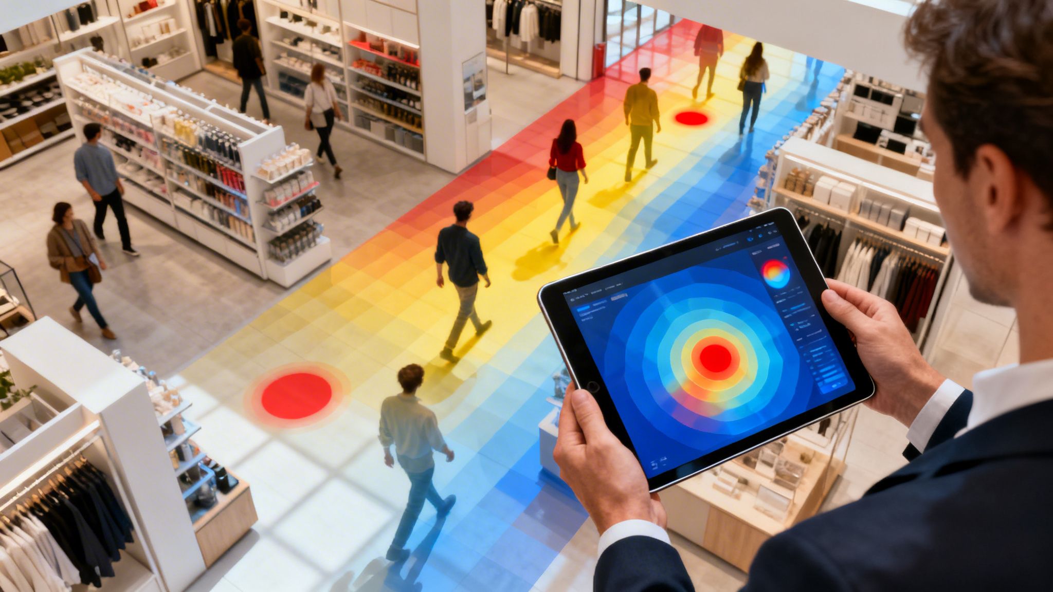
Site heat maps give you a visual story of how people move through your physical space. They use a simple colour-coded system to show you where the action is happening and where it isn't. Think of it like a weather map for your foot traffic: hot red zones are where people are gathering, while cool blue areas are being overlooked. It’s the simplest way to stop guessing and start knowing how your visitors really behave.
What Are Site Heat Maps and How Do They Work?

Trying to understand customer flow without data is like navigating your venue with a blindfold on. You can hear the general buzz of activity, but you have no real idea where people are congregating, which paths they take, or what parts of your layout they're avoiding entirely. Site heat maps take that blindfold off, giving you a clear, intuitive picture of visitor movement.
Unlike website heatmaps that track mouse clicks and scrolling, these maps analyse movement in the real world. They work by collecting anonymous data points from visitors' devices, most often by tapping into your existing WiFi network.
The Role of WiFi Analytics
The secret to generating these powerful visuals is often hidden in the WiFi infrastructure you already have in place. When a visitor with a smartphone enters your venue, their device starts looking for available WiFi networks. Every time the device "pings" one of your access points, it creates a small, anonymous digital breadcrumb.
A platform like Purple gathers these anonymous signals from your access points. By measuring and triangulating the signal strength from different points, the system can determine the approximate location of that device within your space.
It's important to be clear: this process is all about collective behaviour, not individual tracking. The goal is to spot patterns in how crowds move and dwell, which delivers incredible business insight while always respecting visitor privacy.
By collecting thousands of these data points over time, the platform begins to paint a clear picture of your venue's foot traffic. This turns raw, complex data into an easy-to-read heat map, instantly showing your most and least popular zones. This is a core part of what are known as indoor location services, which help businesses make sense of what's happening within their physical spaces.
Site heat maps provide a wealth of data that goes beyond simple footfall counts. The table below breaks down some of the most critical metrics you can unlock.
Key Metrics Revealed by Site Heat Maps
| Metric | What It Measures | Business Application |
|---|---|---|
| Dwell Time | The average time visitors spend in a specific area or your entire venue. | Identify engaging displays, pinpoint bottlenecks, or assess the appeal of amenities like seating areas. |
| Foot Traffic Flow | The most common paths and routes visitors take through your space. | Optimise store layout, place high-margin products on popular routes, and improve navigation. |
| Zone Popularity | Which areas attract the most and least visitor attention. | Inform merchandising decisions, evaluate marketing campaign effectiveness, and guide staffing allocation. |
| Bounce Rate | The percentage of visitors who enter but leave quickly without engaging. | Understand if your entrance, window displays, or initial layout are effectively drawing people in. |
These metrics work together to give you a complete, actionable view of visitor behaviour, turning your physical space into a source of valuable business intelligence.
Real-World Data in Action
The insights this technology can unlock are staggering. For instance, a WiFi data analysis of London's busy Oxford Street found that during lunch hours, peak concentrations of up to 85% of daily WiFi connections were packed into just 20% of the street's total length. On a typical Saturday, over 250,000 unique devices were detected, showing exactly where and when the crowds formed. You can read more about this in this insightful report on OpenHeatmap.
By understanding these kinds of patterns, any business can make smarter decisions to improve their layout, schedule staff more effectively, and refine their marketing for a real, measurable return.
Exploring Different Types of Heat Map Visualisations
When most people hear “heat map,” they picture that familiar, weather-style image with red hotspots. But that's just one tool in the box. The truth is, not all site heat maps are the same, and different visualisations are designed to answer very different business questions.
Choosing the right map is what moves you from simply knowing where people are to truly understanding what they’re doing. Think of it like a doctor’s diagnostic kit. A stethoscope is great for hearing a heartbeat, but you’d need an X-ray to see a broken bone. Each type of map gives you a specific layer of insight into visitor behaviour, helping you ask smarter questions and get far more precise answers.
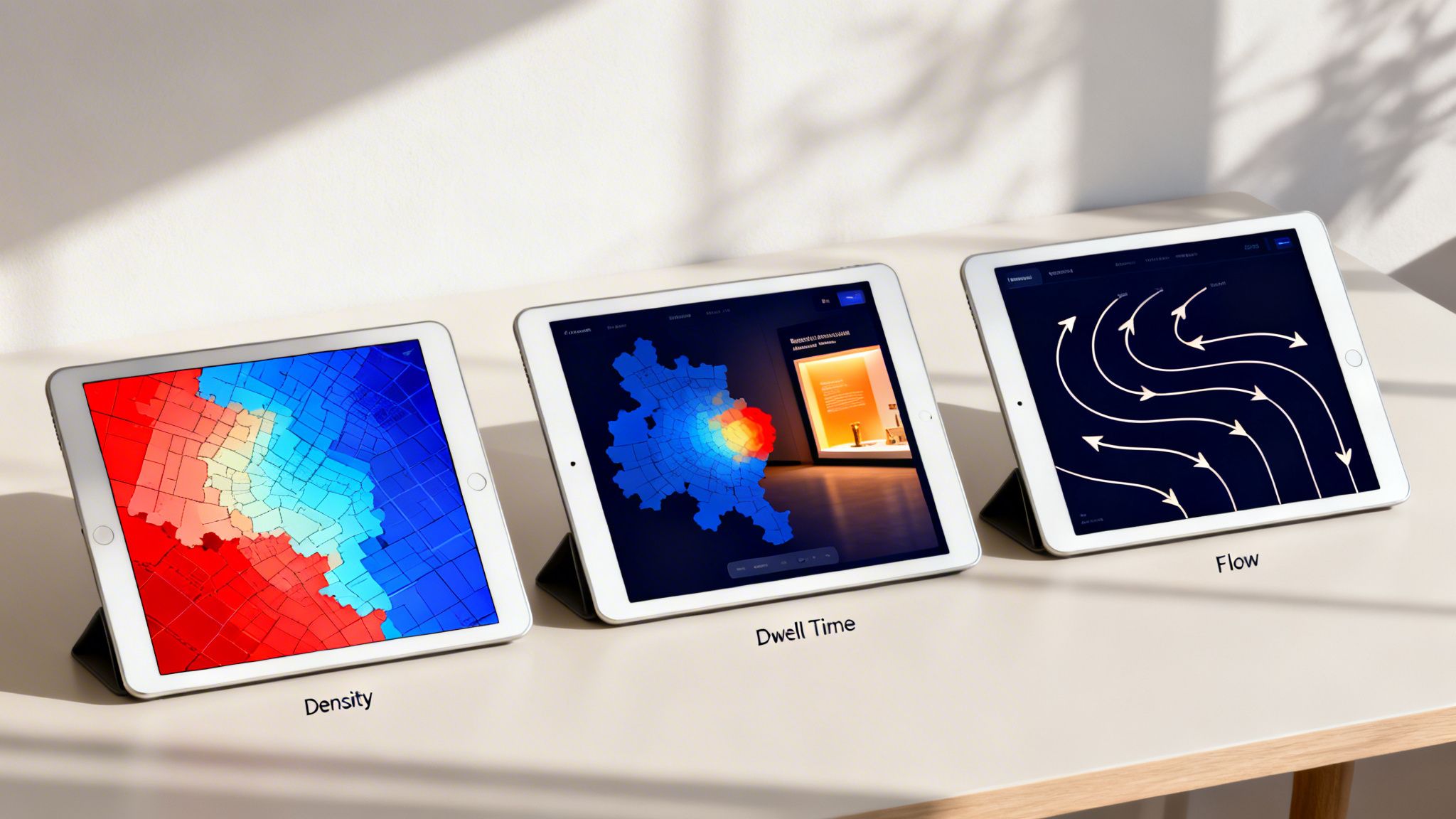
Density Heat Maps: Where Are the Crowds?
This is the classic visualisation you’re likely familiar with—the "weather map" for foot traffic. A density heat map shows the concentration of visitors across your venue at any given time. It’s your go-to for a quick snapshot of crowd levels.
- Red and Orange Zones: These are your hotspots, signalling high crowd density. These areas are magnets for visitor attention.
- Blue and Green Zones: These are the cooler spots with significantly less foot traffic, instantly highlighting the underutilised parts of your space.
A density map is perfect for answering questions like, "Where do people gather most often?" or "Which areas are being completely ignored?" For a retailer, it might reveal a massive red zone near the entrance but a cold blue zone in a far-back corner, giving you a starting point for analysis.
Dwell Time Heat Maps: Where Do People Linger?
Knowing where the crowds are is useful, but knowing where they actually spend their time is far more powerful. This is where dwell time heat maps shine. Instead of just showing crowd numbers, they visualise how long visitors stay put in specific areas.
High dwell time signals engagement. It means someone has stopped to look at a product, read a sign, or interact with a display. The colours might look the same, but they tell a different story: red zones are where people spend the most time, while blue zones are areas they just pass through.
Let's go back to our retail example. The density map showed a busy entrance, sure. But a dwell time map might reveal that the "cold" back corner actually has the highest dwell time, because that's where the new interactive display is. This paints a completely different picture—people aren't just walking by; they're stopping and engaging.
This type of map helps you answer the crucial question, "Where are my visitors most engaged?" It separates the busy thoroughfares from the genuine points of interest, a critical distinction for anyone looking to optimise a physical layout.
Flow Maps: How Do People Journey Through Your Space?
Finally, we have flow maps, sometimes called path maps. These visualisations illustrate the most common journeys visitors take as they move through your venue. Instead of static hotspots, you see lines and arrows that trace visitor movement from one point to another.
They look less like a weather map and more like a flight path chart, revealing the foot traffic superhighways within your space. They show you the most popular A-to-B routes, helping you understand how people naturally navigate the layout you've created.
Flow maps are essential for answering questions like:
- What is the most common path from the main entrance?
- Do people tend to move clockwise or anti-clockwise through my store?
- Are there common drop-off points where journeys end unexpectedly?
By understanding these pathways, a shopping centre could place high-value advertising along the most travelled routes, or a hospital could add clearer signage to guide patients more effectively along confusing journeys. These three visualisation types—density, dwell, and flow—work together to provide a complete picture of visitor behaviour, turning raw data into a clear strategic guide.
Turning WiFi Analytics into Actionable Insights
The different types of site heat maps give you a brilliant visual overview of visitor behaviour, but how does that raw data from your WiFi network actually become such a powerful business tool? The real value emerges when you connect anonymous location data with richer, first-party information, turning what was once a simple cost centre into a genuine strategic asset.
This connection often starts the moment a visitor chooses to log in to your guest WiFi. Platforms like Purple use a secure, passwordless captive portal to welcome guests. In exchange for free, reliable internet access, a visitor might provide basic demographic details like their age or gender, creating a valuable, consented-to data profile.
This enriched data is what fuels truly intelligent analytics. Instead of just seeing an anonymous dot on a map, you can begin to understand the who behind the where. This opens up a world of possibilities for personalising the visitor experience and making much smarter operational decisions.
From Data Points to Customer Profiles
When a visitor connects, their anonymous device ID is linked to the first-party data they willingly share. This isn't about tracking individuals; rather, it’s about building aggregated audience segments. You can suddenly start answering much deeper questions about your venue.
For instance, you can now analyse your heat maps based on specific demographics:
- Age Groups: Do visitors aged 18-25 spend more time in the food court, while those aged 45-60 prefer the homeware stores?
- Visit Frequency: Are first-time visitors exploring different areas compared to loyal, returning customers who head straight for their favourite spots?
- Gender: Do male and female visitors show different dwell time patterns in certain product categories?
This level of detail transforms a simple site heat map from a foot traffic counter into a sophisticated market research tool, all powered by the WiFi network you already have in place.
Seamless Integration with Existing Hardware
One of the biggest advantages of modern WiFi analytics platforms is that they don’t require a complete overhaul of your network infrastructure. Solutions like Purple are designed to integrate directly with the leading network hardware vendors you likely already use.
This means you can add powerful analytics and marketing capabilities without a massive capital investment. By working with your current setup from vendors like Cisco Meraki, Aruba, or Ruckus, you can get sophisticated site heat maps and location services up and running in weeks, not months.
This seamless integration makes the technology accessible and practical, allowing you to focus on the insights rather than a complex and costly installation process. This is particularly crucial for organisations wanting to understand and improve their visitor experience. You can find more detail on how these solutions drive real business results by learning more about location analytics services and their impact on revenue.
A Real-World Example in Action
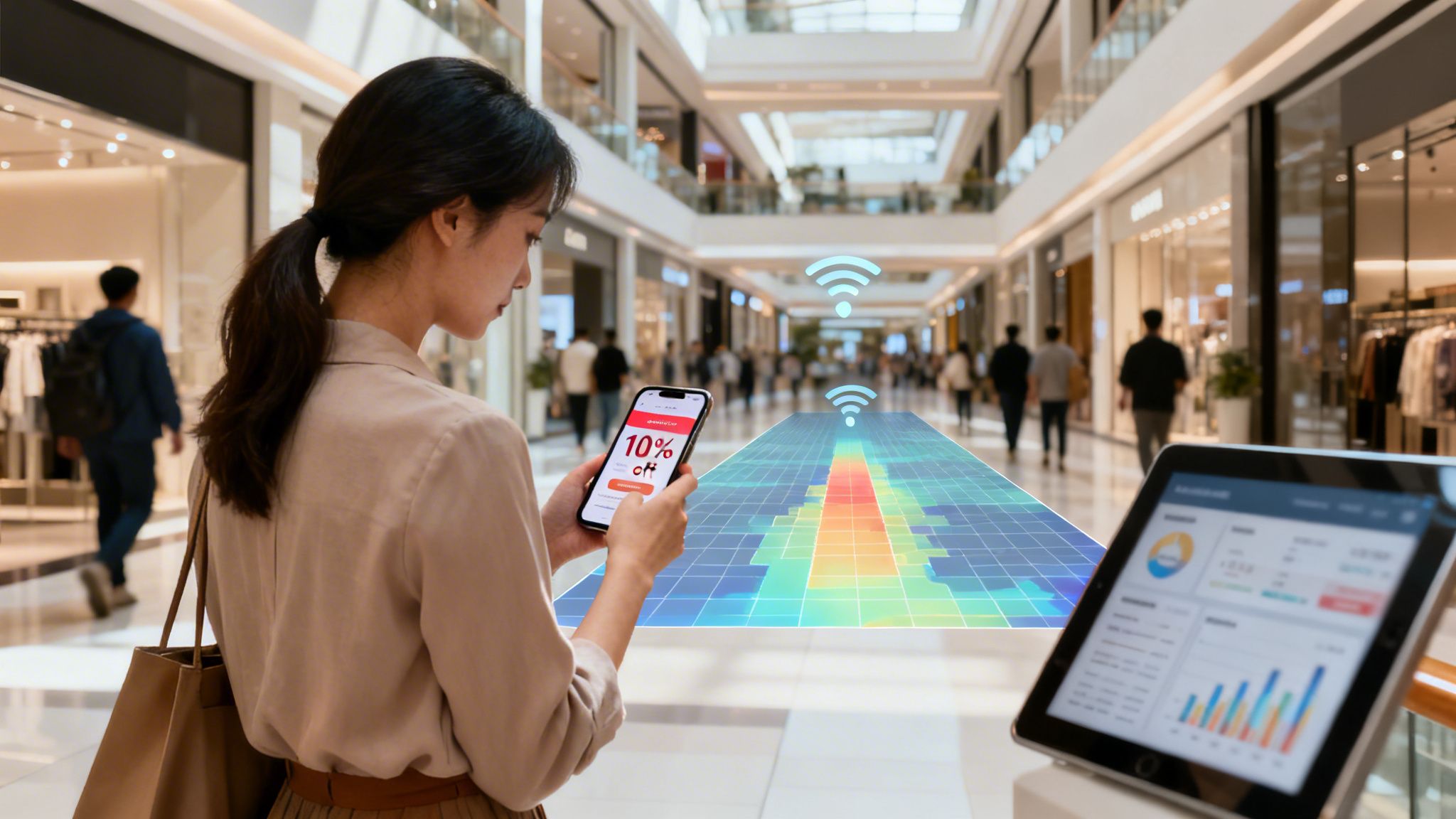
Let's imagine a large shopping centre. The management team uses a density heat map and notices the centre's newly renovated West Wing is consistently a "cool" blue zone, getting far less foot traffic than other areas. Simple door counters wouldn't explain why this is happening, but the heat map makes the problem impossible to ignore.
Using a platform like Purple, they can do more than just spot the problem—they can act on it.
- Identify the Problem: The site heat map clearly shows the West Wing is underperforming.
- Target the Right Audience: The system can identify visitors who are currently dwelling in the adjacent, busier sections of the shopping centre.
- Deploy a Solution: Using integrated marketing tools, the centre automatically sends a targeted mobile voucher—"Enjoy 10% off at stores in the West Wing for the next hour!"—directly to those visitors' devices.
Suddenly, visitors are given a timely and relevant incentive to explore the quiet area. This action drives immediate foot traffic to the struggling stores, boosts sales, and helps change visitor habits over time. The heat map then validates the campaign's success by showing the West Wing turning from blue to a much warmer yellow or orange. This is how raw analytics are turned into direct, measurable action.
Real-World Applications Across Industries
Understanding the theory behind different types of site heat maps is one thing, but the real magic happens when you see them in action. Across every industry, from hospitality to healthcare, these visualisations are turning abstract data into smarter operations, better customer experiences, and a healthier bottom line. It's time to move past the guesswork and see how different sectors are using this technology to act on real-world evidence.
By analysing how people move, gather, and interact within a physical space, businesses can finally get concrete answers to questions they’ve been asking for years. The applications are as varied as the industries themselves.
Optimising Hospitality and Guest Experiences
In the fiercely competitive hospitality world, the guest experience is king. Hotels, bars, and restaurants are using site heat maps to get a deep understanding of how guests use their facilities, leading to immediate, practical improvements.
Think about a large hotel chain. By looking at density heat maps of its lobby, management can see exactly when and where queues build up at the check-in desk.
- Peak Time Analysis: The maps might show a consistent surge of guests between 3 PM and 5 PM, creating a big red hotspot right at the front desk.
- Staffing Adjustments: With this insight, the hotel manager can adjust staffing rotas to make sure more receptionists are on duty during these proven peak hours, cutting down wait times.
- Amenity Usage: In the same way, a dwell time heat map of the hotel bar could reveal that guests linger longer in comfortable booths than at high-top tables. This simple observation can influence future furniture choices and table layouts to maximise both comfort and revenue.
This data-first approach leads to happier guests, more efficient staff, and less operational waste. It's all about fine-tuning the environment to meet guest needs, often before they even have to ask.
Boosting Sales in Retail Environments
For any retailer, understanding the customer journey is fundamental to driving sales. Site heat maps act like a silent shopping companion, revealing which products grab attention and which parts of the store go completely unnoticed. This is where location data provides a serious competitive edge, a topic we explore more deeply in our guide to retail analytics.
Let's say a high-street fashion brand rolls out a new, high-margin collection of jackets, placing them in a freshly designed alcove.
However, a flow map reveals that the main customer path completely bypasses this area, creating a "cold" blue zone. Shoppers simply aren't discovering the products.
By pinpointing this "dead zone," the store manager can act immediately. They might relocate the jacket display to a proven hotspot near the fitting rooms—an area consistently shown to have high dwell times. The result? An immediate and measurable lift in interaction and sales for that product line, all because a heat map exposed a critical flaw in the store's layout.
Improving Patient Flow in Healthcare
In healthcare settings, efficiency and the patient experience are paramount. Hospitals and clinics are increasingly using site heat maps to analyse patient flow, reduce congestion, and create calmer, more organised environments. This isn't just theory; real-world pilots have already shown remarkable results.
For instance, a pilot in UK hospitals used analytics similar to Purple's to map patient journeys. It found that 68% of daily WiFi connections happened in waiting areas. This insight helped trusts reduce patient no-shows by 14% by delivering targeted surveys and information at the right time. You can find these findings and more in this detailed report from NHS England.
By visualising how patients move through a facility, a hospital trust can:
- Redesign Waiting Areas: If a heat map shows severe overcrowding in one outpatient clinic's waiting room, the administration can redesign the layout, add more seating, or adjust appointment schedules to spread out arrivals.
- Improve Signage: Flow maps can highlight confusing journeys where patients frequently double back or seem lost, pointing to a clear need for better wayfinding signage.
- Optimise Resource Placement: A dwell time map might show where patients spend the most time waiting, helping to decide the best spot for information kiosks or water coolers.
The same principles apply to the property sector. Managers in Build-to-Rent (BTR) housing are using this technology to make smarter decisions. Heat maps have highlighted that communal gyms see 55% peak usage between 6 PM and 8 PM, allowing managers to schedule cleaning and maintenance outside these busy hours. When paired with secure WiFi access from platforms like Purple, this data helps create a better, safer living experience, contributing to a 20% higher resident satisfaction rate.
Implementing Heat Maps and Measuring ROI
Getting started with site heat maps is surprisingly straightforward. One of the biggest myths holding businesses back is the fear of a complete, and costly, hardware overhaul. The reality? A powerful analytics solution like Purple can be integrated directly with the WiFi network you already have in your venue.
This means you can start gathering rich location data without the cost and disruption of a major IT project. Modern analytics platforms are designed to play nicely with the network infrastructure you've already invested in, from leading vendors like Meraki or Aruba. The focus shifts from complex installations to quickly unlocking insights you can act on.
The diagram below shows just how these insights can be applied across different industries to solve real-world business challenges.
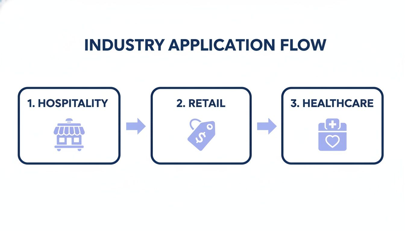
This process flow demonstrates how a single technology can be adapted to the unique needs of hospitality, retail, and healthcare. The key takeaway is that the data from heat maps isn’t just for looking at; it’s a catalyst for targeted actions that improve each sector's bottom line.
Connecting Location Data to Business Outcomes
The true power of site heat maps is realised when you connect the dots between location insights and your actual business results. This is about moving beyond simply watching foot traffic and starting to measure its direct impact on your performance. A critical step here is integrating your analytics platform with your Customer Relationship Management (CRM) system, whether it’s Salesforce or HubSpot.
This connection allows you to attribute real-world visitor actions to specific marketing campaigns or operational changes you’ve made. For instance, if you send a promotional offer to visitors who spent time in a particular zone, you can then track exactly how many of them went on to make a purchase. This creates a clear, undeniable line between your location-based campaign and the resulting sales uplift.
Proving the value of your investment is no longer a matter of guesswork. When you can definitively say, "Our targeted campaign in the west wing drove a 15% increase in sales for those stores," you build a powerful and undeniable business case for your analytics strategy.
By linking anonymous visitor behaviour to tangible outcomes, you stop just collecting data and start generating revenue.
How to Measure ROI from Site Heat Maps
Calculating the return on investment (ROI) from site heat maps means focusing on metrics that directly affect performance. It’s all about putting a number on the value of the changes you make based on the data you’ve gathered. A structured framework helps you track progress and demonstrate success to stakeholders.
The table below outlines key performance indicators (KPIs) to help you track the financial and operational impact of your site heat map strategy across different sectors.
| Industry Sector | Actionable KPI | Measurement Method | Example of Success |
|---|---|---|---|
| Retail | Conversion Rate Lift | Integrate analytics with CRM/POS to track sales from location-based offers. | A 10% higher conversion rate on vouchers sent to visitors in specific zones. |
| Hospitality | Dwell Time in High-Margin Areas | Use dwell time heat maps to analyse time spent in bars, restaurants, or spa areas. | A 25% increase in average dwell time in the lobby bar after a layout redesign. |
| Healthcare | Reduced Patient Wait Times | Measure dwell time in waiting rooms before and after scheduling or layout changes. | A 20% reduction in average wait time during peak hours, improving patient satisfaction. |
| All Sectors | Improved Operational Efficiency | Analyse staff heat maps to align deployment with visitor density, then measure cost savings. | Reduced overtime costs by 15% through more effective staff scheduling based on foot traffic. |
By tracking these concrete metrics, you can clearly demonstrate how site heat maps contribute to a more efficient, profitable, and customer-centric operation. This data-driven approach equips you to not only justify the initial investment but also to continuously refine your strategy for even greater returns.
Right, you're looking into site heat maps and, like anyone exploring this kind of tech, you've probably got a few questions bubbling up. That's completely normal. When a tool touches on everything from operations and marketing to IT, it naturally sparks conversations around privacy, cost, and just how practical it all is.
We get it. To help clear the air, we’ve put together answers to the most common queries we hear from businesses just like yours. Let's tackle them head-on so you can focus on what really matters: using these incredible insights to make your venue better.
Are Site Heat Maps Compliant With Privacy Rules Like GDPR?
This is usually the first and most important question on everyone's mind. And the answer is a clear, confident yes. Reputable platforms like Purple are built with a privacy-first design from the ground up. Compliance isn't an add-on; it's baked into the core of how the system works.
The secret lies in how the data is handled. Site heat maps work by picking up anonymous, aggregated signals from any WiFi-enabled device in the area. No personal information is ever captured by default.
Here’s a quick look at how privacy is protected:
- Pseudonymisation: The moment a device's unique identifier (its MAC address) is detected, it's immediately scrambled and replaced with a random code. The system sees "Device XYZ" was in a certain area, not "John Smith's iPhone."
- Aggregated Data: The insights you see on a heat map aren't about individuals. They're about collective behaviour. The platform analyses patterns from hundreds or thousands of anonymous data points to show where crowds gather, not where one specific person went.
- Informed Consent: If you want to gather richer data, like visitor demographics, people have to explicitly opt-in when they connect to your guest WiFi. This is done through a clear captive portal that lays out the terms, ensuring you're fully compliant with GDPR and other privacy rules.
The goal is always to understand broad visitor trends to improve the overall experience. It’s about spotting patterns in how crowds move, not tracking the movements of any single person.
This commitment to privacy means you can get powerful business intelligence while building trust with your visitors.
How Many WiFi Access Points Do I Need for Accurate Maps?
The number of access points (APs) you'll need boils down to two things: the size of your venue and how much detail you want to see. There’s no magic number, but a few clear principles will guide you.
For a small, single-room space like an independent coffee shop, just one or two well-placed APs can give you a great overview of general hotspots and dwell times. You'll easily see if people are bunching up at the counter or settling into the seating area.
On the other hand, for a large, complex venue—think a multi-floor shopping centre, a sprawling hotel, or a hospital—you'll need a denser network of APs. Having more APs allows the system to use a process called trilateration, using signals from multiple points to pinpoint a device's location with much higher accuracy.
The good news? You probably won’t need to rip everything out and start over. Solutions like Purple are built to work seamlessly with your existing network hardware from top-tier vendors like Cisco Meraki, Aruba, and many others. A professional site survey can map out the best AP placement for the detail you need, but being able to use your current gear makes getting started much easier.
Can Heat Maps Track Staff Movements for Operational Efficiency?
Yes, and this is an incredibly powerful way to use heat map technology. By visualising how your team moves through a space, managers can get a clear picture of workflows, spot operational bottlenecks, and make sure staff are deployed where they're needed most.
This is all managed with security and privacy front and centre. The typical way to do this is by setting up a separate, secure WiFi network (SSID) just for staff devices. You can even lock down access by integrating with your company's existing directories, like Microsoft Entra ID or Google Workspace.
This setup offers a few key advantages:
- Secure Access: Staff can connect automatically and securely, often using certificate-based authentication, so there are no passwords to manage.
- Targeted Analytics: Because staff are on their own network, you can generate heat maps that show only their movements, without mixing that data with visitor analytics.
- Workflow Optimisation: A manager can look at a flow map to see if staff are taking inefficient routes around the building, or check a density map to see if there's enough cover in the busiest sections during peak hours.
Just like with visitor analytics, this is all done using aggregated and anonymised data. The aim isn't to micromanage individual employees, but to understand collective workflow patterns to build a more efficient and responsive operation.
Ready to see how your venue looks on a heat map? Purple provides the most secure, insightful, and easy-to-integrate WiFi analytics platform on the market. Discover how you can turn your existing WiFi network into a powerful business tool today.