Captive Portal सुलभता: WCAG 2.1 अनुपालन मार्गदर्शिका
यह आधिकारिक मार्गदर्शिका बताती है कि WCAG 2.1 AA सुलभता मानकों को पूरा करने वाले Captive Portal को कैसे डिज़ाइन करें, परीक्षण करें और तैनात करें। यूके और यूएस सार्वजनिक-क्षेत्र के अनुपालन आदेशों का पालन करने वाले स्थल संचालकों और IT टीमों के लिए यह एक आवश्यक पठन है।
🎧 इस गाइड को सुनें
ट्रांसक्रिप्ट देखें

कार्यकारी सारांश
एंटरप्राइज़ IT लीडर्स और स्थल संचालन निदेशकों के लिए, Captive Portal सुलभता अब एक वैकल्पिक सुधार नहीं है—यह एक सख्त कानूनी आवश्यकता है। यूके सार्वजनिक क्षेत्र निकाय सुलभता विनियम और यूएस न्याय विभाग का ADA शीर्षक II के तहत 2024 का अंतिम नियम यह अनिवार्य करता है कि सभी सार्वजनिक-सामने वाली डिजिटल सेवाएँ, जिनमें WiFi स्प्लैश पेज भी शामिल हैं, वेब सामग्री सुलभता दिशानिर्देश (WCAG) 2.1 स्तर AA के अनुरूप होनी चाहिए। अनुपालन न करने से संगठनों को कानूनी जोखिम, प्रतिष्ठा को नुकसान और मेहमानों को अलग-थलग पड़ने का खतरा होता है।
इसके बावजूद, Captive Portal आधुनिक IT संपदाओं में सबसे लगातार अनदेखी किए गए अनुपालन टचपॉइंट्स में से एक बने हुए हैं। क्योंकि वे नेटवर्क इंजीनियरिंग और वेब डेवलपमेंट के प्रतिच्छेदन पर स्थित हैं, वे अक्सर मानक सुलभता ऑडिट को दरकिनार कर देते हैं। यह तकनीकी संदर्भ मार्गदर्शिका WCAG 2.1 AA मानकों को पूरा करने के लिए Captive Portal को डिज़ाइन करने, परीक्षण करने और सुधारने पर कार्रवाई योग्य, विक्रेता-तटस्थ मार्गदर्शन प्रदान करती है। इन प्रथाओं को लागू करके, नेटवर्क आर्किटेक्ट यह सुनिश्चित कर सकते हैं कि उनके Guest WiFi परिनियोजन सभी उपयोगकर्ताओं के लिए समान पहुँच प्रदान करें, जबकि Hospitality , Retail , और सार्वजनिक-क्षेत्र के वातावरण में अनुपालन जोखिमों को कम करें।
Captive Portal सुलभता अनुपालन पर हमारी कार्यकारी ब्रीफिंग सुनें:
तकनीकी गहन-विश्लेषण: Captive Portal पर लागू WCAG 2.1 AA
WCAG 2.1 फ्रेमवर्क चार मुख्य सिद्धांतों के इर्द-गिर्द व्यवस्थित है: बोधगम्य (Perceivable), संचालन योग्य (Operable), समझने योग्य (Understandable), और सुदृढ़ (Robust) (POUR)। जबकि मानक में स्तर AA पर 50 सफलता मानदंड शामिल हैं, एक Captive Portal—जो आमतौर पर एक सुव्यवस्थित प्रमाणीकरण फॉर्म होता है—को मुख्य रूप से फॉर्म इंटरैक्शन, कीबोर्ड नेविगेशन और स्क्रीन रीडर संगतता को प्रभावित करने वाले मानदंडों को संबोधित करना चाहिए।
बोधगम्य: कंट्रास्ट और रीफ्लो
ब्रांडेड Captive Portal में सबसे आम सुलभता विफलता अपर्याप्त रंग कंट्रास्ट है। सफलता मानदंड 1.4.3 (न्यूनतम कंट्रास्ट) मानक टेक्स्ट के लिए कम से कम 4.5:1 और बड़े टेक्स्ट या UI घटकों के लिए 3:1 के कंट्रास्ट अनुपात की आवश्यकता है। स्थल संचालक अक्सर प्राथमिक ब्रांड रंगों—जैसे सफेद पृष्ठभूमि पर हल्का ग्रे टेक्स्ट—को लागू करने का प्रयास करते हैं, जो तुरंत अनुपालन जांच में विफल हो जाते हैं। नेटवर्क टीमों को स्प्लैश पेज के लिए एक सुलभ डिजिटल पैलेट को परिभाषित करने के लिए मार्केटिंग के साथ सहयोग करना चाहिए।
इसके अलावा, मानदंड 1.4.10 (रीफ्लो) यह अनिवार्य करता है कि सामग्री 320 CSS पिक्सेल (डेस्कटॉप मॉनिटर पर 400% ज़ूम के बराबर) की व्यूपोर्ट चौड़ाई पर क्षैतिज स्क्रॉलिंग के बिना प्रस्तुत होनी चाहिए। कई पुराने Captive Portal निश्चित-चौड़ाई वाले कंटेनरों का उपयोग करते हैं जो आवर्धन के तहत पूरी तरह से टूट जाते हैं, जिससे कम दृष्टि वाले उपयोगकर्ताओं को प्रभावी ढंग से बाहर कर दिया जाता है। आधुनिक प्रतिक्रियाशील डिज़ाइन एक आधारभूत आवश्यकता है।
संचालन योग्य: कीबोर्ड नेविगेशन और सत्र समय
मोटर अक्षमताओं वाले उपयोगकर्ताओं के लिए जो माउस के बजाय सहायक तकनीकों पर निर्भर करते हैं, कीबोर्ड सुलभता महत्वपूर्ण है। मानदंड 2.1.1 (कीबोर्ड) यह निर्धारित करता है कि पोर्टल पर प्रत्येक इंटरैक्टिव तत्व—इनपुट फ़ील्ड, सबमिट बटन और सेवा की शर्तों के चेकबॉक्स—केवल टैब, एंटर, स्पेस और तीर कुंजियों का उपयोग करके पहुंच योग्य और संचालन योग्य होना चाहिए। एक सामान्य वास्तुशिल्प दोष तब होता है जब कस्टम-शैली वाले चेकबॉक्स को मूल HTML <input type="checkbox"> तत्वों के बजाय <div> तत्वों के रूप में लागू किया जाता है, जिससे वे कीबोर्ड नेविगेशन के लिए अदृश्य हो जाते हैं।
सत्र प्रबंधन भी सुलभता चुनौतियाँ प्रस्तुत करता है। मानदंड 2.2.1 (समय समायोज्य) सीधे नेटवर्क नियंत्रक पर कॉन्फ़िगर किए गए प्रमाणीकरण टाइमआउट विंडो पर लागू होता है। यदि एक Captive Portal पंजीकरण के लिए एक सख्त समय सीमा लगाता है, तो स्क्रीन रीडर या स्विच नियंत्रणों का उपयोग करके धीरे-धीरे नेविगेट करने वाले उपयोगकर्ताओं को असमान रूप से टाइम आउट कर दिया जाएगा। पोर्टल को टाइमआउट होने से पहले उपयोगकर्ता को चेतावनी देनी चाहिए और सत्र को बढ़ाने के लिए एक तंत्र प्रदान करना चाहिए।
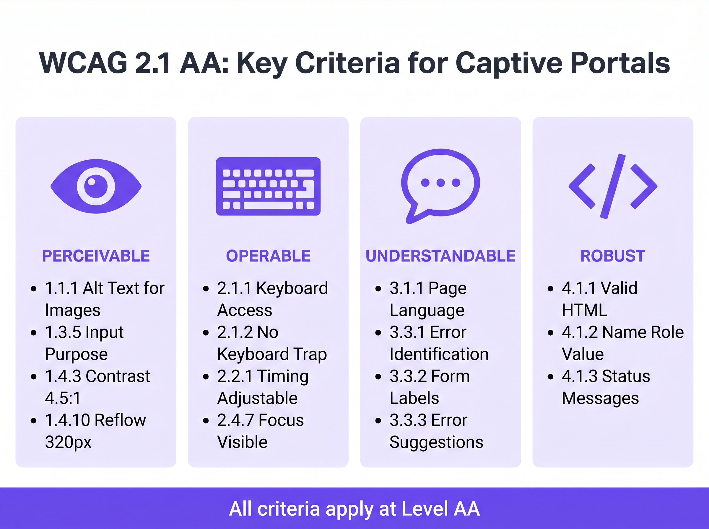
समझने योग्य: फॉर्म लेबल और त्रुटि प्रबंधन
फॉर्म सुलभता एक अनुपालन Captive Portal की आधारशिला है। मानदंड 3.3.2 (लेबल या निर्देश) सभी इनपुट फ़ील्ड के लिए दृश्यमान, स्थायी लेबल की आवश्यकता है। आधुनिक UI डिज़ाइन में एक व्यापक एंटी-पैटर्न स्थायी लेबल के विकल्प के रूप में प्लेसहोल्डर टेक्स्ट का उपयोग है। प्लेसहोल्डर टेक्स्ट इनपुट पर गायब हो जाता है, जिससे संज्ञानात्मक अक्षमताओं वाले उपयोगकर्ता बिना संदर्भ के रह जाते हैं, और अक्सर कंट्रास्ट आवश्यकताओं को पूरा करने में विफल रहता है।
जब प्रमाणीकरण विफल हो जाता है—शायद एक अमान्य ईमेल प्रारूप या एक अस्वीकृत MAC पते के कारण—त्रुटि को स्पष्ट रूप से पहचाना जाना चाहिए और टेक्स्ट में वर्णित किया जाना चाहिए (मानदंड 3.3.1)। त्रुटि स्थिति को इंगित करने के लिए केवल एक लाल बॉर्डर पर निर्भर रहना रंग निर्भरता नियमों और त्रुटि पहचान आवश्यकताओं दोनों का उल्लंघन करता है। त्रुटि टेक्स्ट को aria-describedby विशेषता का उपयोग करके आपत्तिजनक फ़ील्ड के साथ प्रोग्रामेटिक रूप से संबद्ध किया जाना चाहिए।
सुदृढ़: स्क्रीन रीडर संगतता
मानदंड 4.1.2 (नाम, भूमिका, मान) सहायक प्रौद्योगिकी समर्थन की नींव है। प्रत्येक इंटरैक्टिव तत्व में एक सुलभ नाम और प्रोग्रामेटिक भूमिका होनी चाहिए। जब NVDA या VoiceOver चलाने वाला उपयोगकर्ता "Connect" बटन का सामना करता है, तो अंतर्निहित HTML को इसे स्पष्ट रूप से एक बटन के रूप में पहचानना चाहिए और इसके उद्देश्य की घोषणा करनी चाहिए। यदि पोर्टल सुलभ टेक्स्ट लेबल के बिना केवल आइकन वाले सोशल लॉगिन बटन (जैसे, एक Google या Facebook लोगो) पर निर्भर करता है, तो स्क्रीन रीडर केवल "बटन" या "लिंक" की घोषणा करेंगे, जिससे उपयोगकर्ता को कोई संदर्भ नहीं मिलेगा।
कार्यान्वयन मार्गदर्शिका: सुलभ पोर्टल बनाना
एक सुलभ Captive Portal को तैनात करने के लिए पूर्वव्यापी सुधार से सक्रिय डिज़ाइन की ओर बदलाव की आवश्यकता है। Thनिम्नलिखित परिनियोजन चरण नेटवर्क एस्टेट में अनुपालन सुनिश्चित करते हैं।
चरण 1: सिमेंटिक HTML आर्किटेक्चर
सबसे प्रभावी एक्सेसिबिलिटी रणनीति जटिल ARIA (एक्सेसिबल रिच इंटरनेट एप्लिकेशन) ओवरले के बजाय नेटिव, सिमेंटिक HTML पर निर्भर करना है। <form>, <fieldset>, <legend>, <label>, और <input> तत्वों का उपयोग विनिर्देश के अनुसार ही करें। नेटिव तत्व डिफ़ॉल्ट रूप से कीबोर्ड संचालन क्षमता और स्क्रीन रीडर समर्थन प्राप्त करते हैं।
उदाहरण के लिए, मार्केटिंग सहमति का अनुरोध करते समय— Event-Driven Marketing Automation Triggered by WiFi Presence के लिए एक महत्वपूर्ण कदम—चेकबॉक्स को for और id एट्रिब्यूट का उपयोग करके उसके लेबल से स्पष्ट रूप से जोड़ा जाना चाहिए। यह न केवल स्क्रीन रीडर घोषणा सुनिश्चित करता है बल्कि क्लिक करने योग्य हिट क्षेत्र को भी बढ़ाता है, जिससे मोटर नियंत्रण कठिनाइयों वाले उपयोगकर्ताओं को लाभ होता है।
चरण 2: फोकस प्रबंधन और मोडल
Captive portals अक्सर व्यापक नियम और शर्तें या स्वीकार्य उपयोग नीतियां प्रदर्शित करने के लिए मोडल डायलॉग का उपयोग करते हैं। एक्सेसिबिलिटी के दृष्टिकोण से, मोडल उच्च जोखिम वाले घटक हैं। जब कोई मोडल खुलता है, तो कीबोर्ड फोकस को प्रोग्रामेटिक रूप से मोडल में ले जाना चाहिए, और फोकस को उसमें फंसा रहना चाहिए (मानदंड 2.1.2: कोई कीबोर्ड ट्रैप नहीं) जब तक उपयोगकर्ता इसे स्पष्ट रूप से खारिज नहीं कर देता। यदि फोकस मोडल से बाहर निकल जाता है और अस्पष्ट पृष्ठभूमि पृष्ठ पर लौट आता है, तो स्क्रीन रीडर उपयोगकर्ता पूरी तरह से भ्रमित हो जाते हैं।
चरण 3: डायनामिक स्थिति घोषणाएं
आधुनिक स्प्लैश पेज अक्सर पूर्ण पेज रीलोड को मजबूर करने के बजाय APIs के माध्यम से अतुल्यकालिक रूप से प्रमाणीकरण संसाधित करते हैं। जबकि यह सामान्य उपयोगकर्ता अनुभव में सुधार करता है, यदि स्थिति परिवर्तनों की घोषणा नहीं की जाती है तो यह एक्सेसिबिलिटी अंतराल पैदा करता है। ARIA लाइव क्षेत्रों (aria-live="polite" स्थिति अपडेट के लिए, aria-live="assertive" गंभीर त्रुटियों के लिए) का उपयोग यह सुनिश्चित करने के लिए करें कि स्क्रीन रीडर गतिशील परिवर्तनों की घोषणा करें, जैसे "नेटवर्क से कनेक्ट हो रहा है..." या "प्रमाणीकरण विफल। कृपया अपने विवरण जांचें।"
सर्वोत्तम अभ्यास और परीक्षण पद्धति
Captive portal एक्सेसिबिलिटी को मान्य करने के लिए एक हाइब्रिड दृष्टिकोण की आवश्यकता होती है। स्वचालित स्कैनिंग उपकरण त्वरित बेसलाइन जांच प्रदान करते हैं, लेकिन वास्तविक संचालन क्षमता की पुष्टि के लिए मैन्युअल परीक्षण अनिवार्य है।
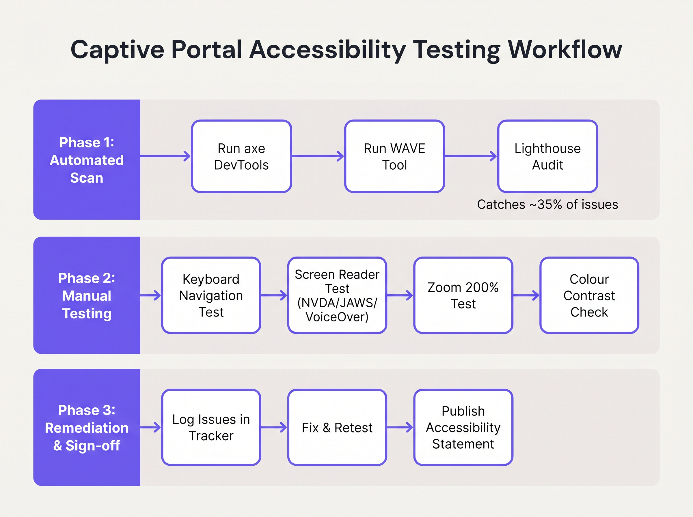
- स्वचालित स्कैनिंग: पोर्टल विकास पाइपलाइन में axe DevTools या WAVE जैसे उपकरणों को एकीकृत करें। ये उपकरण
altटेक्स्ट की कमी, अनुपस्थित लेबल और गंभीर कंट्रास्ट उल्लंघनों जैसे संरचनात्मक मुद्दों को तेजी से पहचानते हैं। हालांकि, स्वचालित उपकरण आमतौर पर WCAG विफलताओं का केवल 30-40% ही पकड़ पाते हैं। - कीबोर्ड नेविगेशन ऑडिट: नेटवर्क इंजीनियरों को माउस को डिस्कनेक्ट करके और विशेष रूप से कीबोर्ड के माध्यम से नेविगेट करके लाइव पोर्टल का नियमित रूप से परीक्षण करना चाहिए। सत्यापित करें कि फोकस संकेतक (सक्रिय तत्व को हाइलाइट करने वाली रूपरेखा) अत्यधिक दृश्यमान है और टैब ऑर्डर एक तार्किक, अनुमानित अनुक्रम का पालन करता है।
- स्क्रीन रीडर सत्यापन: नेटिव स्क्रीन रीडर का उपयोग करके पोर्टल का परीक्षण करें: iOS पर VoiceOver (महत्वपूर्ण, क्योंकि मोबाइल डिवाइस Captive portal प्रमाणीकरण का विशाल बहुमत दर्शाते हैं), Android पर TalkBack, और Windows डेस्कटॉप पर NVDA या JAWS। सत्यापित करें कि सभी फॉर्म फ़ील्ड, त्रुटियां और स्थिति परिवर्तन सटीक रूप से घोषित किए गए हैं।
- विक्रेता जवाबदेही: प्रबंधित WiFi सेवाओं या पोर्टल प्लेटफॉर्म की खरीद करते समय, विक्रेता से एक स्वैच्छिक उत्पाद एक्सेसिबिलिटी टेम्पलेट (VPAT) या एक स्वतंत्र WCAG 2.1 AA अनुरूपता रिपोर्ट की मांग करें। Purple के पोर्टल बिल्डर में मूलभूत एक्सेसिबिलिटी सुविधाएँ शामिल हैं, जो Guest WiFi परिनियोजन के लिए अनुपालन को सुव्यवस्थित करती हैं।
समस्या निवारण और जोखिम न्यूनीकरण
जब एक्सेसिबिलिटी ऑडिट विफल हो जाते हैं, तो मूल कारण आमतौर पर Captive portal आर्किटेक्चर के तीन विशिष्ट क्षेत्रों में पाए जाते हैं।
कस्टम UI ट्रैप
डेवलपर्स अक्सर नेटिव HTML फॉर्म तत्वों को कस्टम <div> और <span> कंस्ट्रक्ट्स से बदल देते हैं जिन्हें सटीक ब्रांड दिशानिर्देशों से मेल खाने के लिए CSS के साथ स्टाइल किया जाता है। जबकि ये दिखने में आकर्षक होते हैं, ये कस्टम तत्व सभी नेटिव एक्सेसिबिलिटी सिमेंटिक्स को हटा देते हैं।
न्यूनीकरण: हमेशा नेटिव HTML तत्वों पर निर्माण करें। यदि कस्टम स्टाइलिंग अनिवार्य है, तो उन्हें बदलने के बजाय नेटिव तत्वों पर CSS लागू करें। यदि एक कस्टम तत्व का उपयोग किया जाना चाहिए, तो डेवलपर्स को ARIA भूमिकाओं, स्थितियों और कीबोर्ड इवेंट श्रोताओं का उपयोग करके एक्सेसिबिलिटी स्टैक को मैन्युअल रूप से फिर से बनाना होगा—जो एक जटिल और त्रुटि-प्रवण प्रक्रिया है।
CAPTCHA बाधा
पारंपरिक दृश्य CAPTCHA (उपयोगकर्ताओं को विकृत टेक्स्ट की पहचान करने या ट्रैफिक लाइट की छवियों का चयन करने की आवश्यकता होती है) गंभीर दृष्टिबाधित उपयोगकर्ताओं के लिए मौलिक रूप से दुर्गम हैं।
न्यूनीकरण: आधुनिक, अदृश्य CAPTCHA समाधान (जैसे reCAPTCHA v3 या Cloudflare Turnstile) लागू करें जो उपयोगकर्ता इंटरैक्शन के बजाय व्यवहारिक टेलीमेट्री के आधार पर जोखिम का आकलन करते हैं। यदि कोई चुनौती अपरिहार्य है, तो एक सुलभ ऑडियो विकल्प प्रदान किया जाना चाहिए।
ऑटो-रीडायरेक्ट भटकाव
सफल प्रमाणीकरण पर, Captive portals आमतौर पर उपयोगकर्ता के ब्राउज़र को एक निर्दिष्ट लैंडिंग पेज या मूल रूप से अनुरोधित URL पर रीडायरेक्ट करते हैं। स्क्रीन रीडर उपयोगकर्ताओं के लिए, अचानक, अघोषित संदर्भ परिवर्तन अत्यधिक भ्रामक होते हैं।
न्यूनीकरण: रीडायरेक्ट निष्पादित करने से पहले एक स्पष्ट, मध्यवर्ती स्थिति संदेश ("प्रमाणीकरण सफल। आपको अब इंटरनेट पर रीडायरेक्ट किया जा रहा है।") प्रदान करें। सुनिश्चित करें कि लक्ष्य लैंडिंग पेज भी पूरी तरह से सुलभ है।
ROI और व्यावसायिक प्रभाव
Captive portal एक्सेसिबिलिटी में निवेश केवल जोखिम से बचने से परे मापने योग्य रिटर्न प्रदान करता है। सार्वजनिक क्षेत्र की संस्थाओं, शिक्षा संस्थानों और स्वास्थ्य सेवा प्रदाताओं के लिए, WCAG 2.1 AA अनुपालन एक सख्त कानूनी जनादेश है; अनुपालन न करने पर औपचारिक जांच, वित्तीय दंड और जनसंपर्क संकट उत्पन्न होते हैं।
हालांकि, Retail और Transport जैसे वाणिज्यिक क्षेत्रों में, एक्सेसिबिलिटी सीधे लाभ को प्रभावित करती है। एक Captive portal ग्राहक d के लिए एक प्राथमिक अधिग्रहण चैनल हैअतः। यदि वैश्विक आबादी का 15% किसी न किसी प्रकार की विकलांगता का अनुभव करता है, तो एक दुर्गम पोर्टल सक्रिय रूप से एक महत्वपूर्ण जनसांख्यिकी को वफादारी कार्यक्रमों में शामिल होने या मार्केटिंग संचार का विकल्प चुनने से रोकता है।
एक सुलभ पोर्टल तैनात करके, स्थल संचालक प्रमाणीकरण सफलता दरों को अधिकतम करते हैं, अपने लक्षित मार्केटिंग दर्शकों का विस्तार करते हैं, और समावेशी डिजिटल अनुभवों के प्रति एक ठोस प्रतिबद्धता प्रदर्शित करते हैं। इन अनुपालक पोर्टलों को व्यापक मार्केटिंग रणनीतियों के साथ एकीकृत करना—जैसे Mailchimp Plus Purple: WiFi साइन-अप से स्वचालित ईमेल मार्केटिंग —यह सुनिश्चित करता है कि विस्तारित डेटा कैप्चर सीधे ग्राहक आजीवन मूल्य में वृद्धि में परिवर्तित हो।
मुख्य शब्द और परिभाषाएं
WCAG 2.1 AA
The Web Content Accessibility Guidelines version 2.1, Level AA. The internationally recognised technical standard for digital accessibility, mandated by law in the UK and US for public-sector digital services.
The benchmark standard that network architects must reference when procuring or designing captive portal solutions to ensure legal compliance.
Assistive Technology (AT)
Hardware or software—such as screen readers, screen magnifiers, or alternative keyboards—used by individuals with disabilities to interact with digital interfaces.
Captive portals must be coded to interface correctly with AT; failure to do so prevents authentication and network access.
Screen Reader
Software that translates on-screen text and interface elements into synthesized speech or braille output (e.g., VoiceOver, NVDA, JAWS).
The primary tool used by visually impaired guests to navigate WiFi splash pages, requiring strict adherence to semantic HTML and ARIA standards.
ARIA (Accessible Rich Internet Applications)
A set of HTML attributes that define ways to make web content and web applications more accessible to people with disabilities.
Used by portal developers to bridge accessibility gaps in complex or dynamic UI components when native HTML is insufficient.
Keyboard Trap
An accessibility failure where a user navigating via keyboard can enter a specific component (like a modal dialog) but cannot use the keyboard to exit it.
A critical failure point in captive portals, often occurring when terms and conditions overlays are poorly implemented, permanently blocking the authentication flow.
Focus Indicator
The visual outline (often a ring) that highlights which interactive element currently has keyboard focus.
Essential for sighted keyboard users to track their position on the portal. Often mistakenly removed by designers for aesthetic reasons using `outline: none` in CSS.
Contrast Ratio
The mathematical difference in luminance between a text color and its background color, ranging from 1:1 to 21:1.
WCAG AA requires a minimum ratio of 4.5:1 for standard text. Network teams must verify brand colors against this metric before deploying splash pages.
Semantic HTML
The use of HTML markup to reinforce the semantics, or meaning, of the information in webpages rather than merely to define its presentation.
The fundamental building block of an accessible portal. Using a `<button>` tag for a submit action rather than a styled `<div>` ensures the browser and screen reader understand the element's purpose.
केस स्टडीज
A 400-room hotel is upgrading its guest WiFi infrastructure. The marketing department has provided a portal design featuring light grey placeholder text inside form fields, custom-styled terms and conditions checkboxes built using `<div>` elements, and a session timeout of 60 seconds to prevent lingering unauthenticated connections. How should the network architect remediate this design for WCAG 2.1 AA compliance?
The network architect must mandate three specific remediations before deployment:
- Form Labels: Replace the placeholder text with persistent, visible
<label>elements positioned above each input field. Ensure the text meets the 4.5:1 contrast ratio requirement against the background. - Native Checkboxes: Discard the custom
<div>checkboxes. Implement native<input type="checkbox">elements, styled via CSS if necessary, ensuring they are reachable via the Tab key and toggleable via the Spacebar. - Timeout Management: The 60-second timeout is too aggressive for users relying on assistive technology. The architect should implement a warning modal at 45 seconds, alerting the user to the impending timeout and providing a clear, keyboard-accessible button to extend the session.
A university IT department is deploying a new captive portal across campus. During testing, they discover that when a user enters an invalid student ID format, the input box border turns red, but VoiceOver on iOS does not announce the error, leaving visually impaired students unable to authenticate. How should the development team fix this?
The team must implement programmatic error association and dynamic announcements.
- They must add a descriptive text error message below the input field (e.g., "Error: Student ID must be 8 digits").
- They must assign a unique ID to the error message element.
- They must add the
aria-describedbyattribute to the input field, referencing the error message's ID. - To ensure immediate announcement upon form submission, the error container should utilize an ARIA live region (e.g.,
aria-live="assertive").
परिदृश्य विश्लेषण
Q1. Your venue marketing team wants to remove the visible text labels from the captive portal login form and rely entirely on placeholder text inside the input fields to achieve a 'cleaner, minimalist aesthetic'. How should you respond?
💡 संकेत:Consider WCAG Criterion 3.3.2 (Labels or Instructions) and the behaviour of placeholder text when a user begins typing.
अनुशंसित दृष्टिकोण दिखाएं
You must reject this design change. Relying solely on placeholder text violates WCAG 2.1 AA Criterion 3.3.2. Placeholder text disappears as soon as the user begins typing, removing vital context for users with cognitive disabilities. Furthermore, default placeholder text often fails the 4.5:1 minimum contrast ratio requirement. Persistent, visible <label> elements positioned outside the input fields are mandatory for compliance.
Q2. During a manual accessibility audit of your new splash page, you attempt to navigate using only the keyboard. You successfully Tab through the email and name fields, and press Enter to open the 'Terms and Conditions' modal overlay. However, once inside the modal, pressing Tab cycles focus through the background page elements behind the modal, rather than the 'Accept' and 'Decline' buttons within the modal itself. What is this failure called, and how is it resolved?
💡 संकेत:Consider how keyboard focus must be managed when dynamic overlays are presented to the user.
अनुशंसित दृष्टिकोण दिखाएं
This is a failure of focus management, specifically violating the principles related to keyboard operability and focus order. When the modal opens, the development team must programmatically shift focus into the modal container. More importantly, they must implement a 'focus trap' using JavaScript, ensuring that pressing Tab cycles only through the interactive elements within the modal until the user explicitly dismisses it. Once dismissed, focus must be returned to the button that originally opened the modal.
Q3. A local government client requires that their public WiFi portal meets strict WCAG 2.1 AA standards. They have requested a 2-minute session timeout on the authentication page for security reasons. Is this compliant?
💡 संकेत:Review WCAG Criterion 2.2.1 (Timing Adjustable) regarding time limits.
अनुशंसित दृष्टिकोण दिखाएं
A strict 2-minute timeout without warning is not compliant. Under WCAG Criterion 2.2.1 (Timing Adjustable), users must be warned before a time limit expires and given at least 20 seconds to extend the time limit with a simple action (e.g., pressing the Spacebar). Users with motor impairments or those using screen readers may require significantly longer than 2 minutes to read terms and conditions and complete form fields.
