Acessibilidade do Captive Portal: Guia de Conformidade WCAG 2.1
Este guia autorizado detalha como projetar, testar e implementar captive portals que cumprem os padrões de acessibilidade WCAG 2.1 AA. Leitura essencial para operadores de espaços e equipas de TI que navegam nos mandatos de conformidade do setor público do Reino Unido e dos EUA.
🎧 Ouça este Guia
Ver Transcrição

Resumo Executivo
Para líderes de TI empresariais e diretores de operações de espaços, a acessibilidade do captive portal já não é um aprimoramento opcional — é um requisito legal rigoroso. Os Regulamentos de Acessibilidade para Organismos do Setor Público do Reino Unido e a regra final de 2024 do Departamento de Justiça dos EUA ao abrigo do Título II da ADA exigem que todos os serviços digitais de acesso público, incluindo as páginas de apresentação de WiFi, estejam em conformidade com as Web Content Accessibility Guidelines (WCAG) 2.1 Nível AA. O incumprimento expõe as organizações a riscos legais, danos à reputação e alienação de convidados.
Apesar disso, os captive portals permanecem um dos pontos de contacto de conformidade mais consistentemente negligenciados nos modernos sistemas de TI. Como se situam na intersecção da engenharia de redes e do desenvolvimento web, frequentemente contornam as auditorias de acessibilidade padrão. Este guia de referência técnica fornece orientação acionável e neutra em relação ao fornecedor sobre como projetar, testar e remediar captive portals para cumprir os padrões WCAG 2.1 AA. Ao implementar estas práticas, os arquitetos de rede podem garantir que as suas implementações de Guest WiFi proporcionam acesso equitativo a todos os utilizadores, ao mesmo tempo que mitigam os riscos de conformidade em ambientes de Hospitality , Retail e do setor público.
Ouça o nosso briefing executivo sobre a conformidade da acessibilidade do captive portal:
Análise Técnica Aprofundada: WCAG 2.1 AA Aplicado a Captive Portals
O framework WCAG 2.1 está organizado em torno de quatro princípios centrais: Percebível, Operável, Compreensível e Robusto (POUR). Embora o padrão contenha 50 critérios de sucesso no Nível AA, um captive portal — tipicamente um formulário de autenticação simplificado — deve abordar principalmente os critérios que afetam a interação do formulário, a navegação por teclado e a compatibilidade com leitores de ecrã.
Percebível: Contraste e Refluxo
A falha de acessibilidade mais frequente em captive portals de marca é o contraste de cor insuficiente. O Critério de Sucesso 1.4.3 (Contraste Mínimo) exige uma relação de contraste de pelo menos 4.5:1 para texto padrão e 3:1 para texto grande ou componentes de UI. Os operadores de espaços frequentemente tentam aplicar as cores primárias da marca — como texto cinzento claro sobre um fundo branco — o que falha imediatamente nas verificações de conformidade. As equipas de rede devem colaborar com o marketing para definir uma paleta digital acessível para a página de apresentação.
Além disso, o Critério 1.4.10 (Refluxo) exige que o conteúdo seja apresentado sem rolagem horizontal numa largura de viewport de 320 pixels CSS (equivalente a 400% de zoom num monitor de desktop). Muitos captive portals legados empregam contentores de largura fixa que se desfazem completamente sob ampliação, bloqueando efetivamente os utilizadores com baixa visão. O design responsivo moderno é um requisito básico.
Operável: Navegação por Teclado e Tempo de Sessão
Para utilizadores com deficiências motoras que dependem de tecnologias de assistência em vez de um rato, a acessibilidade do teclado é crítica. O Critério 2.1.1 (Teclado) dita que cada elemento interativo no portal — campos de entrada, botões de envio e caixas de seleção de termos de serviço — deve ser acessível e operável usando apenas as teclas Tab, Enter, Space e as setas. Uma falha arquitetónica comum ocorre quando as caixas de seleção com estilo personalizado são implementadas como elementos <div> em vez de elementos HTML nativos <input type="checkbox">, tornando-as invisíveis para a navegação por teclado.
A gestão de sessões também introduz desafios de acessibilidade. O Critério 2.2.1 (Tempo Ajustável) aplica-se diretamente às janelas de tempo limite de autenticação configuradas no controlador de rede. Se um captive portal impõe um limite de tempo rigoroso para o registo, os utilizadores que navegam lentamente usando leitores de ecrã ou controlos de comutação serão desproporcionalmente excluídos por tempo limite. O portal deve avisar o utilizador antes que o tempo limite ocorra e fornecer um mecanismo para estender a sessão.
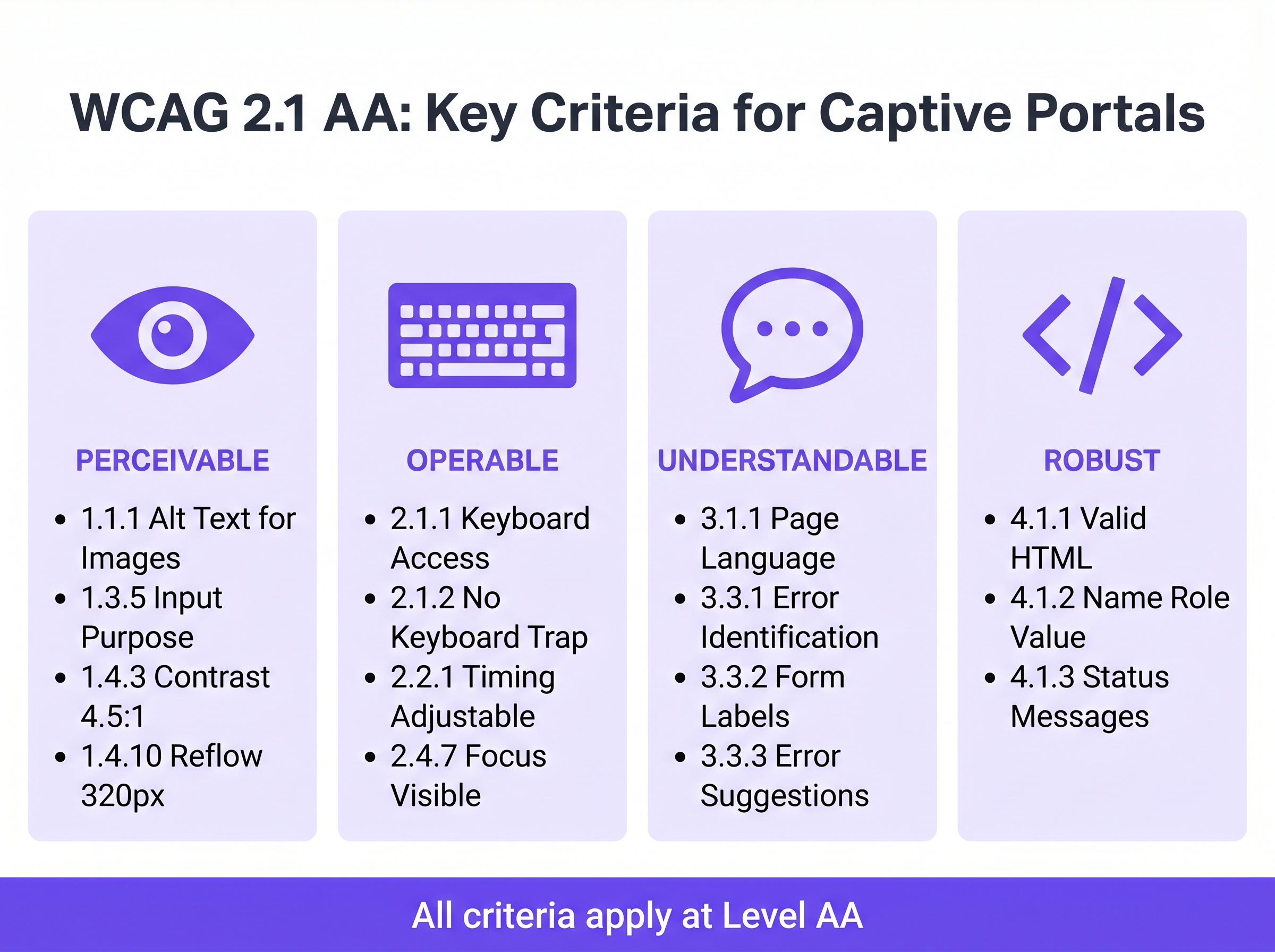
Compreensível: Rótulos de Formulário e Tratamento de Erros
A acessibilidade do formulário é a pedra angular de um captive portal em conformidade. O Critério 3.3.2 (Rótulos ou Instruções) exige rótulos visíveis e persistentes para todos os campos de entrada. Um anti-padrão generalizado no design de UI moderno é o uso de texto de marcador de posição como substituto para rótulos persistentes. O texto de marcador de posição desaparece após a entrada, deixando os utilizadores com deficiências cognitivas sem contexto, e frequentemente falha nos requisitos de contraste.
Quando a autenticação falha — talvez devido a um formato de e-mail inválido ou a um endereço MAC não aceite — o erro deve ser explicitamente identificado e descrito em texto (Critério 3.3.1). Confiar apenas numa borda vermelha para indicar um estado de erro viola tanto as regras de dependência de cor quanto os requisitos de identificação de erro. O texto de erro deve ser programaticamente associado ao campo ofensivo usando o atributo aria-describedby.
Robusto: Compatibilidade com Leitores de Ecrã
O Critério 4.1.2 (Nome, Função, Valor) é a base do suporte a tecnologias de assistência. Cada elemento interativo deve possuir um nome acessível e uma função programática. Quando um utilizador a executar NVDA ou VoiceOver encontra um botão "Connect", o HTML subjacente deve identificá-lo explicitamente como um botão e anunciar o seu propósito. Se o portal depender de botões de login social apenas com ícones (por exemplo, um logótipo do Google ou Facebook) sem rótulos de texto acessíveis, os leitores de ecrã anunciarão apenas "botão" ou "link", não fornecendo contexto ao utilizador.
Guia de Implementação: Construir Portais Acessíveis
Implementar um captive portal acessível requer uma mudança da correção retroativa para o design proativo. The as seguintes fases de implementação garantem a conformidade em toda a infraestrutura de rede.
Fase 1: Arquitetura HTML Semântica
A estratégia de acessibilidade mais eficaz é depender de HTML nativo e semântico, em vez de sobreposições ARIA (Accessible Rich Internet Applications) complexas. Utilize os elementos <form>, <fieldset>, <legend>, <label> e <input> exatamente como pretendido pela especificação. Os elementos nativos herdam a operabilidade por teclado e o suporte a leitores de ecrã por predefinição.
Por exemplo, ao solicitar o consentimento de marketing — um passo crítico para Automação de Marketing Orientada por Eventos Acionada pela Presença WiFi — a caixa de seleção deve ser explicitamente ligada à sua etiqueta usando os atributos for e id. Isto não só garante o anúncio pelo leitor de ecrã, mas também aumenta a área clicável, beneficiando utilizadores com dificuldades de controlo motor.
Fase 2: Gestão de Foco e Modais
Os Captive Portals frequentemente empregam diálogos modais para exibir Termos e Condições abrangentes ou Políticas de Utilização Aceitável. De uma perspetiva de acessibilidade, os modais são componentes de alto risco. Quando um modal abre, o foco do teclado deve ser programaticamente movido para o modal, e o foco deve ser retido dentro dele (Critério 2.1.2: Sem Armadilha de Teclado) até que o utilizador o descarte explicitamente. Se o foco escapar do modal e retornar à página de fundo obscurecida, os utilizadores de leitores de ecrã ficam completamente desorientados.
Fase 3: Anúncios de Estado Dinâmico
As páginas de splash modernas frequentemente processam a autenticação assincronamente via APIs, em vez de forçar recarregamentos completos da página. Embora isto melhore a experiência geral do utilizador, cria lacunas de acessibilidade se as alterações de estado não forem anunciadas. Utilize regiões ARIA live (aria-live="polite" para atualizações de estado, aria-live="assertive" para erros críticos) para garantir que os leitores de ecrã anunciam alterações dinâmicas, como "A ligar à rede..." ou "Autenticação falhou. Por favor, verifique os seus dados."
Melhores Práticas e Metodologia de Teste
A validação da acessibilidade de um Captive Portal requer uma abordagem híbrida. As ferramentas de varredura automatizadas fornecem verificações de linha de base rápidas, mas o teste manual é obrigatório para confirmar a verdadeira operabilidade.
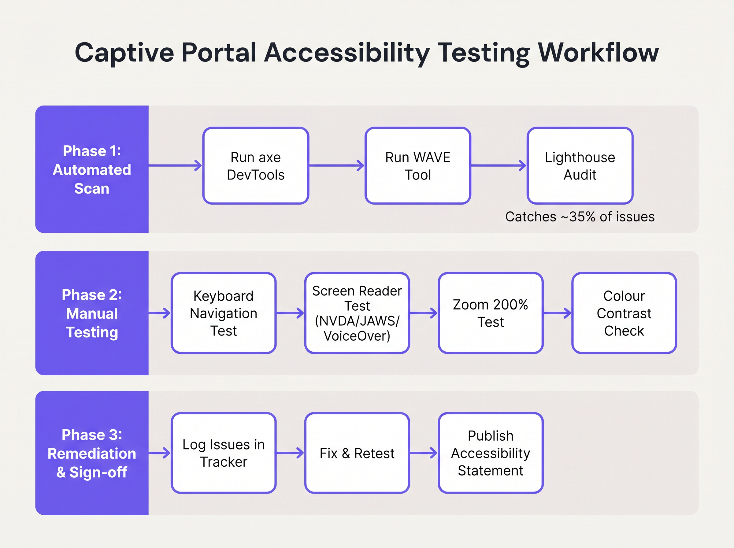
- Varredura Automatizada: Integre ferramentas como axe DevTools ou WAVE no pipeline de desenvolvimento do portal. Estas ferramentas identificam rapidamente problemas estruturais, como texto
altem falta, etiquetas ausentes e violações graves de contraste. No entanto, as ferramentas automatizadas geralmente detetam apenas 30-40% das falhas WCAG. - Auditorias de Navegação por Teclado: Os engenheiros de rede devem testar rotineiramente o portal em tempo real, desconectando o rato e navegando exclusivamente via teclado. Verifique se o indicador de foco (o contorno que realça o elemento ativo) é altamente visível e se a ordem de tabulação segue uma sequência lógica e previsível.
- Verificação com Leitor de Ecrã: Teste o portal usando leitores de ecrã nativos: VoiceOver no iOS (crucial, pois os dispositivos móveis representam a grande maioria das autenticações de Captive Portal), TalkBack no Android, e NVDA ou JAWS no desktop Windows. Verifique se todos os campos de formulário, erros e alterações de estado são anunciados com precisão.
- Responsabilidade do Fornecedor: Ao adquirir serviços WiFi geridos ou plataformas de portal, exija um Voluntary Product Accessibility Template (VPAT) ou um relatório independente de conformidade WCAG 2.1 AA do fornecedor. O construtor de portais da Purple incorpora funcionalidades de acessibilidade fundamentais, simplificando a conformidade para implementações de Guest WiFi .
Resolução de Problemas e Mitigação de Riscos
Quando as auditorias de acessibilidade falham, as causas-raiz são tipicamente encontradas em três áreas específicas da arquitetura do Captive Portal.
A Armadilha da UI Personalizada
Os programadores frequentemente substituem elementos de formulário HTML nativos por construções <div> e <span> personalizadas, estilizadas com CSS para corresponder a diretrizes de marca precisas. Embora visualmente apelativos, estes elementos personalizados removem toda a semântica de acessibilidade nativa.
Mitigação: Construa sempre sobre elementos HTML nativos. Se a estilização personalizada for obrigatória, aplique CSS aos elementos nativos em vez de os substituir. Se um elemento personalizado tiver de ser usado, os programadores devem reconstruir manualmente a pilha de acessibilidade usando funções ARIA, estados e ouvintes de eventos de teclado — um processo complexo e propenso a erros.
A Barreira CAPTCHA
Os CAPTCHAs visuais tradicionais (que exigem que os utilizadores identifiquem texto distorcido ou selecionem imagens de semáforos) são fundamentalmente inacessíveis para utilizadores com deficiências visuais graves.
Mitigação: Implemente soluções CAPTCHA modernas e invisíveis (como reCAPTCHA v3 ou Cloudflare Turnstile) que avaliam o risco com base na telemetria comportamental, em vez da interação do utilizador. Se um desafio for inevitável, uma alternativa de áudio acessível deve ser fornecida.
A Desorientação do Redirecionamento Automático
Após a autenticação bem-sucedida, os Captive Portals tipicamente redirecionam o navegador do utilizador para uma página de destino designada ou para o URL originalmente solicitado. Para utilizadores de leitores de ecrã, as mudanças de contexto súbitas e não anunciadas são altamente desorientadoras.
Mitigação: Forneça uma mensagem de estado clara e intermédia ("Autenticação bem-sucedida. Está agora a ser redirecionado para a internet.") antes de executar o redirecionamento. Garanta que a página de destino também é totalmente acessível.
ROI e Impacto no Negócio
Investir na acessibilidade do Captive Portal oferece retornos mensuráveis para além da mera evitação de riscos. Para entidades do setor público, instituições de ensino e prestadores de cuidados de saúde, a conformidade com WCAG 2.1 AA é um mandato legal rigoroso; o incumprimento convida a investigações formais, penalidades financeiras e crises de relações públicas.
No entanto, em setores comerciais como Retalho e Transportes , a acessibilidade impacta diretamente o resultado final. Um Captive Portal é um canal de aquisição primário para clientes data. Se 15% da população global experiencia alguma forma de deficiência, um portal inacessível impede ativamente uma demografia significativa de aderir a programas de fidelidade ou de optar por comunicações de marketing.
Ao implementar um portal acessível, os operadores de espaços maximizam as taxas de sucesso de autenticação, expandem o seu público-alvo de marketing e demonstram um compromisso tangível com experiências digitais inclusivas. A integração destes portais compatíveis com estratégias de marketing mais amplas — como Mailchimp Plus Purple: Automated Email Marketing from WiFi Sign-Ups — garante que a captura de dados expandida se traduz diretamente num aumento do valor vitalício do cliente.
Termos-Chave e Definições
WCAG 2.1 AA
The Web Content Accessibility Guidelines version 2.1, Level AA. The internationally recognised technical standard for digital accessibility, mandated by law in the UK and US for public-sector digital services.
The benchmark standard that network architects must reference when procuring or designing captive portal solutions to ensure legal compliance.
Assistive Technology (AT)
Hardware or software—such as screen readers, screen magnifiers, or alternative keyboards—used by individuals with disabilities to interact with digital interfaces.
Captive portals must be coded to interface correctly with AT; failure to do so prevents authentication and network access.
Screen Reader
Software that translates on-screen text and interface elements into synthesized speech or braille output (e.g., VoiceOver, NVDA, JAWS).
The primary tool used by visually impaired guests to navigate WiFi splash pages, requiring strict adherence to semantic HTML and ARIA standards.
ARIA (Accessible Rich Internet Applications)
A set of HTML attributes that define ways to make web content and web applications more accessible to people with disabilities.
Used by portal developers to bridge accessibility gaps in complex or dynamic UI components when native HTML is insufficient.
Keyboard Trap
An accessibility failure where a user navigating via keyboard can enter a specific component (like a modal dialog) but cannot use the keyboard to exit it.
A critical failure point in captive portals, often occurring when terms and conditions overlays are poorly implemented, permanently blocking the authentication flow.
Focus Indicator
The visual outline (often a ring) that highlights which interactive element currently has keyboard focus.
Essential for sighted keyboard users to track their position on the portal. Often mistakenly removed by designers for aesthetic reasons using `outline: none` in CSS.
Contrast Ratio
The mathematical difference in luminance between a text color and its background color, ranging from 1:1 to 21:1.
WCAG AA requires a minimum ratio of 4.5:1 for standard text. Network teams must verify brand colors against this metric before deploying splash pages.
Semantic HTML
The use of HTML markup to reinforce the semantics, or meaning, of the information in webpages rather than merely to define its presentation.
The fundamental building block of an accessible portal. Using a `<button>` tag for a submit action rather than a styled `<div>` ensures the browser and screen reader understand the element's purpose.
Estudos de Caso
A 400-room hotel is upgrading its guest WiFi infrastructure. The marketing department has provided a portal design featuring light grey placeholder text inside form fields, custom-styled terms and conditions checkboxes built using `<div>` elements, and a session timeout of 60 seconds to prevent lingering unauthenticated connections. How should the network architect remediate this design for WCAG 2.1 AA compliance?
The network architect must mandate three specific remediations before deployment:
- Form Labels: Replace the placeholder text with persistent, visible
<label>elements positioned above each input field. Ensure the text meets the 4.5:1 contrast ratio requirement against the background. - Native Checkboxes: Discard the custom
<div>checkboxes. Implement native<input type="checkbox">elements, styled via CSS if necessary, ensuring they are reachable via the Tab key and toggleable via the Spacebar. - Timeout Management: The 60-second timeout is too aggressive for users relying on assistive technology. The architect should implement a warning modal at 45 seconds, alerting the user to the impending timeout and providing a clear, keyboard-accessible button to extend the session.
A university IT department is deploying a new captive portal across campus. During testing, they discover that when a user enters an invalid student ID format, the input box border turns red, but VoiceOver on iOS does not announce the error, leaving visually impaired students unable to authenticate. How should the development team fix this?
The team must implement programmatic error association and dynamic announcements.
- They must add a descriptive text error message below the input field (e.g., "Error: Student ID must be 8 digits").
- They must assign a unique ID to the error message element.
- They must add the
aria-describedbyattribute to the input field, referencing the error message's ID. - To ensure immediate announcement upon form submission, the error container should utilize an ARIA live region (e.g.,
aria-live="assertive").
Análise de Cenários
Q1. Your venue marketing team wants to remove the visible text labels from the captive portal login form and rely entirely on placeholder text inside the input fields to achieve a 'cleaner, minimalist aesthetic'. How should you respond?
💡 Dica:Consider WCAG Criterion 3.3.2 (Labels or Instructions) and the behaviour of placeholder text when a user begins typing.
Mostrar Abordagem Recomendada
You must reject this design change. Relying solely on placeholder text violates WCAG 2.1 AA Criterion 3.3.2. Placeholder text disappears as soon as the user begins typing, removing vital context for users with cognitive disabilities. Furthermore, default placeholder text often fails the 4.5:1 minimum contrast ratio requirement. Persistent, visible <label> elements positioned outside the input fields are mandatory for compliance.
Q2. During a manual accessibility audit of your new splash page, you attempt to navigate using only the keyboard. You successfully Tab through the email and name fields, and press Enter to open the 'Terms and Conditions' modal overlay. However, once inside the modal, pressing Tab cycles focus through the background page elements behind the modal, rather than the 'Accept' and 'Decline' buttons within the modal itself. What is this failure called, and how is it resolved?
💡 Dica:Consider how keyboard focus must be managed when dynamic overlays are presented to the user.
Mostrar Abordagem Recomendada
This is a failure of focus management, specifically violating the principles related to keyboard operability and focus order. When the modal opens, the development team must programmatically shift focus into the modal container. More importantly, they must implement a 'focus trap' using JavaScript, ensuring that pressing Tab cycles only through the interactive elements within the modal until the user explicitly dismisses it. Once dismissed, focus must be returned to the button that originally opened the modal.
Q3. A local government client requires that their public WiFi portal meets strict WCAG 2.1 AA standards. They have requested a 2-minute session timeout on the authentication page for security reasons. Is this compliant?
💡 Dica:Review WCAG Criterion 2.2.1 (Timing Adjustable) regarding time limits.
Mostrar Abordagem Recomendada
A strict 2-minute timeout without warning is not compliant. Under WCAG Criterion 2.2.1 (Timing Adjustable), users must be warned before a time limit expires and given at least 20 seconds to extend the time limit with a simple action (e.g., pressing the Spacebar). Users with motor impairments or those using screen readers may require significantly longer than 2 minutes to read terms and conditions and complete form fields.
