Accessibilità del Captive Portal: Guida alla conformità WCAG 2.1
Questa guida autorevole descrive come progettare, testare e implementare Captive Portal che soddisfano gli standard di accessibilità WCAG 2.1 AA. Lettura essenziale per gli operatori di sedi e i team IT che devono affrontare i mandati di conformità del settore pubblico nel Regno Unito e negli Stati Uniti.
🎧 Ascolta questa guida
Visualizza trascrizione
Riepilogo Esecutivo
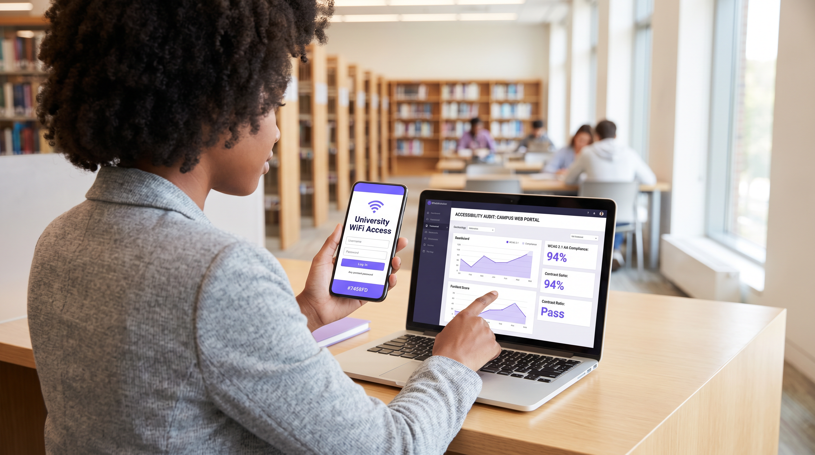
Per i responsabili IT aziendali e i direttori delle operazioni delle sedi, l'accessibilità del Captive Portal non è più un miglioramento opzionale, ma un requisito legale stringente. Le normative sull'accessibilità degli enti del settore pubblico del Regno Unito e la norma finale del 2024 del Dipartimento di Giustizia degli Stati Uniti ai sensi dell'ADA Titolo II impongono che tutti i servizi digitali rivolti al pubblico, incluse le pagine splash WiFi, debbano essere conformi alle Web Content Accessibility Guidelines (WCAG) 2.1 Livello AA. La mancata conformità espone le organizzazioni a rischi legali, danni alla reputazione e ospiti insoddisfatti.
Nonostante ciò, i Captive Portal rimangono uno dei punti di conformità più costantemente trascurati negli ambienti IT moderni. Poiché si trovano all'intersezione tra ingegneria di rete e sviluppo web, spesso bypassano gli audit di accessibilità standard. Questa guida di riferimento tecnico fornisce indicazioni pratiche e neutrali rispetto ai fornitori sulla progettazione, il test e la correzione dei Captive Portal per soddisfare gli standard WCAG 2.1 AA. Implementando queste pratiche, gli architetti di rete possono garantire che le loro implementazioni Guest WiFi forniscano un accesso equo a tutti gli utenti, mitigando al contempo i rischi di conformità in ambienti Hospitality , Retail e del settore pubblico.
Ascolta il nostro briefing esecutivo sulla conformità all'accessibilità del Captive Portal:
Approfondimento Tecnico: WCAG 2.1 AA Applicato ai Captive Portal
Il framework WCAG 2.1 è organizzato attorno a quattro principi fondamentali: Perceivable (Percepibile), Operable (Utilizzabile), Understandable (Comprensibile) e Robust (Robusto) (POUR). Mentre lo standard contiene 50 criteri di successo al Livello AA, un Captive Portal — tipicamente un modulo di autenticazione semplificato — deve affrontare principalmente i criteri che influenzano l'interazione con i moduli, la navigazione da tastiera e la compatibilità con gli screen reader.
Percepibile: Contrasto e Reflow
Il fallimento di accessibilità più frequente nei Captive Portal brandizzati è un contrasto cromatico insufficiente. Il Criterio di Successo 1.4.3 (Contrasto Minimo) richiede un rapporto di contrasto di almeno 4.5:1 per il testo standard e 3:1 per il testo grande o i componenti dell'interfaccia utente. Gli operatori delle sedi tentano frequentemente di applicare i colori primari del brand — come testo grigio chiaro su sfondo bianco — che falliscono immediatamente i controlli di conformità. I team di rete devono collaborare con il marketing per definire una palette digitale accessibile per la splash page.
Inoltre, il Criterio 1.4.10 (Reflow) impone che il contenuto debba essere presentato senza scorrimento orizzontale a una larghezza del viewport di 320 pixel CSS (equivalente a uno zoom del 400% su un monitor desktop). Molti Captive Portal legacy utilizzano contenitori a larghezza fissa che si rompono completamente sotto ingrandimento, bloccando di fatto gli utenti con problemi di vista. Un design responsive moderno è un requisito di base.
Utilizzabile: Navigazione da Tastiera e Temporizzazione della Sessione
Per gli utenti con disabilità motorie che si affidano a tecnologie assistive anziché a un mouse, l'accessibilità da tastiera è fondamentale. Il Criterio 2.1.1 (Tastiera) stabilisce che ogni elemento interattivo sul portale — campi di input, pulsanti di invio e caselle di controllo dei termini di servizio — deve essere raggiungibile e utilizzabile usando solo i tasti Tab, Invio, Spazio e le frecce. Un difetto architettonico comune si verifica quando le caselle di controllo personalizzate vengono implementate come elementi <div> anziché come elementi HTML nativi <input type="checkbox">, rendendole invisibili alla navigazione da tastiera.
Anche la gestione delle sessioni introduce sfide di accessibilità. Il Criterio 2.2.1 (Temporizzazione Regolabile) si applica direttamente alle finestre di timeout di autenticazione configurate sul controller di rete. Se un Captive Portal impone un limite di tempo rigoroso per la registrazione, gli utenti che navigano lentamente utilizzando screen reader o controlli a interruttore verranno disproporzionalmente esclusi per timeout. Il portale deve avvisare l'utente prima che si verifichi il timeout e fornire un meccanismo per estendere la sessione.
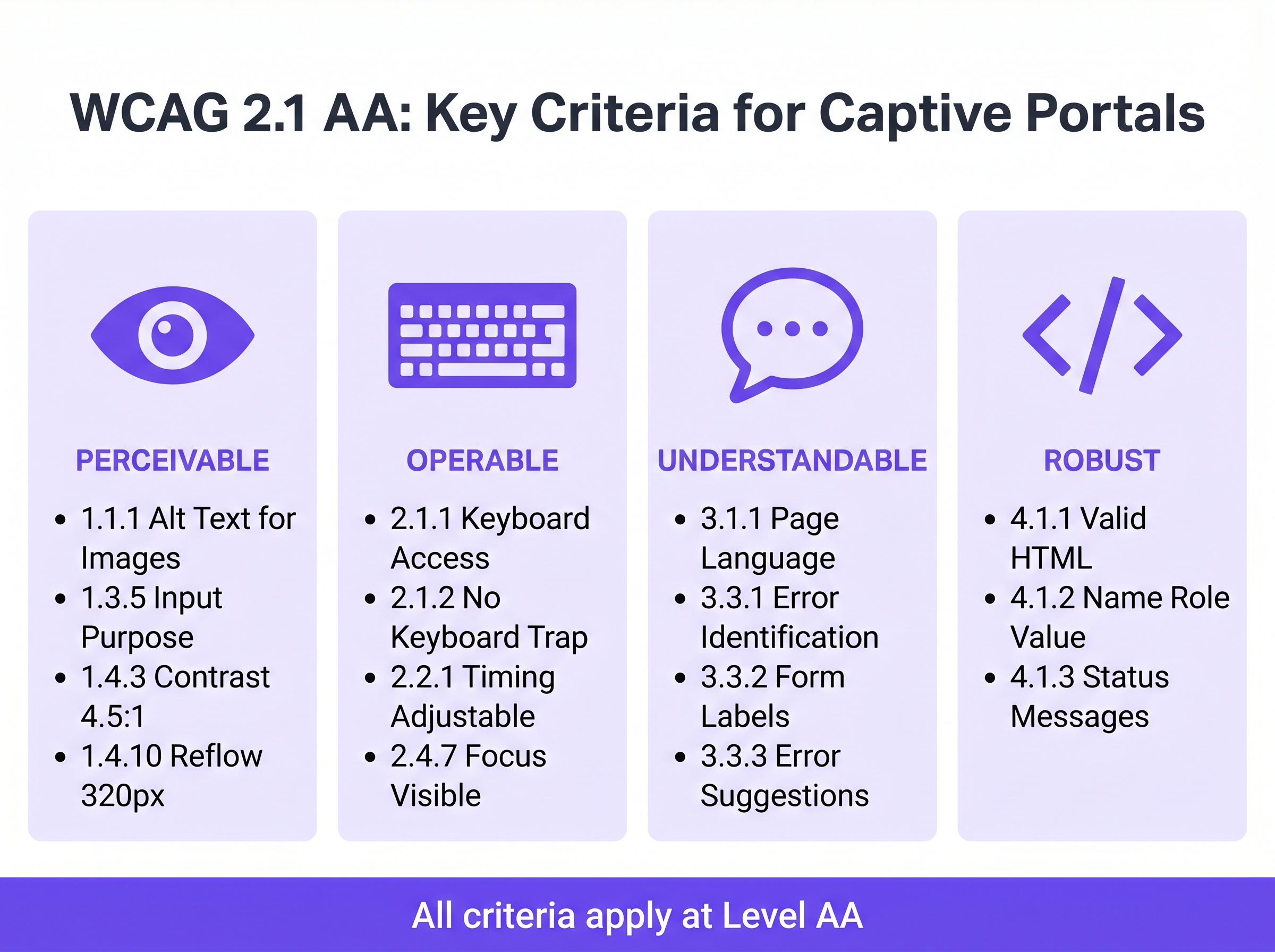
Comprensibile: Etichette dei Moduli e Gestione degli Errori
L'accessibilità dei moduli è la pietra angolare di un Captive Portal conforme. Il Criterio 3.3.2 (Etichette o Istruzioni) richiede etichette visibili e persistenti per tutti i campi di input. Un anti-pattern diffuso nel design moderno dell'interfaccia utente è l'uso del testo segnaposto come sostituto delle etichette persistenti. Il testo segnaposto scompare all'inserimento, lasciando gli utenti con disabilità cognitive senza contesto e spesso non soddisfa i requisiti di contrasto.
Quando l'autenticazione fallisce — magari a causa di un formato email non valido o di un indirizzo MAC non accettato — l'errore deve essere esplicitamente identificato e descritto nel testo (Criterio 3.3.1). Affidarsi esclusivamente a un bordo rosso per indicare uno stato di errore viola sia le regole di dipendenza dal colore che i requisiti di identificazione degli errori. Il testo dell'errore deve essere associato programmaticamente al campo problematico utilizzando l'attributo aria-describedby.
Robusto: Compatibilità con gli Screen Reader
Il Criterio 4.1.2 (Nome, Ruolo, Valore) è il fondamento del supporto alle tecnologie assistive. Ogni elemento interattivo deve possedere un nome accessibile e un ruolo programmatico. Quando un utente che esegue NVDA o VoiceOver incontra un pulsante "Connect", l'HTML sottostante deve identificarlo esplicitamente come un pulsante e annunciarne lo scopo. Se il portale si affida a pulsanti di social login solo con icone (ad esempio, un logo Google o Facebook) senza etichette testuali accessibili, gli screen reader annunceranno semplicemente "pulsante" o "link", non fornendo alcun contesto all'utente.
Guida all'Implementazione: Costruire Portali Accessibili
L'implementazione di un Captive Portal accessibile richiede un passaggio dalla correzione retroattiva alla progettazione proattiva. Qule seguenti fasi di implementazione garantiscono la conformità in tutta l'infrastruttura di rete.
Fase 1: Architettura HTML Semantica
La strategia di accessibilità più efficace si basa sull'HTML nativo e semantico piuttosto che su complessi overlay ARIA (Accessible Rich Internet Applications). Utilizzare gli elementi <form>, <fieldset>, <legend>, <label> e <input> esattamente come previsto dalla specifica. Gli elementi nativi ereditano per impostazione predefinita l'operabilità da tastiera e il supporto per i lettori di schermo.
Ad esempio, quando si richiede il consenso marketing—un passaggio critico per l' Automazione Marketing basata su Eventi Attivati dalla Presenza WiFi —la casella di controllo deve essere esplicitamente collegata alla sua etichetta utilizzando gli attributi for e id. Ciò non solo garantisce l'annuncio da parte del lettore di schermo, ma aumenta anche l'area cliccabile, a vantaggio degli utenti con difficoltà di controllo motorio.
Fase 2: Gestione del Focus e Modali
I Captive Portal utilizzano frequentemente finestre di dialogo modali per visualizzare Termini e Condizioni completi o Politiche di Utilizzo Accettabile. Dal punto di vista dell'accessibilità, i modali sono componenti ad alto rischio. Quando si apre un modale, il focus della tastiera deve essere spostato programmaticamente all'interno del modale, e il focus deve rimanere intrappolato al suo interno (Criterio 2.1.2: Nessuna Trappola da Tastiera) finché l'utente non lo chiude esplicitamente. Se il focus sfugge al modale e ritorna alla pagina di sfondo oscurata, gli utenti di lettori di schermo si disorientano completamente.
Fase 3: Annunci di Stato Dinamici
Le moderne splash page spesso elaborano l'autenticazione in modo asincrono tramite API anziché forzare il ricaricamento completo della pagina. Sebbene ciò migliori l'esperienza utente generale, crea lacune di accessibilità se i cambiamenti di stato non vengono annunciati. Utilizzare le regioni live ARIA (aria-live="polite" per gli aggiornamenti di stato, aria-live="assertive" per gli errori critici) per garantire che i lettori di schermo annuncino i cambiamenti dinamici, come "Connessione alla rete..." o "Autenticazione fallita. Si prega di controllare i dettagli."
Migliori Pratiche e Metodologia di Test
La convalida dell'accessibilità dei Captive Portal richiede un approccio ibrido. Gli strumenti di scansione automatizzati forniscono rapidi controlli di base, ma i test manuali sono obbligatori per confermare la vera operabilità.
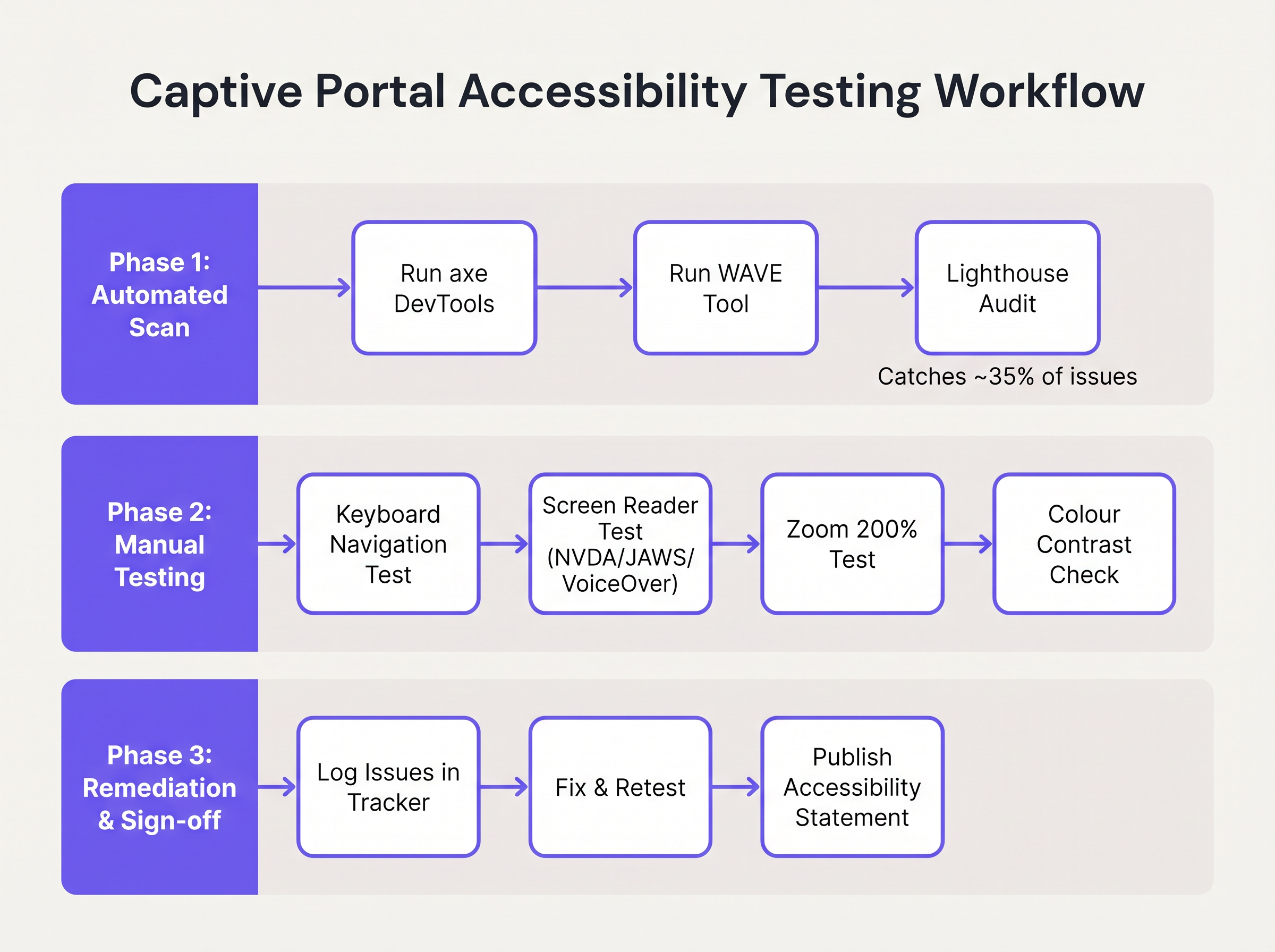
- Scansione Automatica: Integrare strumenti come axe DevTools o WAVE nel processo di sviluppo del portale. Questi strumenti identificano rapidamente problemi strutturali come testo
altmancante, etichette assenti e gravi violazioni del contrasto. Tuttavia, gli strumenti automatizzati di solito rilevano solo il 30-40% dei fallimenti WCAG. - Audit di Navigazione da Tastiera: Gli ingegneri di rete devono testare regolarmente il portale live scollegando il mouse e navigando esclusivamente tramite la tastiera. Verificare che l'indicatore di focus (il contorno che evidenzia l'elemento attivo) sia ben visibile e che l'ordine di tabulazione segua una sequenza logica e prevedibile.
- Verifica con Screen Reader: Testare il portale utilizzando screen reader nativi: VoiceOver su iOS (cruciale, poiché i dispositivi mobili rappresentano la stragrande maggioranza delle autenticazioni Captive Portal), TalkBack su Android e NVDA o JAWS su desktop Windows. Verificare che tutti i campi del modulo, gli errori e i cambiamenti di stato siano annunciati accuratamente.
- Responsabilità del Fornitore: Quando si acquistano servizi WiFi gestiti o piattaforme di portale, richiedere un Voluntary Product Accessibility Template (VPAT) o un rapporto di conformità WCAG 2.1 AA indipendente dal fornitore. Il costruttore di portali di Purple incorpora funzionalità di accessibilità fondamentali, semplificando la conformità per le implementazioni Guest WiFi .
Risoluzione dei Problemi e Mitigazione del Rischio
Quando gli audit di accessibilità falliscono, le cause principali si trovano tipicamente in tre aree specifiche dell'architettura del Captive Portal.
La Trappola dell'Interfaccia Utente Personalizzata
Gli sviluppatori sostituiscono frequentemente gli elementi nativi dei moduli HTML con costrutti <div> e <span> personalizzati, stilizzati con CSS per corrispondere a precise linee guida del marchio. Sebbene visivamente accattivanti, questi elementi personalizzati eliminano tutte le semantiche di accessibilità native.
Mitigazione: Costruire sempre su elementi HTML nativi. Se la stilizzazione personalizzata è obbligatoria, applicare CSS agli elementi nativi anziché sostituirli. Se deve essere utilizzato un elemento personalizzato, gli sviluppatori devono ricostruire manualmente lo stack di accessibilità utilizzando ruoli ARIA, stati e listener di eventi da tastiera—un processo complesso e soggetto a errori.
La Barriera CAPTCHA
I CAPTCHA visivi tradizionali (che richiedono agli utenti di identificare testo distorto o selezionare immagini di semafori) sono fondamentalmente inaccessibili agli utenti con gravi disabilità visive.
Mitigazione: Implementare soluzioni CAPTCHA moderne e invisibili (come reCAPTCHA v3 o Cloudflare Turnstile) che valutano il rischio basandosi sulla telemetria comportamentale piuttosto che sull'interazione dell'utente. Se una sfida è inevitabile, deve essere fornita un'alternativa audio accessibile.
Il Disorientamento da Reindirizzamento Automatico
Dopo un'autenticazione riuscita, i Captive Portal reindirizzano tipicamente il browser dell'utente a una pagina di destinazione designata o all'URL originariamente richiesto. Per gli utenti di screen reader, i cambiamenti di contesto improvvisi e non annunciati sono altamente disorientanti.
Mitigazione: Fornire un messaggio di stato chiaro e intermedio ("Autenticazione riuscita. Si sta per essere reindirizzati a internet.") prima di eseguire il reindirizzamento. Assicurarsi che la pagina di destinazione sia anch'essa completamente accessibile.
ROI e Impatto sul Business
Investire nell'accessibilità dei Captive Portal offre ritorni misurabili che vanno oltre la semplice prevenzione del rischio. Per gli enti del settore pubblico, le istituzioni educative e i fornitori di servizi sanitari, la conformità WCAG 2.1 AA è un mandato legale rigoroso; la mancata conformità comporta indagini formali, sanzioni finanziarie e crisi di pubbliche relazioni.
Tuttavia, nei settori commerciali come Retail e Transport , l'accessibilità influisce direttamente sui profitti. Un Captive Portal è un canale di acquisizione primario per i clienti data. Se il 15% della popolazione globale sperimenta una qualche forma di disabilità, un portale inaccessibile impedisce attivamente a una demografia significativa di aderire a programmi fedeltà o di optare per comunicazioni di marketing.
Implementando un portale accessibile, gli operatori delle sedi massimizzano i tassi di successo dell'autenticazione, espandono il loro pubblico di marketing indirizzabile e dimostrano un impegno tangibile verso esperienze digitali inclusive. L'integrazione di questi portali conformi con strategie di marketing più ampie—come Mailchimp Plus Purple: Email Marketing Automatizzato dalle Iscrizioni WiFi —assicura che l'acquisizione di dati espansa si traduca direttamente in un aumento del valore a vita del cliente.
Termini chiave e definizioni
WCAG 2.1 AA
The Web Content Accessibility Guidelines version 2.1, Level AA. The internationally recognised technical standard for digital accessibility, mandated by law in the UK and US for public-sector digital services.
The benchmark standard that network architects must reference when procuring or designing captive portal solutions to ensure legal compliance.
Assistive Technology (AT)
Hardware or software—such as screen readers, screen magnifiers, or alternative keyboards—used by individuals with disabilities to interact with digital interfaces.
Captive portals must be coded to interface correctly with AT; failure to do so prevents authentication and network access.
Screen Reader
Software that translates on-screen text and interface elements into synthesized speech or braille output (e.g., VoiceOver, NVDA, JAWS).
The primary tool used by visually impaired guests to navigate WiFi splash pages, requiring strict adherence to semantic HTML and ARIA standards.
ARIA (Accessible Rich Internet Applications)
A set of HTML attributes that define ways to make web content and web applications more accessible to people with disabilities.
Used by portal developers to bridge accessibility gaps in complex or dynamic UI components when native HTML is insufficient.
Keyboard Trap
An accessibility failure where a user navigating via keyboard can enter a specific component (like a modal dialog) but cannot use the keyboard to exit it.
A critical failure point in captive portals, often occurring when terms and conditions overlays are poorly implemented, permanently blocking the authentication flow.
Focus Indicator
The visual outline (often a ring) that highlights which interactive element currently has keyboard focus.
Essential for sighted keyboard users to track their position on the portal. Often mistakenly removed by designers for aesthetic reasons using `outline: none` in CSS.
Contrast Ratio
The mathematical difference in luminance between a text color and its background color, ranging from 1:1 to 21:1.
WCAG AA requires a minimum ratio of 4.5:1 for standard text. Network teams must verify brand colors against this metric before deploying splash pages.
Semantic HTML
The use of HTML markup to reinforce the semantics, or meaning, of the information in webpages rather than merely to define its presentation.
The fundamental building block of an accessible portal. Using a `<button>` tag for a submit action rather than a styled `<div>` ensures the browser and screen reader understand the element's purpose.
Casi di studio
A 400-room hotel is upgrading its guest WiFi infrastructure. The marketing department has provided a portal design featuring light grey placeholder text inside form fields, custom-styled terms and conditions checkboxes built using `<div>` elements, and a session timeout of 60 seconds to prevent lingering unauthenticated connections. How should the network architect remediate this design for WCAG 2.1 AA compliance?
The network architect must mandate three specific remediations before deployment:
- Form Labels: Replace the placeholder text with persistent, visible
<label>elements positioned above each input field. Ensure the text meets the 4.5:1 contrast ratio requirement against the background. - Native Checkboxes: Discard the custom
<div>checkboxes. Implement native<input type="checkbox">elements, styled via CSS if necessary, ensuring they are reachable via the Tab key and toggleable via the Spacebar. - Timeout Management: The 60-second timeout is too aggressive for users relying on assistive technology. The architect should implement a warning modal at 45 seconds, alerting the user to the impending timeout and providing a clear, keyboard-accessible button to extend the session.
A university IT department is deploying a new captive portal across campus. During testing, they discover that when a user enters an invalid student ID format, the input box border turns red, but VoiceOver on iOS does not announce the error, leaving visually impaired students unable to authenticate. How should the development team fix this?
The team must implement programmatic error association and dynamic announcements.
- They must add a descriptive text error message below the input field (e.g., "Error: Student ID must be 8 digits").
- They must assign a unique ID to the error message element.
- They must add the
aria-describedbyattribute to the input field, referencing the error message's ID. - To ensure immediate announcement upon form submission, the error container should utilize an ARIA live region (e.g.,
aria-live="assertive").
Analisi degli scenari
Q1. Your venue marketing team wants to remove the visible text labels from the captive portal login form and rely entirely on placeholder text inside the input fields to achieve a 'cleaner, minimalist aesthetic'. How should you respond?
💡 Suggerimento:Consider WCAG Criterion 3.3.2 (Labels or Instructions) and the behaviour of placeholder text when a user begins typing.
Mostra l'approccio consigliato
You must reject this design change. Relying solely on placeholder text violates WCAG 2.1 AA Criterion 3.3.2. Placeholder text disappears as soon as the user begins typing, removing vital context for users with cognitive disabilities. Furthermore, default placeholder text often fails the 4.5:1 minimum contrast ratio requirement. Persistent, visible <label> elements positioned outside the input fields are mandatory for compliance.
Q2. During a manual accessibility audit of your new splash page, you attempt to navigate using only the keyboard. You successfully Tab through the email and name fields, and press Enter to open the 'Terms and Conditions' modal overlay. However, once inside the modal, pressing Tab cycles focus through the background page elements behind the modal, rather than the 'Accept' and 'Decline' buttons within the modal itself. What is this failure called, and how is it resolved?
💡 Suggerimento:Consider how keyboard focus must be managed when dynamic overlays are presented to the user.
Mostra l'approccio consigliato
This is a failure of focus management, specifically violating the principles related to keyboard operability and focus order. When the modal opens, the development team must programmatically shift focus into the modal container. More importantly, they must implement a 'focus trap' using JavaScript, ensuring that pressing Tab cycles only through the interactive elements within the modal until the user explicitly dismisses it. Once dismissed, focus must be returned to the button that originally opened the modal.
Q3. A local government client requires that their public WiFi portal meets strict WCAG 2.1 AA standards. They have requested a 2-minute session timeout on the authentication page for security reasons. Is this compliant?
💡 Suggerimento:Review WCAG Criterion 2.2.1 (Timing Adjustable) regarding time limits.
Mostra l'approccio consigliato
A strict 2-minute timeout without warning is not compliant. Under WCAG Criterion 2.2.1 (Timing Adjustable), users must be warned before a time limit expires and given at least 20 seconds to extend the time limit with a simple action (e.g., pressing the Spacebar). Users with motor impairments or those using screen readers may require significantly longer than 2 minutes to read terms and conditions and complete form fields.
