Captive Portal Accesibilidad: Guía de Cumplimiento WCAG 2.1
Esta guía autorizada detalla cómo diseñar, probar e implementar captive portals que cumplan con los estándares de accesibilidad WCAG 2.1 AA. Lectura esencial para operadores de recintos y equipos de TI que gestionan los mandatos de cumplimiento del sector público del Reino Unido y EE. UU.
🎧 Escucha esta guía
Ver transcripción

Resumen Ejecutivo
Para los líderes de TI empresariales y directores de operaciones de recintos, la accesibilidad del captive portal ya no es una mejora opcional, es un requisito legal estricto. Las Regulaciones de Accesibilidad para Organismos del Sector Público del Reino Unido y la norma final de 2024 del Departamento de Justicia de EE. UU. bajo el Título II de la ADA exigen que todos los servicios digitales de cara al público, incluidas las páginas de inicio de sesión de WiFi, deben cumplir con las Pautas de Accesibilidad para el Contenido Web (WCAG) 2.1 Nivel AA. El incumplimiento expone a las organizaciones a riesgos legales, daño reputacional y huéspedes insatisfechos.
A pesar de esto, los captive portals siguen siendo uno de los puntos de cumplimiento más consistentemente pasados por alto en los entornos de TI modernos. Debido a que se encuentran en la intersección de la ingeniería de redes y el desarrollo web, a menudo eluden las auditorías de accesibilidad estándar. Esta guía de referencia técnica proporciona orientación práctica y neutral respecto al proveedor sobre cómo diseñar, probar y corregir captive portals para cumplir con los estándares WCAG 2.1 AA. Al implementar estas prácticas, los arquitectos de red pueden asegurar que sus implementaciones de Guest WiFi proporcionen acceso equitativo para todos los usuarios, al tiempo que mitigan los riesgos de cumplimiento en entornos de Hostelería , Comercio Minorista y del sector público.
Escuche nuestro informe ejecutivo sobre el cumplimiento de la accesibilidad del captive portal:
Análisis Técnico Detallado: WCAG 2.1 AA Aplicado a Captive Portals
El marco WCAG 2.1 se organiza en torno a cuatro principios fundamentales: Perceptible, Operable, Comprensible y Robusto (POUR). Si bien el estándar contiene 50 criterios de éxito en el Nivel AA, un captive portal —típicamente un formulario de autenticación simplificado— debe abordar principalmente los criterios que afectan la interacción con formularios, la navegación por teclado y la compatibilidad con lectores de pantalla.
Perceptible: Contraste y Reorganización
El fallo de accesibilidad más frecuente en los captive portals de marca es un contraste de color insuficiente. El Criterio de Éxito 1.4.3 (Contraste Mínimo) requiere una relación de contraste de al menos 4.5:1 para texto estándar y 3:1 para texto grande o componentes de UI. Los operadores de recintos con frecuencia intentan aplicar colores de marca primarios —como texto gris claro sobre un fondo blanco— lo que inmediatamente falla las verificaciones de cumplimiento. Los equipos de red deben colaborar con marketing para definir una paleta digital accesible para la página de inicio de sesión.
Además, el Criterio 1.4.10 (Reorganización) exige que el contenido se presente sin desplazamiento horizontal con un ancho de ventana gráfica de 320 píxeles CSS (equivalente a un zoom del 400% en un monitor de escritorio). Muchos captive portals heredados emplean contenedores de ancho fijo que se rompen completamente bajo la magnificación, bloqueando efectivamente a los usuarios con baja visión. El diseño responsivo moderno es un requisito básico.
Operable: Navegación por Teclado y Tiempo de Sesión
Para los usuarios con discapacidades motoras que dependen de tecnologías de asistencia en lugar de un ratón, la accesibilidad del teclado es fundamental. El Criterio 2.1.1 (Teclado) dicta que cada elemento interactivo en el portal —campos de entrada, botones de envío y casillas de verificación de términos de servicio— debe ser accesible y operable utilizando solo las teclas Tab, Enter, Espacio y las flechas. Un fallo arquitectónico común ocurre cuando las casillas de verificación con estilo personalizado se implementan como elementos <div> en lugar de elementos HTML nativos <input type="checkbox">, lo que las hace invisibles para la navegación por teclado.
La gestión de sesiones también introduce desafíos de accesibilidad. El Criterio 2.2.1 (Tiempo Ajustable) se aplica directamente a las ventanas de tiempo de espera de autenticación configuradas en el controlador de red. Si un captive portal impone un límite de tiempo estricto para el registro, los usuarios que navegan lentamente usando lectores de pantalla o controles de conmutación serán desproporcionadamente desconectados por tiempo de espera. El portal debe advertir al usuario antes de que ocurra el tiempo de espera y proporcionar un mecanismo para extender la sesión.
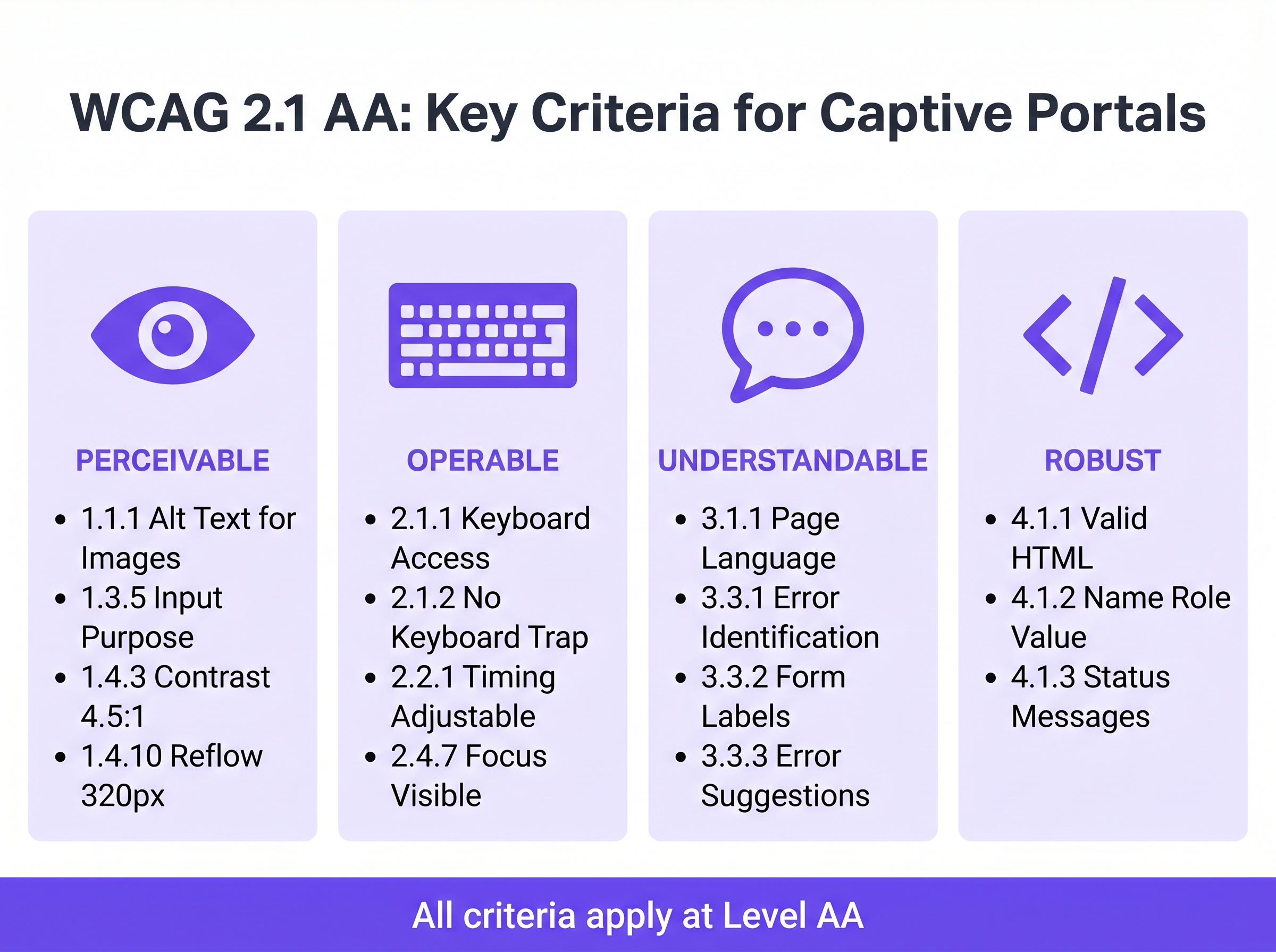
Comprensible: Etiquetas de Formulario y Manejo de Errores
La accesibilidad de los formularios es la piedra angular de un captive portal que cumple con las normativas. El Criterio 3.3.2 (Etiquetas o Instrucciones) requiere etiquetas visibles y persistentes para todos los campos de entrada. Un anti-patrón generalizado en el diseño de UI moderno es el uso de texto de marcador de posición como sustituto de etiquetas persistentes. El texto de marcador de posición desaparece al introducir datos, dejando a los usuarios con discapacidades cognitivas sin contexto, y con frecuencia no cumple los requisitos de contraste.
Cuando la autenticación falla —quizás debido a un formato de correo electrónico no válido o una dirección MAC no aceptada— el error debe ser identificado y descrito explícitamente en texto (Criterio 3.3.1). Depender únicamente de un borde rojo para indicar un estado de error viola tanto las reglas de dependencia del color como los requisitos de identificación de errores. El texto de error debe asociarse programáticamente con el campo infractor utilizando el atributo aria-describedby.
Robusto: Compatibilidad con Lectores de Pantalla
El Criterio 4.1.2 (Nombre, Rol, Valor) es la base del soporte de tecnología de asistencia. Cada elemento interactivo debe poseer un nombre accesible y un rol programático. Cuando un usuario que ejecuta NVDA o VoiceOver encuentra un botón "Connect", el HTML subyacente debe identificarlo explícitamente como un botón y anunciar su propósito. Si el portal depende de botones de inicio de sesión social solo con iconos (por ejemplo, un logotipo de Google o Facebook) sin etiquetas de texto accesibles, los lectores de pantalla simplemente anunciarán "botón" o "enlace", sin proporcionar contexto al usuario.
Guía de Implementación: Construyendo Portales Accesibles
Implementar un captive portal accesible requiere un cambio de la corrección retroactiva al diseño proactivo. ElLas siguientes fases de implementación garantizan el cumplimiento en toda la infraestructura de red.
Fase 1: Arquitectura HTML Semántica
La estrategia de accesibilidad más efectiva es depender del HTML nativo y semántico en lugar de superposiciones complejas de ARIA (Accessible Rich Internet Applications). Utilice los elementos <form>, <fieldset>, <legend>, <label> e <input> exactamente como lo prevé la especificación. Los elementos nativos heredan la operabilidad del teclado y el soporte para lectores de pantalla por defecto.
Por ejemplo, al solicitar el consentimiento de marketing —un paso crítico para la Automatización de Marketing Basada en Eventos Activada por Presencia WiFi — la casilla de verificación debe vincularse explícitamente a su etiqueta utilizando los atributos for e id. Esto no solo garantiza el anuncio por parte del lector de pantalla, sino que también aumenta el área de clic, beneficiando a los usuarios con dificultades de control motor.
Fase 2: Gestión del Enfoque y Modales
Los Captive Portals frecuentemente emplean diálogos modales para mostrar Términos y Condiciones completos o Políticas de Uso Aceptable. Desde una perspectiva de accesibilidad, los modales son componentes de alto riesgo. Cuando se abre un modal, el enfoque del teclado debe moverse programáticamente al modal, y el enfoque debe quedar atrapado dentro de él (Criterio 2.1.2: Sin Trampa de Teclado) hasta que el usuario lo descarte explícitamente. Si el enfoque escapa del modal y regresa a la página de fondo oscurecida, los usuarios de lectores de pantalla se desorientan por completo.
Fase 3: Anuncios de Estado Dinámico
Las páginas de bienvenida modernas a menudo procesan la autenticación de forma asíncrona a través de APIs en lugar de forzar recargas completas de la página. Si bien esto mejora la experiencia general del usuario, crea brechas de accesibilidad si los cambios de estado no se anuncian. Utilice las regiones ARIA live (aria-live="polite" para actualizaciones de estado, aria-live="assertive" para errores críticos) para asegurar que los lectores de pantalla anuncien cambios dinámicos, como "Conectando a la red..." o "Autenticación fallida. Por favor, verifique sus datos."
Mejores Prácticas y Metodología de Pruebas
La validación de la accesibilidad de un Captive Portal requiere un enfoque híbrido. Las herramientas de escaneo automatizado proporcionan verificaciones rápidas de referencia, pero las pruebas manuales son obligatorias para confirmar la verdadera operabilidad.
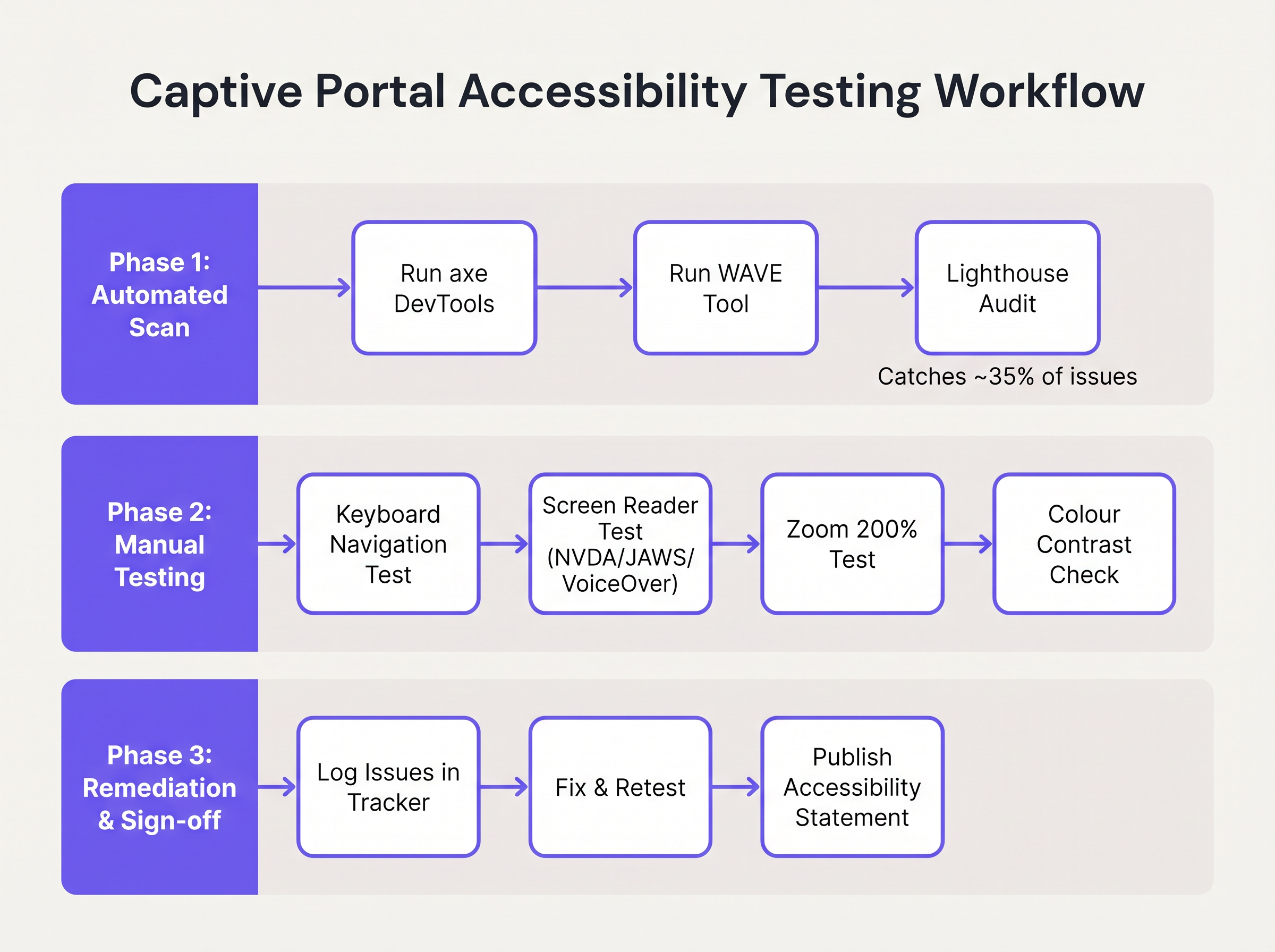
- Escaneo Automatizado: Integre herramientas como axe DevTools o WAVE en el proceso de desarrollo del portal. Estas herramientas identifican rápidamente problemas estructurales como texto
altfaltante, etiquetas ausentes y violaciones severas de contraste. Sin embargo, las herramientas automatizadas suelen detectar solo el 30-40% de las fallas de WCAG. - Auditorías de Navegación por Teclado: Los ingenieros de red deben probar rutinariamente el portal en vivo desconectando el mouse y navegando exclusivamente a través del teclado. Verifique que el indicador de enfoque (el contorno que resalta el elemento activo) sea altamente visible y que el orden de tabulación siga una secuencia lógica y predecible.
- Verificación con Lector de Pantalla: Pruebe el portal utilizando lectores de pantalla nativos: VoiceOver en iOS (crucial, ya que los dispositivos móviles representan la gran mayoría de las autenticaciones de Captive Portal), TalkBack en Android, y NVDA o JAWS en Windows de escritorio. Verifique que todos los campos de formulario, errores y cambios de estado se anuncien con precisión.
- Responsabilidad del Proveedor: Al adquirir servicios gestionados de WiFi o plataformas de portal, exija una Plantilla Voluntaria de Accesibilidad del Producto (VPAT) o un informe de conformidad WCAG 2.1 AA independiente del proveedor. El constructor de portales de Purple incorpora características fundamentales de accesibilidad, agilizando el cumplimiento para implementaciones de Guest WiFi .
Solución de Problemas y Mitigación de Riesgos
Cuando las auditorías de accesibilidad fallan, las causas raíz se encuentran típicamente en tres áreas específicas de la arquitectura del Captive Portal.
La Trampa de la Interfaz de Usuario Personalizada
Los desarrolladores frecuentemente reemplazan los elementos nativos de formulario HTML con construcciones personalizadas de <div> y <span> estilizadas con CSS para que coincidan con las directrices precisas de la marca. Aunque visualmente atractivos, estos elementos personalizados eliminan toda la semántica de accesibilidad nativa.
Mitigación: Siempre construya sobre elementos HTML nativos. Si el estilo personalizado es obligatorio, aplique CSS a los elementos nativos en lugar de reemplazarlos. Si se debe usar un elemento personalizado, los desarrolladores deben reconstruir manualmente la pila de accesibilidad utilizando roles ARIA, estados y oyentes de eventos de teclado, un proceso complejo y propenso a errores.
La Barrera CAPTCHA
Los CAPTCHA visuales tradicionales (que requieren que los usuarios identifiquen texto distorsionado o seleccionen imágenes de semáforos) son fundamentalmente inaccesibles para usuarios con discapacidades visuales graves.
Mitigación: Implemente soluciones CAPTCHA modernas e invisibles (como reCAPTCHA v3 o Cloudflare Turnstile) que evalúen el riesgo basándose en la telemetría conductual en lugar de la interacción del usuario. Si un desafío es inevitable, se debe proporcionar una alternativa de audio accesible.
La Desorientación por Redirección Automática
Tras una autenticación exitosa, los Captive Portals suelen redirigir el navegador del usuario a una página de destino designada o a la URL solicitada originalmente. Para los usuarios de lectores de pantalla, los cambios de contexto repentinos y no anunciados son altamente desorientadores.
Mitigación: Proporcione un mensaje de estado intermedio claro ("Autenticación exitosa. Ahora está siendo redirigido a internet.") antes de ejecutar la redirección. Asegúrese de que la página de destino también sea totalmente accesible.
ROI e Impacto Comercial
Invertir en la accesibilidad de un Captive Portal ofrece retornos medibles más allá de la mera evitación de riesgos. Para las entidades del sector público, instituciones educativas y proveedores de atención médica, el cumplimiento de WCAG 2.1 AA es un mandato legal estricto; el incumplimiento invita a investigaciones formales, sanciones financieras y crisis de relaciones públicas.
Sin embargo, en sectores comerciales como Retail y Transport , la accesibilidad impacta directamente en los resultados finales. Un Captive Portal es un canal de adquisición principal para el cliente data. Si el 15% de la población mundial experimenta alguna forma de discapacidad, un portal inaccesible impide activamente que un grupo demográfico significativo se una a programas de lealtad o se suscriba a comunicaciones de marketing.
Al implementar un portal accesible, los operadores de recintos maximizan las tasas de éxito de autenticación, amplían su audiencia de marketing direccionable y demuestran un compromiso tangible con experiencias digitales inclusivas. La integración de estos portales conformes con estrategias de marketing más amplias —como Mailchimp Plus Purple: Marketing por correo electrónico automatizado a partir de registros de WiFi — asegura que la captura de datos ampliada se traduzca directamente en un mayor valor de vida del cliente.
Términos clave y definiciones
WCAG 2.1 AA
The Web Content Accessibility Guidelines version 2.1, Level AA. The internationally recognised technical standard for digital accessibility, mandated by law in the UK and US for public-sector digital services.
The benchmark standard that network architects must reference when procuring or designing captive portal solutions to ensure legal compliance.
Assistive Technology (AT)
Hardware or software—such as screen readers, screen magnifiers, or alternative keyboards—used by individuals with disabilities to interact with digital interfaces.
Captive portals must be coded to interface correctly with AT; failure to do so prevents authentication and network access.
Screen Reader
Software that translates on-screen text and interface elements into synthesized speech or braille output (e.g., VoiceOver, NVDA, JAWS).
The primary tool used by visually impaired guests to navigate WiFi splash pages, requiring strict adherence to semantic HTML and ARIA standards.
ARIA (Accessible Rich Internet Applications)
A set of HTML attributes that define ways to make web content and web applications more accessible to people with disabilities.
Used by portal developers to bridge accessibility gaps in complex or dynamic UI components when native HTML is insufficient.
Keyboard Trap
An accessibility failure where a user navigating via keyboard can enter a specific component (like a modal dialog) but cannot use the keyboard to exit it.
A critical failure point in captive portals, often occurring when terms and conditions overlays are poorly implemented, permanently blocking the authentication flow.
Focus Indicator
The visual outline (often a ring) that highlights which interactive element currently has keyboard focus.
Essential for sighted keyboard users to track their position on the portal. Often mistakenly removed by designers for aesthetic reasons using `outline: none` in CSS.
Contrast Ratio
The mathematical difference in luminance between a text color and its background color, ranging from 1:1 to 21:1.
WCAG AA requires a minimum ratio of 4.5:1 for standard text. Network teams must verify brand colors against this metric before deploying splash pages.
Semantic HTML
The use of HTML markup to reinforce the semantics, or meaning, of the information in webpages rather than merely to define its presentation.
The fundamental building block of an accessible portal. Using a `<button>` tag for a submit action rather than a styled `<div>` ensures the browser and screen reader understand the element's purpose.
Casos de éxito
A 400-room hotel is upgrading its guest WiFi infrastructure. The marketing department has provided a portal design featuring light grey placeholder text inside form fields, custom-styled terms and conditions checkboxes built using `<div>` elements, and a session timeout of 60 seconds to prevent lingering unauthenticated connections. How should the network architect remediate this design for WCAG 2.1 AA compliance?
The network architect must mandate three specific remediations before deployment:
- Form Labels: Replace the placeholder text with persistent, visible
<label>elements positioned above each input field. Ensure the text meets the 4.5:1 contrast ratio requirement against the background. - Native Checkboxes: Discard the custom
<div>checkboxes. Implement native<input type="checkbox">elements, styled via CSS if necessary, ensuring they are reachable via the Tab key and toggleable via the Spacebar. - Timeout Management: The 60-second timeout is too aggressive for users relying on assistive technology. The architect should implement a warning modal at 45 seconds, alerting the user to the impending timeout and providing a clear, keyboard-accessible button to extend the session.
A university IT department is deploying a new captive portal across campus. During testing, they discover that when a user enters an invalid student ID format, the input box border turns red, but VoiceOver on iOS does not announce the error, leaving visually impaired students unable to authenticate. How should the development team fix this?
The team must implement programmatic error association and dynamic announcements.
- They must add a descriptive text error message below the input field (e.g., "Error: Student ID must be 8 digits").
- They must assign a unique ID to the error message element.
- They must add the
aria-describedbyattribute to the input field, referencing the error message's ID. - To ensure immediate announcement upon form submission, the error container should utilize an ARIA live region (e.g.,
aria-live="assertive").
Análisis de escenarios
Q1. Your venue marketing team wants to remove the visible text labels from the captive portal login form and rely entirely on placeholder text inside the input fields to achieve a 'cleaner, minimalist aesthetic'. How should you respond?
💡 Sugerencia:Consider WCAG Criterion 3.3.2 (Labels or Instructions) and the behaviour of placeholder text when a user begins typing.
Mostrar enfoque recomendado
You must reject this design change. Relying solely on placeholder text violates WCAG 2.1 AA Criterion 3.3.2. Placeholder text disappears as soon as the user begins typing, removing vital context for users with cognitive disabilities. Furthermore, default placeholder text often fails the 4.5:1 minimum contrast ratio requirement. Persistent, visible <label> elements positioned outside the input fields are mandatory for compliance.
Q2. During a manual accessibility audit of your new splash page, you attempt to navigate using only the keyboard. You successfully Tab through the email and name fields, and press Enter to open the 'Terms and Conditions' modal overlay. However, once inside the modal, pressing Tab cycles focus through the background page elements behind the modal, rather than the 'Accept' and 'Decline' buttons within the modal itself. What is this failure called, and how is it resolved?
💡 Sugerencia:Consider how keyboard focus must be managed when dynamic overlays are presented to the user.
Mostrar enfoque recomendado
This is a failure of focus management, specifically violating the principles related to keyboard operability and focus order. When the modal opens, the development team must programmatically shift focus into the modal container. More importantly, they must implement a 'focus trap' using JavaScript, ensuring that pressing Tab cycles only through the interactive elements within the modal until the user explicitly dismisses it. Once dismissed, focus must be returned to the button that originally opened the modal.
Q3. A local government client requires that their public WiFi portal meets strict WCAG 2.1 AA standards. They have requested a 2-minute session timeout on the authentication page for security reasons. Is this compliant?
💡 Sugerencia:Review WCAG Criterion 2.2.1 (Timing Adjustable) regarding time limits.
Mostrar enfoque recomendado
A strict 2-minute timeout without warning is not compliant. Under WCAG Criterion 2.2.1 (Timing Adjustable), users must be warned before a time limit expires and given at least 20 seconds to extend the time limit with a simple action (e.g., pressing the Spacebar). Users with motor impairments or those using screen readers may require significantly longer than 2 minutes to read terms and conditions and complete form fields.
