A guest walks into your hotel lobby after a delayed train, opens their phone, taps your WiFi, and hits a captive portal that asks for too much, loads too slowly, or fails halfway through. They haven't reached the room yet, but they've already formed an opinion about your operation.
That moment is where digital user experience stops being a website problem and becomes a venue problem.
In physical spaces, the first digital interaction is often WiFi access, a guest portal, a loyalty sign-up, a visitor check-in, or a post-visit survey. If that journey is clumsy, people feel it immediately. If it's smooth, they move on without friction and your team gets cleaner data, fewer complaints, and better engagement. That's why user experience metrics matter in venues. They turn “people seem annoyed” into something you can diagnose, improve, and monitor.
Why User Experience Metrics Matter for Your Venue
In a venue, poor UX rarely looks dramatic. It looks like a guest asking reception for the WiFi code again. A shopper abandoning a sign-up screen. A contractor in an office reception area switching to mobile data because the onboarding page keeps looping.
Those are service failures, even if the network itself is technically up.
The UK gives this a useful lens. The Office for National Statistics reported that in 2023, 92% of UK adults were recent internet users, and 61% used a mobile phone as their main device, as cited in this UK customer experience metrics overview . In practice, that means many individuals arrive with expectations shaped by mobile-first digital services. If your venue's authentication flow struggles on a phone screen, the issue isn't minor. It affects the default way people access digital services.
The first digital handshake
For hotels, restaurants, shopping centres, hospitals, and offices, WiFi login is often the first digital handshake with the brand. It sets the tone for everything after it.
A well-designed flow does three things:
- Gets people connected quickly: They can move on to what they came to do.
- Reduces operational drag: Front desk staff and help desks spend less time solving preventable access issues.
- Improves data quality: Fewer drop-offs during sign-up means better consent capture, cleaner first-party records, and a more reliable picture of visitor behaviour.
Why venue teams need measurement, not opinion
Many operators still assess UX by listening for complaints. That misses too much. Users often won't report a broken or awkward experience. They'll just give up, use their own connection, or leave with a slightly worse view of the venue.
Poor venue UX usually hides in small failures repeated all day.
User experience metrics give you a practical operating model. Instead of asking whether the portal “looks modern”, you ask whether people can complete the task, how long it takes, where errors happen, and whether different visitor groups experience the flow differently.
That's a stronger way to run a venue because it ties digital interactions to real service quality, not aesthetics.
Understanding Behavioural vs Attitudinal Metrics
Most venue teams get better decisions once they split user experience metrics into two groups: behavioural and attitudinal.
That distinction matters because people don't always do what they say, and they don't always say what the data alone can explain.

What users do
Behavioural metrics capture observed actions. In a store, that might mean where people move, how long they stay, whether they return, or whether they complete a purchase. In a WiFi journey, it means whether someone starts the login flow, completes it, retries, abandons, or gets stuck on a specific step.
This data is useful because it records actual performance. It doesn't depend on memory or mood. If users repeatedly fail at the same form field or stall on the same page, the behaviour tells you there's a design or process problem.
Typical venue examples include:
- Authentication completion: Did the visitor get online?
- Time to connect: How long did it take from first tap to successful access?
- Drop-off point: Where in the flow did people leave?
- Repeat visit behaviour: Do people reconnect smoothly on later visits?
What users say
Attitudinal metrics capture reported perception. You ask people how easy, satisfying, or frustrating the experience felt.
A flow can look successful in the data and still feel poor. For instance, a guest may eventually connect, but only after several retries, uncertainty, and irritation. While behaviour shows completion, attitude reveals the cost of getting there.
A short survey after authentication can answer questions such as:
- Was the process easy to understand?
- Did the login feel fast enough?
- Would the visitor recommend the experience overall?
- Did the digital journey match the quality of the physical venue?
Practical rule: If behavioural data tells you where the problem is, attitudinal data helps you understand why the problem matters to users.
Why you need both in a venue
A shopping centre marketing team might see strong connection volume and assume all is well. Then a satisfaction check reveals that visitors dislike having to repeat consent steps on each visit. An office IT lead might see low survey complaints but discover in behavioural data that mobile users abandon the onboarding flow more often than desktop users.
Neither side is enough on its own.
A simple way to think about it is this:
| Metric type | Venue question it answers | Example |
|---|---|---|
| Behavioural | What happened? | Visitors failed on the registration page |
| Attitudinal | How did it feel? | Guests said the process felt confusing |
The strongest programmes combine both. Watch the journey. Then ask about the experience.
Behavioural Metrics You Can Measure Today
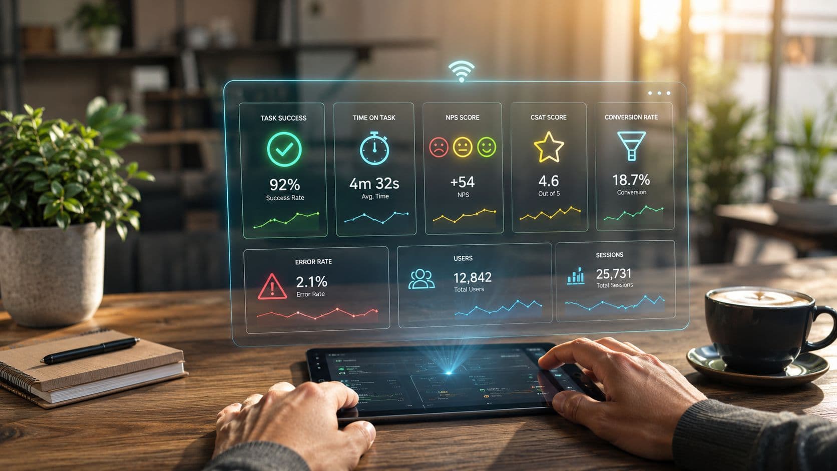
The most useful behavioural metrics for venue UX are usually the simplest ones. In UK digital services guidance, task success rate, time on task, and error rate are often treated as the most actionable trio because together they show effectiveness, efficiency, and breakdown severity, as described in this guide to UX metrics and KPIs .
That framework maps neatly onto venue WiFi.

Task success rate
Task success rate asks a blunt question. Did the user complete the job?
For a venue, the task might be:
- connecting to guest WiFi
- registering as a first-time visitor
- accepting terms and reaching the confirmation screen
- accessing a guest portal after authentication
The standard definition is the percentage of users who complete a task.
A practical formula is:
Task success rate = successful completions / total attempts
This is the first metric I'd put in front of any hotel or enterprise team because it strips away design debate. If a meaningful share of users start and fail, the experience is broken. It doesn't matter whether the screen is on-brand.
Time on task
Some teams stop at completion. That's a mistake.
A user can eventually get connected and still have a bad experience if the process takes too long, especially while standing in a queue, waiting in a lobby, or trying to join a meeting from reception.
Time on task = duration taken to complete the task
In venue terms, this often means the time between selecting the network and receiving usable internet access. If the time stretches because the portal is slow, the form is too long, or the instructions are unclear, people feel that friction immediately.
Time on task is especially valuable when:
- your completion rate looks acceptable
- support teams still hear complaints
- mobile users seem slower than desktop users
- different sites use different captive portal designs
Error rate
Error rate helps separate slow journeys from broken ones.
The standard definition is errors divided by task attempts.
Error rate = total errors / total attempts
In a WiFi context, an error can include:
- invalid form submissions
- repeated verification failures
- retries caused by expired sessions
- clicks on the wrong CTA because the layout is unclear
A high error rate often points to one of two things. Either the interface is unclear, or the process is asking too much from people in the wrong context. A hotel guest in a lobby doesn't want to fill out a long form. A retail visitor won't tolerate multiple redirects just to get basic connectivity.
If users need instructions to complete guest WiFi, the flow is already carrying too much weight.
Retention and repeat connection
Retention is useful in venues when repeat visits matter. A hospitality brand wants returning guests to reconnect with little effort. A corporate site wants regular visitors and contractors to move through access quickly. A shopping centre wants a known visitor to authenticate cleanly and continue their visit.
In physical environments, retention often shows up as repeat successful connections and reduced friction on return visits rather than app-style daily usage.
That's where WiFi analytics becomes more than a network report. It becomes a UX instrument. Tools that track login completion, dwell, return behaviour, and on-site movement can help teams tie digital friction to real footfall and visit patterns. For example, platforms with guest WiFi analytics for venues can show whether visitors complete onboarding, how they behave after connection, and whether return journeys are smoother than first-time ones.
What works and what doesn't
Here's the trade-off I see most often:
| What works | What doesn't |
|---|---|
| Measuring one critical task end to end | Reporting only total connections |
| Separating first-time and returning visitors | Averaging everyone together |
| Looking at completion, speed, and errors together | Treating a single success metric as enough |
| Reviewing mobile journeys in detail | Assuming desktop logic applies in-venue |
Start with one journey. Usually that's WiFi authentication. If you can measure success, speed, and failure clearly, you already know far more than teams relying on complaints alone.
Attitudinal Metrics for Deeper Insights
Behavioural data tells you what happened. It doesn't tell you whether the experience felt effortless, irritating, or out of step with the standard of the venue itself.
That's where attitudinal metrics earn their place.
A guest may complete your WiFi login in the end. If they describe it as clunky, intrusive, or confusing, that feedback matters because it shapes whether they trust the rest of your digital touchpoints.
CSAT for in-the-moment reactions
Customer Satisfaction (CSAT) is usually the most practical attitudinal metric for venue teams because it captures immediate sentiment right after the experience.
If someone has just connected to WiFi, checked in, or accessed a portal, a short satisfaction question can tell you whether the flow felt acceptable in context. That timing matters. In-venue experiences are quick and situational. If you wait too long, people forget the details.
Use CSAT when you want to learn:
- whether the login process felt smooth
- whether a recent change improved perception
- whether certain sites or devices create frustration
A short prompt after successful access often works better than a long survey later. Keep it tight. Ask one or two useful questions, not ten.

NPS for broader brand loyalty
Net Promoter Score (NPS) sits at a different level. It isn't really about the login flow alone. It's about loyalty and recommendation.
That makes it useful if your venue wants to understand whether digital interactions are helping or hurting the wider brand experience. A hotel chain, premium workspace, or private healthcare provider may care whether digital touchpoints support an overall feeling of confidence and quality.
NPS is less useful when used in isolation on a single journey. It's too broad for diagnosing a specific friction point. If the WiFi experience is the problem, NPS might move slowly or hide the issue entirely.
Use NPS when:
- you want a broader relationship signal
- you're comparing the digital touchpoint against wider brand perception
- you can segment responses by site, user type, or journey stage
SUS for usability quality
System Usability Scale (SUS) is more focused on usability than loyalty. It helps when you need a more structured view of whether a system feels easy to use.
For venue environments, SUS can be valuable when testing:
- a guest onboarding portal
- a resident app in build-to-rent or student housing
- a staff self-service network access process
- a multi-step registration experience used across multiple sites
SUS is less conversational than CSAT, so it's better suited to periodic evaluation than constant live deployment. I'd use it when a team is redesigning a flow and wants a consistent way to compare versions over time.
How to collect attitudinal feedback without annoying users
The usual mistake is over-surveying. A venue already asks enough of people. If the WiFi flow demands registration, consent, and verification, then a bulky feedback form at the end just adds fatigue.
A better approach is selective collection:
- After successful authentication: Ask a brief ease or satisfaction question.
- After repeated failed attempts: Trigger a lighter rescue question or support option.
- After a return visit: Ask whether the process felt easier this time.
- During redesign periods: Run a focused usability pulse rather than permanent survey clutter.
For teams using captive portal workflows, platforms that support WiFi survey collection within the access journey can make that easier because the request appears at a moment when the experience is still fresh.
A short question at the right moment beats a detailed survey sent too late.
What these metrics are really for
Attitudinal metrics are not there to flatter the team. They're there to challenge your assumptions.
If your connection data looks healthy but users report confusion, believe the tension and investigate it. If ratings improve while a specific user group starts struggling, the average may be hiding a worse problem. That's why attitudinal metrics are strongest when paired with segmentation, context, and real behaviour, not when treated as standalone proof that the experience is good.
Connecting UX Metrics to Business Goals
Venue teams rarely get budget for “better UX” as an abstract idea. They get budget to reduce support load, improve guest satisfaction, increase opt-ins, strengthen loyalty, and make digital services easier to operate.
That's why user experience metrics need to connect to business goals directly.
The UK public-sector precedent is useful here. The UK Service Standard, formalised in 2014, treats user experience as something measurable and operational rather than a matter of taste, as described in this overview of measurable UX practice . Businesses should think the same way. If people can't complete a core digital task in your venue, service quality is already compromised.

The business translation
A faster WiFi login isn't just a nicer experience. It can mean fewer interruptions for front desk staff. A cleaner registration flow doesn't just improve usability. It can mean more people complete consented sign-up journeys. Better repeat authentication doesn't just help convenience. It can support loyalty and reduce churn in regular visitors.
Here's a practical mapping.
| UX Metric | Hospitality Goal (Hotel/Restaurant) | Retail Goal (Shopping Centre) | Enterprise Goal (Office) |
|---|---|---|---|
| Task success rate | More guests complete WiFi access and portal entry | More visitors complete sign-up and connect on site | More staff and visitors access network services without support |
| Time on task | Faster check-in feel and fewer reception interruptions | Less abandonment during in-store or mall WiFi onboarding | Smoother arrival experience for staff, guests, and contractors |
| Error rate | Fewer login complaints and fewer failed verification attempts | Less drop-off caused by confusing forms or redirects | Lower help desk volume tied to access problems |
| Satisfaction or ease score | Better alignment between digital touchpoints and service standards | Stronger perception of convenience in venue | Better confidence in IT service delivery |
| Repeat connection rate | Easier return stays and loyalty-friendly experience | Better recognition of repeat visitors | More efficient access for regular site users |
What good teams do differently
Teams that get value from UX metrics tend to make three decisions early:
- They pick a business outcome first: Reduce support demand, improve opt-in quality, or increase repeat engagement.
- They choose only a few metrics: Usually one behavioural success metric, one efficiency metric, and one attitudinal check.
- They review metrics by journey stage: Start, complete, fail, retry, return.
Metrics become useful when someone can act on them this week.
The weak pattern is the opposite. Teams build a broad dashboard, mix operational and marketing numbers together, and end up with no clear owner for any problem. If task completion drops, who fixes it? If mobile users are slower, who redesigns the flow? If satisfaction falls, what changes next?
The best metric is the one that creates a decision.
Putting It All Together Real World Examples
A hotel group I've seen operate well didn't start with a grand UX programme. The team started with one complaint pattern. Guests were getting online eventually, but reception staff kept hearing that the process felt awkward on mobile.
They reviewed task completion data, looked at the time it took to authenticate, and paired that with short satisfaction feedback after connection. The average result looked acceptable at first. Then they broke it down by device type and first-time versus returning visitors. That's where the core issue emerged. New mobile users were taking longer and dropping off more often because one field in the captive portal created hesitation.
The fix wasn't dramatic. They simplified the page, reduced cognitive load, and made the path to access clearer. Then they watched the same metrics again. That's the part many teams skip. They redesign, then stop measuring.
A shopping centre example
A shopping centre IT lead faces a different version of the same problem. There, the issue often isn't front-desk pressure. It's invisible abandonment. Visitors start the WiFi journey, hit friction, and switch back to mobile data. Marketing loses a touchpoint, tenants lose part of the digital audience, and support only hears from the most annoyed people.
The better approach is to treat the mall as a set of user segments, not one audience. The most useful question isn't “what's our UX score?” but “which segments are hidden by the average?”, as discussed in this guide to measuring user experience by segment . In public-facing venues, that matters because age, ability, and context change how people experience the same flow.
A shopping centre team can combine login metrics with location and visit behaviour to see whether friction clusters around first-time visitors, specific entrances, or mobile-heavy periods. Broader venue datasets can also help with interpretation. In large public venues, behaviour shifts by crowd pattern and event type, which is why resources such as this stadium fan behaviour insights report are useful reference points when teams want to think beyond raw connection counts.
A lesson from high-movement environments
Cruise terminals and ships offer a useful analogy because people move through connected spaces with changing expectations, limited patience, and strong dependence on phones. If you want a simple example of how movement context shapes digital behaviour, a live cruise ship tracker is a handy reference. It makes the point quickly. User journeys don't happen in a vacuum. They happen while people are travelling, waiting, navigating, and trying to stay informed.
That's why the strongest venue teams measure by context. They don't just ask whether the average improved. They ask whether the improvement helped the people who struggle most.
Start Measuring Your User Experience Today
You don't need a giant dashboard to begin. Pick one critical venue journey, usually guest WiFi authentication, and measure a small set of user experience metrics that show whether people succeed, how long it takes, and how they felt about it.
That gives you a workable baseline. From there, improve one point of friction, check the numbers again, and keep going. In physical venues, digital experience isn't a side issue anymore. It's part of service delivery. Teams that measure it can manage it.
If you want to turn venue WiFi into a measurable user experience channel, Purple is one option to evaluate. It supports guest access, surveys, and analytics that help venue teams connect login journeys with behaviour in physical spaces, so IT, operations, and marketing can work from the same evidence rather than assumptions.