
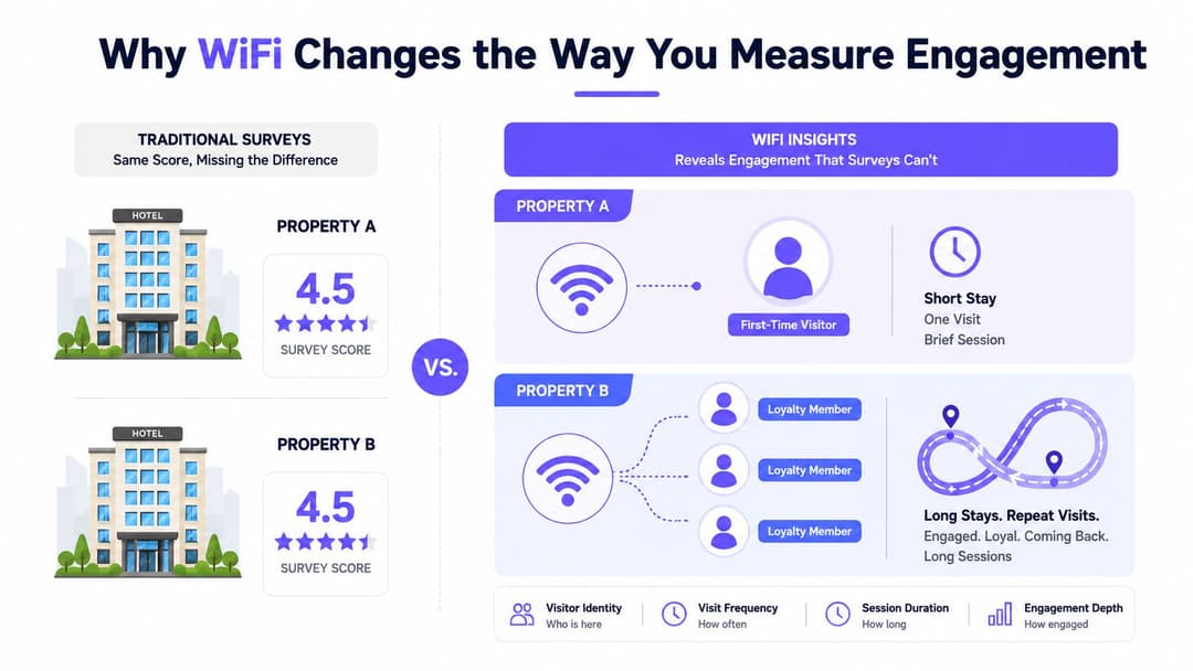
A hotel manager sees strong guest WiFi adoption and assumes engagement is healthy. The dashboard shows plenty of connections, the post-stay survey is positive, and the campaign report lists a respectable number of portal clicks. Yet the property may still be attracting mostly first-time users who connect once and disappear, while another hotel with a similar survey result builds a much stronger base of returning guests.
That distinction matters in hotels, shopping centers and hospitals. WiFi data can show observable interaction with a venue, including authentication, session duration, return frequency, portal actions and movement between access points. It can't tell you whether someone felt satisfied or intended to return, so surveys and operational systems still matter. The useful question is more precise: which user groups return, what do they do, and which venue action follows?
Why WiFi Changes the Way You Measure Engagement
Two hotels can receive similar survey scores while creating very different patterns of digital behavior. Property A might have many first-time users with short sessions and few portal revisits. Property B might have a larger returning cohort, longer authenticated sessions and repeated interactions with loyalty or communications journeys. A survey score can describe the stated experience, but it won't expose that difference on its own.
Start with an observable definition
For venue analytics, define a first-party engagement window before you collect results. It might begin when a visitor authenticates and end when the network records a completed session, a meaningful period of inactivity, or a defined visit boundary. The exact rule matters less than applying it consistently across properties and reporting periods.
An access event isn't automatically meaningful engagement. A device that reaches a splash page and disconnects has created telemetry, but it hasn't necessarily interacted with the venue. A stronger event might include completed authentication, a portal action, a return visit, an authenticated session across a defined period, or a consented movement into a loyalty or communications flow.
Use WiFi as behavioral evidence
Network telemetry can reveal friction that surveys often miss. Authentication failures can point to a broken access journey. Session duration can expose differences between zones or visitor groups. Return frequency can show whether a campaign or service experience produced repeat interaction. Bandwidth and device usage can add context, although heavy usage isn't proof of satisfaction or commercial value.
The measurement objective isn't to count connected devices. It's to link consented, authenticated sessions to privacy-safe cohorts while respecting consent, purpose limitation and data minimization. The US Employee Engagement Survey demonstrates why repeatable benchmarks matter. Its engagement index was 62% in 2022, based on a representative sample of 814 adults, and a later analysis reported 65% in 2024 after a statistically significant three percentage-point increase from the prior year, as described in the Engage for Success survey report.
Practical rule: Use surveys to understand attitudes, WiFi to observe interaction, and operational systems to verify outcomes. None of the three should carry the whole measurement burden.
Core Engagement KPIs Worth Tracking
A useful engagement model separates acquisition, depth, frequency, quality and outcomes. That prevents one attractive number, such as total sessions, from becoming a substitute for understanding behavior.
| KPI category | Examples | What it signals | Key limitation |
|---|---|---|---|
| Acquisition | Authentications, unique users, connection rate, first-time users | Whether visitors enter the digital journey | Mandatory access or a prominent portal can inflate connection activity |
| Depth | Session duration, active days, portal interactions, bandwidth and device usage | How extensively users interact with the network and venue journey | Long sessions can reflect poor connectivity, waiting time or devices left connected |
| Frequency | Returning users, repeat-visit rate, authenticated return sessions | Whether interaction continues beyond the initial visit | Shared devices and changing identifiers can distort human-level return behavior |
| Quality | Completion rate, authentication failures, reconnects, portal abandonment | Whether the access experience works smoothly | A technically successful login says little about satisfaction |
| Outcomes | Loyalty enrollment, campaign response, app download, booking, service use or feedback completion | Whether WiFi interaction supports a business or service result | WiFi alone can't establish commercial impact without a joined outcome source |
Define each KPI with a numerator, denominator and reporting window. For example, repeat-visit rate can be defined as returning authenticated users divided by users in the original cohort, measured over an agreed period. A portal interaction rate can compare users who complete a selected portal action with users who reach the portal. Document whether the denominator contains unique authenticated identities, sessions or devices. Those are different populations.
Add context before interpretation
Segment results by acquisition date, visit type, location, device class, access method and time of day. Hotels may need guest status and loyalty membership. Retail teams may compare campaign exposure, center zone and tenant journey. Healthcare operators should separate patients, visitors and staff, then keep clinical traffic on the appropriate secure network.
Start with a small set of KPIs tied to decisions. If nobody knows what to do when session duration changes, it shouldn't occupy the top row of the dashboard. Add a metric only when an owner can investigate it and an operational action follows.
The employee engagement framework illustrates the danger of relying on one headline score. Engage for Success builds its Engagement Index from three survey questions and also reports four enablers, Strategic Narrative at 58%, Engaging Managers at 72%, Employee Voice at 61%, and Organizational Integrity at 66%, detailed in the engagement measurement framework. WiFi analytics needs the same discipline. A weak return rate might reflect access friction, poor communications, an unappealing offer or a change in visitor mix.
Compare like with like
National benchmarks can provide context, but a venue should prefer comparable cohorts and sectors. Hive HR's Q1 2026 benchmark uses over 500,000 employee responses from US-based organizations and defines its Engagement Index through Loyalty, Advocacy and Pride on a 0 to 10 scale, with scores of 7 and above treated as positive, as set out in its Q1 2026 employee engagement benchmarks. That principle transfers directly to WiFi: compare a resort with similar resorts, not with an unfiltered network-wide average.
Data Sources Behind the Numbers
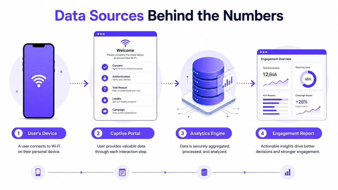
The report is only as reliable as the capture path underneath it. Start at the device, follow the authentication journey, and document every system that adds identity, context or outcome data.
Capture the access journey
The captive portal or splash page is often the first deliberate interaction. Depending on the venue and lawful basis, it can record consent, authentication details, visit reason, loyalty membership and campaign exposure. Keep the form focused. Collecting extra personal information creates more governance work without necessarily improving the analysis.
Access controllers and RADIUS or authentication logs add technical evidence. They can provide timestamps, session status, access point, device information and failure or completion events. These records help analysts distinguish a completed connection from a failed attempt and identify where access friction occurs.
Passpoint, certificate-based access and roaming credentials can make repeat access smoother when identity, consent and policy controls are configured correctly. The convenience is useful, but it shouldn't remove the need to define what constitutes a return or how the system handles a user who changes devices.
Join systems with approved keys
Directory and CRM integrations can connect a consented WiFi profile with membership tier, visit history or campaign status. Booking, point-of-sale, appointment and loyalty systems provide outcome context. Ticketing and service platforms can show whether a network interaction preceded a booking, purchase, check-in or appointment action.
Use privacy-safe IDs and approved join keys rather than collecting information because a system can store it. Stable identifiers, event timestamps and consistent time zone handling are essential. Analysts also need rules for duplicate suppression, shared devices, bots, retention limits and access logs.
A practical data flow looks like this:
- Device to access layer: The network records an authentication attempt and session event.
- Access layer to analytics engine: Controllers and authentication logs contribute timing, location and status.
- Analytics to customer systems: Approved identifiers connect consented profiles with CRM, booking, loyalty or service records.
- Reporting to action: Dashboards expose cohort behavior, friction and outcomes to named owners.
Teams that already measure digital campaigns can use this digital marketing measurement guide to align channel metrics with a broader reporting discipline. The same principle applies here: define the event, preserve the denominator, and connect the interaction to a decision.
Network engineering owns capture reliability. Marketing owns campaign context. Operations validates whether the behavior reflects the physical journey. Analytics defines the model, while privacy and security approve the collection, access and retention controls.
Building Dashboards That Tell a Story
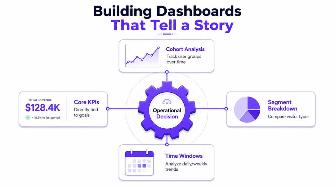
A dashboard should help a venue decide what to change, not merely display everything the platform can count. The top row might show authenticated users, repeat-visit rate and a selected outcome. The next layer should explain who produced those results and where the pattern changed.
Design around operational questions
Every tile needs a question behind it. “Is loyalty growing in this guest segment?” requires a loyalty cohort, a defined denominator and a time comparison. “Which campaign produced repeat visits?” requires campaign exposure joined to authenticated returns. “Where is dwell time falling?” requires location, time window and a clear definition of dwell.
A practical layout combines four elements:
- Top-line tile: Show the current KPI, its denominator and the comparison period.
- Segment drill-down: Break the result by visitor type, zone, device class, acquisition channel or access method.
- Cohort strip: Track groups acquired through the same portal flow, campaign or first visit.
- Anomaly callout: Flag unusual authentication failures, sudden abandonment or a divergence between behavior and outcome.
Use time-window controls deliberately. Daily views help operations respond to immediate changes. Week-over-week comparisons expose recurring patterns. Rolling 28-day views reduce noise from isolated days, while season-over-season comparisons can support venues with changing visitor mixes. Don't compare windows with different population definitions.
Make latency visible
A tile that updates late will lose trust, especially when frontline teams expect an operational response. Display the data refresh time and separate provisional figures from finalized results. Never mix a live session count with a completed outcome measure without making the difference obvious.
Counts need rates beside them. A property with more visitors will naturally produce more sessions, so raw volume alone isn't evidence of better engagement. Pair each KPI with the audience behind it, such as returning users by guest type or portal completion by zone.
For teams reviewing the mechanics of guest connectivity and analytics together, the WiFi analytics guide provides a useful reference point. The dashboard itself should still remain specific to the decision. A marketing manager, network administrator and hospital operations lead shouldn't all receive the same view.
A dashboard earns its place when a manager can identify the affected cohort, name the likely cause, and assign the next action without opening a separate spreadsheet.
Cohort Analysis and Attribution
Raw WiFi sessions describe activity, not persistence. Cohort analysis adds the missing time dimension by grouping users according to a shared starting point and then observing what happens afterward.
Begin with the first authenticated session. Useful cohort labels include acquisition week, campaign code, portal flow, visit type, property, zone or booking source. Then track return, deeper interaction and outcome behavior across agreed windows such as 1, 7, 30 and 90 days. The windows aren't interchangeable. A hotel may care about a later return, while a shopping center may care about repeated visits within a campaign period.
Build the retention view
A retention matrix makes the story easier to inspect than a single aggregate. Use rates or counts consistently, and define whether each cell represents users, sessions or completed outcomes.
| Cohort | Week 0 | Week 1 | Week 4 | Week 8 |
|---|---|---|---|---|
| Direct booking offer | Initial authenticated cohort | Returning users | Repeat interaction and service use | Later return or outcome |
| OTA-acquired visitors | Initial authenticated cohort | Returning users | Repeat interaction and service use | Later return or outcome |
| Loyalty portal users | Initial authenticated cohort | Returning users | Repeat interaction and service use | Later return or outcome |
Consider a hotel comparing guests acquired through a direct booking offer with guests acquired through an online travel agency. At acquisition, the OTA cohort may look larger, making that channel appear popular. Once the team measures authenticated returns and on-property spend over a defined 60-day period, the relevant question changes: which source creates the stronger repeat relationship, not which source delivered the most initial logins?
Attribution requires a chain of evidence. Map the WiFi login, portal redirect, campaign code and consented reconnect to the same privacy-safe identity, then join that record to the relevant booking, loyalty or spend event. A correlation between campaign exposure and return behavior is a useful signal, but it isn't proof of causation without a credible comparison or attribution design.
Control contamination
Shared tablets, family devices and rotating device identifiers can make one person look like several users or several people look like one. A short attribution window may miss a genuine return, while a long one can attach an unrelated later visit to the original campaign. Changing the rules halfway through a reporting program destroys comparability.
Purple's guidance on first-party data from guest WiFi is relevant to this design because the identity layer must be intentional. Authentication can support cohort analysis, but only when the organization records consent, documents identity resolution rules and accepts that a device isn't automatically a human.
Sector Examples From Hospitality, Retail and Healthcare
The same measurement framework behaves differently in each venue. The signal only becomes useful when an operator connects it to the decision that follows.

Hospitality
A resort can compare authenticated cohorts by loyalty status, booking source and stay type. The analysis might show that loyalty-portal users return more often or interact with more on-property services, while one-off guests primarily use WiFi for basic access. The useful output isn't a chart of connections. It's a distribution decision, a loyalty-enrollment change or a revised portal journey.
Retail
A shopping center can attach WiFi sessions to zones and visit windows, then compare repeat behavior with consented campaign exposure and tenant outcomes. If a food-court cohort returns more often and produces stronger cross-tenant interaction than another zone, mall management has evidence for adjusting wayfinding, promotional placement or tenant collaboration. Dwell time alone can't justify that change, but it can identify where to investigate.
Healthcare
A hospital needs strict separation between staff and patient or visitor access. WiFi analytics can examine authentication friction in waiting areas, patient portal interactions and service-related journeys, while clinical systems remain protected on a separate secure network. The decision may be to simplify guest access, improve appointment communications or investigate repeated failed authentication, not to treat connectivity as a proxy for care quality.
In each case, first-party WiFi provides behavioral context. Booking, point-of-sale, appointment and service records determine whether that behavior produced a meaningful operational result.
Actioning Insights and Avoiding Common Mistakes
Measurement changes operations only when every important signal has an owner, a threshold and a response. Assign network failures to IT, portal abandonment to the digital or marketing team, weak repeat visits to the relevant venue operator, and outcome gaps to the team responsible for the customer journey.
Review the data at a regular operational cadence. A weekly review can identify immediate friction after a portal or access-point change. A monthly cohort comparison can show whether an acquisition source produces lasting interaction. Test changes through defined time windows, location rollouts or customer groups, and keep the attribution rules fixed while the test runs.
Use a launch checklist
- Define the event: Separate a connection, authenticated session, meaningful portal interaction and repeat visit.
- Fix the denominator: Record whether each KPI uses devices, users, sessions or outcomes.
- Protect comparability: Document time zone boundaries, deduplication, cohort rules and attribution windows.
- Check data quality: Investigate missing timestamps, duplicate identities, shared devices and delayed feeds.
- Assign action owners: Every alert should route to a named team with a practical response.
- Protect the user: Review consent, retention, access permissions and privacy-safe identifiers before launch.
Common failures include treating every connection as engagement, merging guest-only and authenticated sessions, optimizing raw session volume, and changing attribution rules retrospectively. Teams also mistake correlation for causation. WiFi can show that two behaviors occur together, but campaign impact still needs supporting evidence.
For governance decisions, keep the measurement model alongside the privacy controls. Purple's guest WiFi data privacy guidance is a relevant reference for teams designing consented, first-party access journeys. Used properly, WiFi data helps hotels improve loyalty journeys, retailers refine in-venue experiences and healthcare providers reduce access friction without turning connectivity records into an unjustified profile of the individual.
Purple provides identity-based guest WiFi, authenticated first-party analytics, CRM connectors and cohort-oriented reporting for venues that need to connect network interaction with repeat engagement. Visit Purple to see how its platform can support measurable WiFi journeys across hospitality, retail, healthcare and other multi-site environments.